"Good design is clear thinking made visible" -Edward Tufte
Geographic Visualization, the Artist Formerly Known as Cartography, derives much of its power to speak because it is visual. We humans are voracious abstract visual thinkers: just try not seeing the characters in front of you as words that denote meaning. Or eevn wehn the wrods are sellped wonrg, our bainrs jsut power thugroh fnie, in part because we don't just see letters, we mentally 'chunk' information into high-level structures shaped in large part by a clever bit of programming called prior experience. In fact, we can only read as fast as we do because we don't read individual letters but groups of them called words, and beyond that at the highest level, because languages have understood rules that make certain combinations of letters and words impossible allowing our brains to filter-out the ridiculous and focus on the likely. This, however, is both a blessing and a curse since we can process information very, very quickly (hitting a 95 mp/h fastball), but we often only see what our brains tells us we should expect to see (why trick pitches work). As a result, words, maps and other graphic representations have an expressway into our consciousness, often imparting vast amounts of data in mere glance. We can't help it – it's literally how we're wired.
While the eye-brain system is a masterpiece of evolution, it also has these well-known limitations and pitfalls. Optical illusions are one such example, including the one below by MIT professor Edward Adelson which is one of the best I've ever seen: It beautifully illustrates how our brains automagically discount the actual gray of the squares (their real lightness) in order to keep the logic of the checker-floor true (it discounts the shadow cast by the cylinder, our own built-in 'image correction software'). Here's the proof.
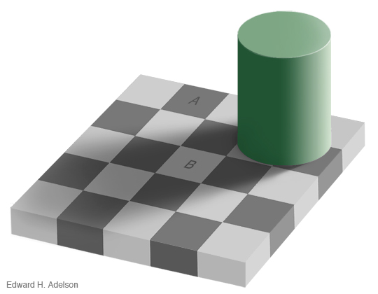 The brain sees what it expects to see: Squares A and B are exactly the same shade of gray. For real.
Within visualization we worry about both Type 1 and Type 2 errors; seeing things that aren't there, and missing things that are. Given both the power of graphics to speak so clearly to us and the very real limitations of 'visual thinking', it behooves us to not only use such power wisely, but to also understand as Alan MacEachren notes, how and why maps work.
Maps, Schmaps
When some visiting speakers come to my department and learn I'm 'the cartographer' it's amazing how many times their next comment is "I know my maps are bad" and smile or chuckle, but with the unspoken "but that doesn't really matter to my message/findings/purpose." Can you imagine if I confessed that I was 'the statistician' and they said "I know my stats are totally wrong" and brushed it off with a smile? This is especially disturbing when these maps are so often the central piece of evidence offered up by these speakers ("as you can see here on the map, there is a clear correlation between..."). It's not so much that this is bad graphic design that worries me; It's that this is bad science.
I've seen many researchers take years to painstakingly collect and verify their data. Science is by design a very slow and thorough process and it has to be to ensure that our knowledge claims are correct. But after taking sometimes years to collect the data, I'm astonished when I see brilliant scientists content to present their findings using clunky maps and graphics that showcase how bad software defaults are and little else (don't get me started on 3D pie charts!). They look as if they were slapped together in 20 minutes and that saddens me because their work deserves better than this, especially when one considers that these images so often become the public face of this data. Indeed, many famous maps and graphs are produced and reproduced for years, long after the original paper they were attached to have been forgotten. As Edward Tufte has demonstrated time and time again, better designed graphics would make their arguments clearer, more convincing, the data richer and more nuanced.
Why Design Matters
To be clear: Good cartography is more than making data pretty. It's a recognition that the best data in the world can be diminished--or worse, distorted--if the map is clumsily executed. It's a recognition that the map is the intuitive and flexible interface between our data and the knowledge we seek to gleam from those data. We may live in a glorious digital age, but let's face it, those 1's and 0's we're so good at collecting don't really come alive until we translate them into images and maps and graphs that are representations of data, those data themselves being representations of the real thing. Maps should not, thus, be confused with reality (although they are often assumed to be perfect mirrors of reality).
Most importantly, good design and good map-making is an understanding that the graphic choices we make fundamentally change what our data say, and thus, what we think we know about the world. If we're sloppy about how we choose to represent our data (and by proxy, the world), then we're being sloppy about the knowledge those images create inside our heads. This is why relying on software defaults, the one-size-fits-all-needs approach to design, is something we at Axis Maps have worked so hard to fight.
When maps are offered-up in the dual role of both 'evidence' of our knowledge claims, and the means by which we explain those knowledge claims to others, should they not be subject to at least the same standards that would be applied to any other part of the scientific process (e.g., data quality, statistical significance)? Maps are the ultimate executive summary: caveat emptor.
I'll leave with a quote from the delightful blog Presentation Zen (August 30th, 2006):
To many business people, design is something you spread on the surface, it's like icing on a cake. It's nice, but not mission-critical. But this is not design to me, this is more akin to "decoration." Decoration, for better or worse, is noticeable, for example — sometimes enjoyable, sometimes irritating — but it is unmistakably *there.* However, sometimes the best designs are so well done that "the design" of it is never even noticed consciously by the observer/user, such as the design of a book or signage in an airport (i.e., we take conscious note of the messages which the design helped make utterly clear, but not the color palette, typography, concept, etc.). One thing is for sure, design is not something that's merely on the surface, superficial and lacking depth. Rather it is something which goes "soul deep."