 ☰
☰
We have been making maps to help experts understand and communicate public health data for 10 years. During that time, we've helped a diverse group of clients...
Contact us today! We'd love to hear more about your project and start thinking about a solution that's right for you.
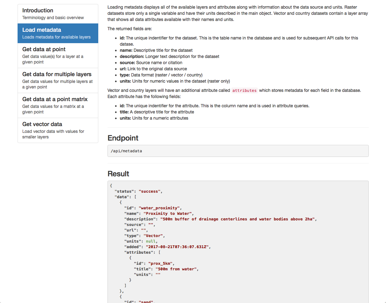
Public health datasets are growing exponentially in size. We can help you create meaning from this data and solve the technical challenge of serving it efficiently.
The data collection processes already in place at your organization are paramount. We can help you by designing new software that brings spatial data to your existing workflows.
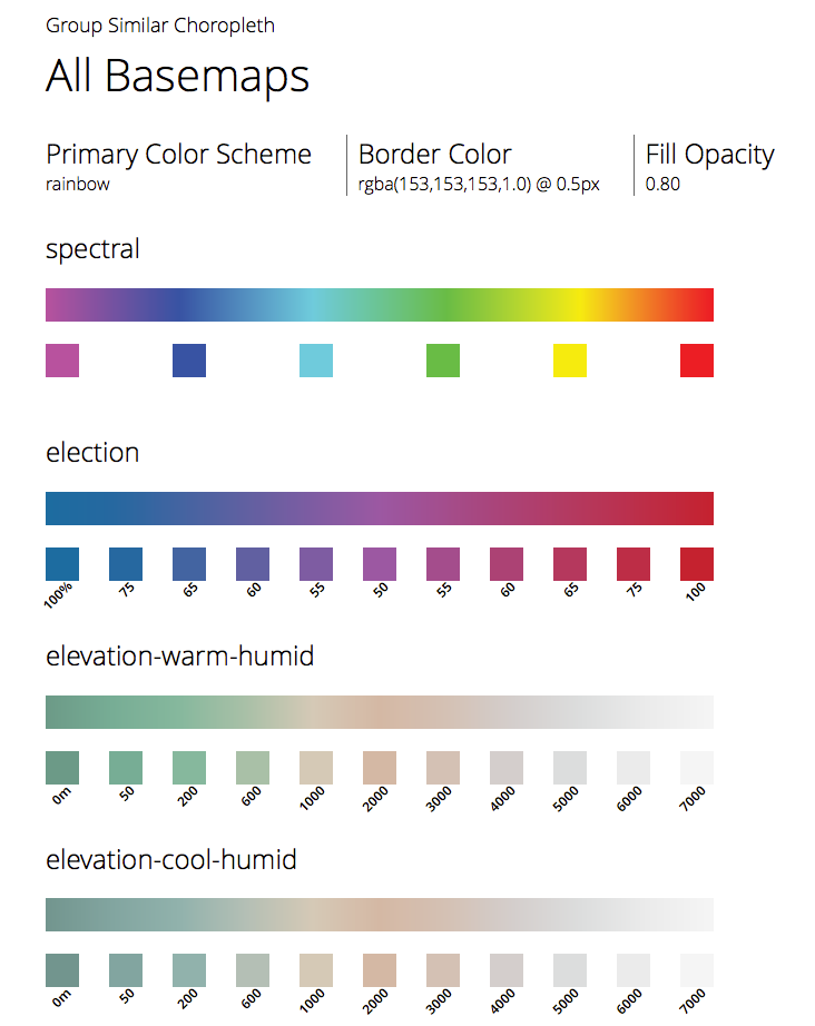
Out maps are 100% custom-designed for you and your data. We can help you design maps and thematic graphics that match your branding, making your maps look uniquely your own.
Public health data and maps help shape public policy. To help your users communicate their findings to others, we include export tools in our maps that let them create graphics or reports to disseminate.
Maps and graphics all have inherent weaknesses in how the present data. To ensure your users receive the most complete picture of the data, we build multi-graphic visualization dashboards.
We've built maps for a wide range of users, from experts shaping public policy to general users curious about local health. We target our UI and cartographic design to the expertise-level of the users you're targeting.

Axis Maps worked with us every step of the way to produce a top-of-its-class mapping application, fully customized for our needs. As our project expanded, Axis Maps was able to fully accommodate our additions, building in robust new features that worked seamlessly with existing functionality. We’re thrilled with our final California Healthy Places Index map!
Advanced workflows for expert users influencing policy
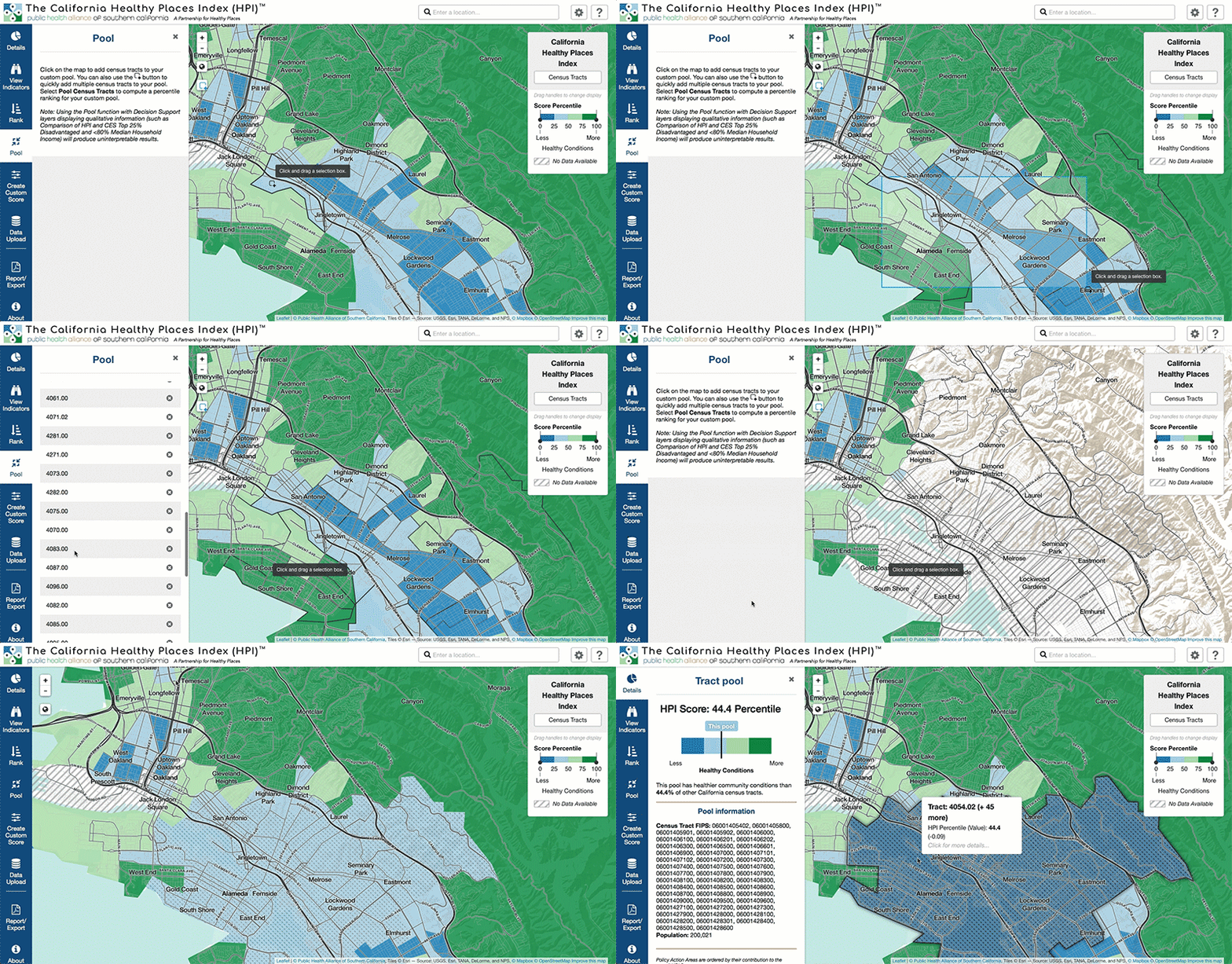
When we parterned with The Public Health Alliance of Southern California to redesign and rebuild their Healthy Places Index tool, our goal was to create an interactive online environment that support the work of a diverse group of experts that wanted to bring public health data into their work. This involved creating a highly interactive environment, akin to a guided GIS system.
The initial data work for the health places index was done at the census tract level. After considering that this scale may be too granular for many of our users looking at issues beyond the hyperlocal level, we added 8 additional aggregated geography types. We also built additional back-end tools to pre-caculate and cache values for every indicator at every geography level. For users who require a higher degree of customization, we built a custom pooling system where users can select and combine individual tracts into new custom units and retrieve a score calculated on-the-fly.

Linked charts to uncover unknowns about health outcomes

Using big data and map animation to understand patterns of vaccination and prevalence