Desktop-style cartography with web graphics

This is a companion post to my NACIS 2019 Practical Cartography Day talk, in which there’s not enough time to say anything practical. If you’ve arrived here after seeing the slides, I hope you’re ready for some coding!

Desktop computer and hand-drawn cartography have a long history of subtle-yet-advanced design tricks to turn good maps into great maps. With web maps, it’s easy to spend all your effort on getting code to work or building user interfaces or programming interactivity, and neglect little cartographic design enhancements. Today I’m here to demonstrate web technology as a design tool and show some processes for bringing desktop-esque design enhancements to web maps. My hope is to explain some technical approaches well enough for cartographers to get the hang of them and adapt them to their own design ideas.

A helpful prerequisite—and it’s a doozy—is a basic understanding of using D3 to draw maps on the web. But don’t run away if you’re not a D3 expert. Start by playing with the forthcoming map examples, and fill in gaps later.

As promised, here are links to fully explained examples and code. They are written in Observable notebooks, which are live and interactive. Play around with the code and see what happens!

The presentation also includes a few images of Canvas examples not contained in the tutorials:

If you’ve arrived here from elsewhere, below are the less-than-informative slides that these tutorials are meant to accompany.

Happy mapping!


Now hiring: Web Map Developer

September 5, 2019: We are no longer taking applications for the Web Map Developer position, but will post updates here if an opening becomes available. Thank you to all who applied!


Watercolor map style with Canvas

Stamen has long been a prolific creative influence in the data visualizatio and mapping world, but perhaps their most best known, instantly recognizable work is still their watercolor map style, developed and released back in 2012. It’s a beautiful, relatively early example of moving beyond the everyday vector graphics language (strokes, fills, etc.) when rendering map data (OpenStreetMap) for the web, and it still remains one of the best.

Although the original watercolor map is made of pre-rendered tiles, instricate raster map rendering on the fly in a browser is gradually becoming practical as Canvas becomes more capable, and libraries like D3 make it easy to render vector data to raster graphics. A partial duplication of some of Stamen’s watercolor processes, this time using D3 and Canvas, is a great exercise to hint at what’s possible and spur some new creative ideas in our web maps.

This watercolor map notebook on Observable does that, looking back at Stamen’s techniques as described by the late Zach Watson. (There is further explanation of paint and texture from Geraldine Sarmiento.) It needs to be viewed in the Chrome browser, as some Canvas techniques implemented are experimental and not supported by all browsers.

Advanced map rendering with Canvas tends to involve drawing the same shapes many times as layers and masks are built up, and thus performance may still limit what we can do in realtime without even more advanced technology (WebGL?), but the possibilities are vast and fun nonetheless! Play around with the notebook to see just one example!


Processing Big Data with Docker in the Cloud

Recently, we’ve been partnering with Hammerhead to design offline maps for their on-bike cycling computer. It’s been really interesting to work on a design project where size concerns (all the data must be downloaded to the device and MBs count) and hardware concerns (the styles must read in direct sunlight) are equally as important as aesthetics.

As part of this project, we needed to optimize and process global OSM data, converting it to the format used on the device and stripping out all the additional layers not used by the map style. The process uses GDAL, Osmosis, and PBF extracts downloaded from Geofabrik. We had already bundled it into a bash script that takes the name of an OSM area and:

  1. Downloads all the required data files
  2. Creates land and sea polygons and crops to the desired area
  3. Converts the OSM data
  4. Uploads the converted data to S3 along with a small text file defining the extents

After running a few multi-hour tests on single US states, it became clear it was going to take a week to complete the entire world running from my local machine… and we had to deliver in a couple of days. We weren’t thinking big enough! Obviously 1 computer wasn’t going to cut it, we needed 50, all more powerful than my stupid laptop. We had been working with Docker and DigitalOcean before, but mostly as a convenience way to not have to constantly rebuild server dependency. This seemed like a good opportunity to test their scalability and see how they could help us with dealing with a monster dataset.

Docker

Docker is a system that lets you create containers / sandboxes where you can define the dependencies required to run your application. It standardizes the sometimes messy process of server provisioning and dependency installation that is often a barrier-to-entry to running software. How the container is setup is defined in the Dockerfile. Docker takes these instructions and builds the container that can run the software.

Dockerfiles usually begin with an import statement that gives Docker an image to use as a starting point. This can be a different image you’ve made, but it’s often just an OS. For this one, we’re using Ubuntu Xenial.

FROM ubuntu:xenial

Next, we’re going to install all the software dependencies we need to run our processing script.

RUN apt-get update \
  && apt-get install -y wget git zip software-properties-common default-jdk awscli

RUN add-apt-repository -y ppa:ubuntugis/ppa \
  && apt update \
  && apt install -y gdal-bin python-gdal

Try to condense the number of commands in your Dockerfiles by chaining commands together with && but don’t forget to escape line breaks with \.

After that, we can include the Osmosis installation instructions line-for-line from the website:

RUN wget https://bretth.dev.openstreetmap.org/osmosis-build/osmosis-latest.tgz \
  && mkdir osmosis \
  && mv osmosis-latest.tgz osmosis \
  && cd osmosis \
  && tar xvfz osmosis-latest.tgz \
  && rm osmosis-latest.tgz \
  && chmod a+x bin/osmosis

Don’t forget: Each RUN command starts from the root of the virtual drive.

If you want to add some of your own files, you can either run a command to clone a repository:

RUN git clone https://github.com/axismaps/mapsforge-creator.git

Or you can add a file from your local directory (specifying both the source and destination):

ADD tag-mapping.xml tag-mapping.xml

If you need to pass data to the Docker image, you can use the ENV tag. These will become particularly useful because we can override them when running the image, allowing us to keep sensitive data private:

ENV OSMOSIS_HOME="/osmosis"
ENV MAP_TAG_CONF_FILE="/tag-mapping.xml"
ENV THREADS=8
ENV SKIP_POI_CREATION="true"
ENV SKIP_MAP_CREATION="false"
ENV S3_BUCKET="hammerhead-mapsforge"

ENV AWS_ACCESS_KEY_ID="XXX"
ENV AWS_SECRET_ACCESS_KEY="XXX"

The last thing to set in the Dockerfile is the ENTRYPOINT. For this use-case, I think it’s helpful to think of a Docker container as a Mr. Meeseeks from Rick & Morty. They are designed and created to serve a singular purpose. As soon as it’s complete, they disappear. The ENTRYPOINT defines the image’s raison d’être. In our case, it’s a bash script:

ENTRYPOINT ["mapsforge-creator/map-creator"]

With the Dockerfile complete, we just need to build the image and then push it to Docker Cloud so it can be easily accessed later:

docker build . -t axismaps/mapsforge
docker push axismaps/mapsforge

Running the Images

With the Docker image built and uploaded, we’ve created a stable environment that we know will run our code anywhere. The next step is to write a simple script that will provision virtual machines (VMs) and tell them to run our Docker image with some specific commands. We’re using DigitalOcean as our cloud host, but you should be able to do this with any provider.

All of this works because when we create a new VM on DigitalOcean, we can send it some bash commands to execute immediately after it starts up. These commands are:

#!/bin/bash
docker pull axismaps/hammerhead-mapsforge
docker run -e AWS_ACCESS_KEY_ID=<key> -e AWS_SECRET_ACCESS_KEY=<key> axismaps/hammerhead-mapsforge ${area_name} hd en
shutdown -P

The first command tells docker to grab the image we uploaded to Docker Cloud. The second command gives it the runtime instructions. The -e arguments allow us to override the ENV variables we specified and send our AWS credentials we didn’t want included in the Dockerfile or image. We’ve already defined the ENTRYPOINT so every unnamed argument after axismaps/hammerhead-mapsforge gets sent directly to our ENTRYPOINT script, including the name of the OSM area we want to render. The final command shuts the VM down when it finishes.

In our Python script we use to manage this process, all the bash commands are saved as a String named data that we pass to the DigitalOcean API in Python like:

d = digitalocean.Droplet(
	token=os.environ.get('TOKEN'),
	image='docker-18-04',
	region='nyc2',
	name=area_name,
	size_slug='s-8vcpu-32gb',
	user_data=data,
	tags=['mapsforge']
)
d.create()

The other parameters in that function define the VM image to use (Docker on Ubuntu 18.04), the VM size, and a few other bits to help us identify the VM when it is running.

If you’re just running a handful of operations, you now have everything you need to start up 1 VM for each area you want to render. However, if you have more areas to render than your limit of VMs, you’ll need to manage them a little bit. The below code:

  1. Gets a list of all your current VMs with a specified tag
  2. Checks if the VM status is off because it has finished rendering
  3. If the status is off, it destroys the VM, stopping you from being billed and freeing up a slot for the next VM
  4. If the status is not off, it adds the VM name to a list so you can know not to create a VM for that task again.
manager = digitalocean.Manager(token=os.environ.get('TOKEN'))
drops = manager.get_all_droplets(tag_name='mapsforge')
active = []
for droplet in drops:
  if droplet.status == 'off':
    droplet.destroy()
  else:
    active.append(droplet.name)

Wrapping Up

Going forward, this work represents a strategy instead of a plug-and-play code library that we can reuse. Our big push in the last few years with our data work has been towards scriptability and repeatability, using code to handle every step of data processing from source to inside the application. What we learned on this project extends that scriptability to include not only the computer systems we run these projects on, but the level of scalability required to quickly process monster data jobs.


DIY Hillshade

Continuing recent themes of working with elevation data—but stepping back to something more in the realm of ordinary cartography—over on Observable we’ve got a notebook going through some processes of “DIY Hillshade” with JavaScript on a web map.

The notebook shows one way in which it’s possible to use terrain tiles to render customized shaded relief on the fly with ordinary JavaScript and canvas. It’s not intended to be an efficient means of getting relief on your web map, but rather an explanation and demonstration of certain precise controls you can have over a hillshaded map’s aesthetics when algorithms and code are exposed. It assembles a map using a basic hillshade, hypsometric tints, a water layer, and an approximation of cast shadows.

Head over to the DIY Hillshade notebook to play around with the various controls—and the code if you dare—to see how you can push pixels to render your very own shaded relief!


Go with the flow

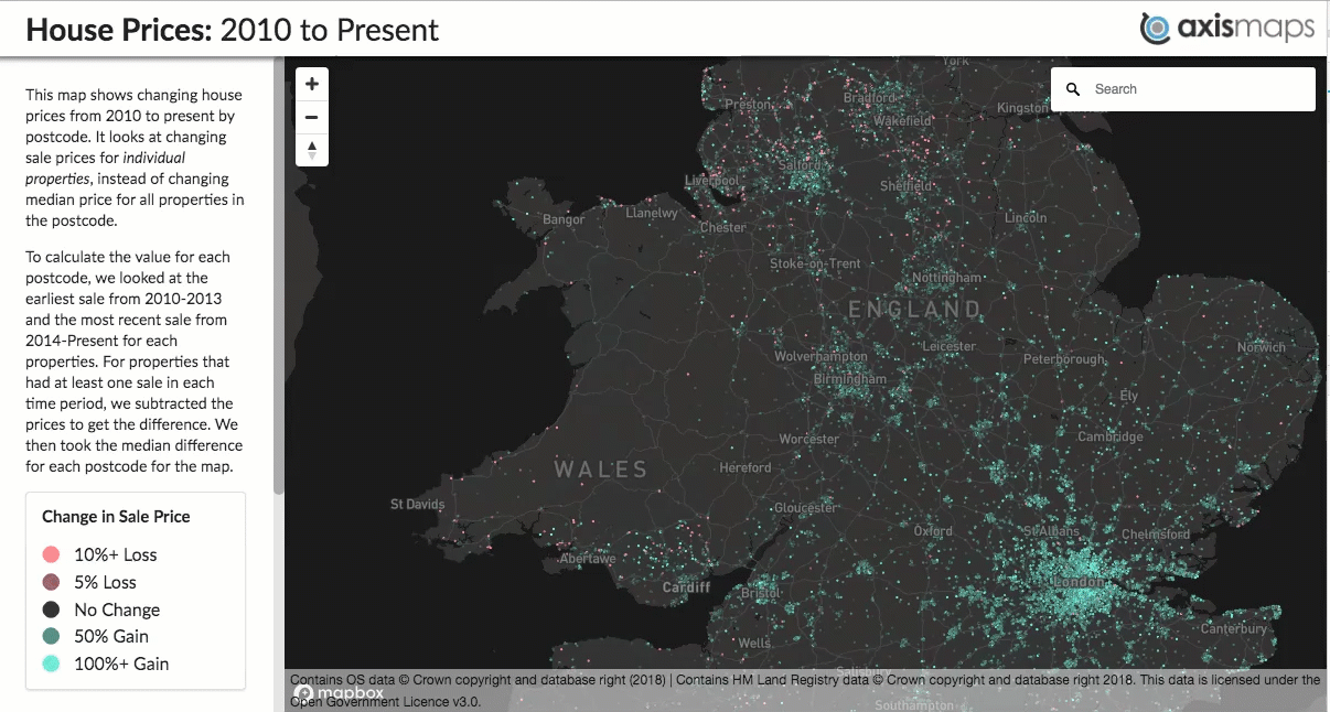
Most of my cartographic side projects these days follow a theme: mapping elevation data in some way or another. In the past year that has included wading into some “traditional” waters—trying some modern digital hillshading following Daniel Huffman’s processes, and hand-shading follwing Sarah Bell’s processes (and Eduard Imhof’s, in turn)—but most projects have been experiements in web-based terrain maps: from simple shaded relief to fuzzy things to flowing things to contour maps. And now, to this next thing.

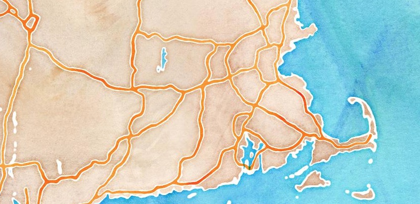
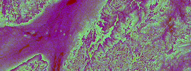
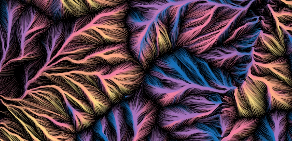
Mount Washington, New Hampshire

I’d just like to share a few images from what I’ve been playing with off and on for much of 2018, because they’re kind of pretty!

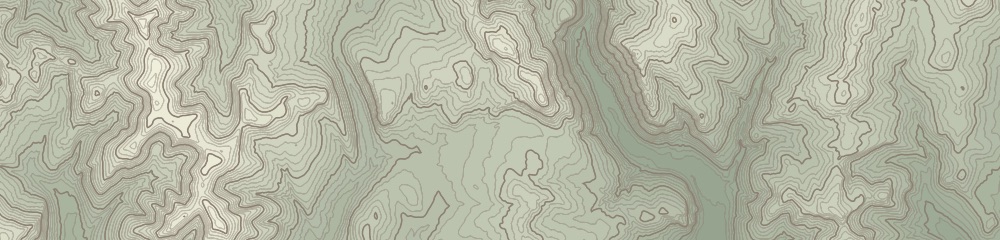
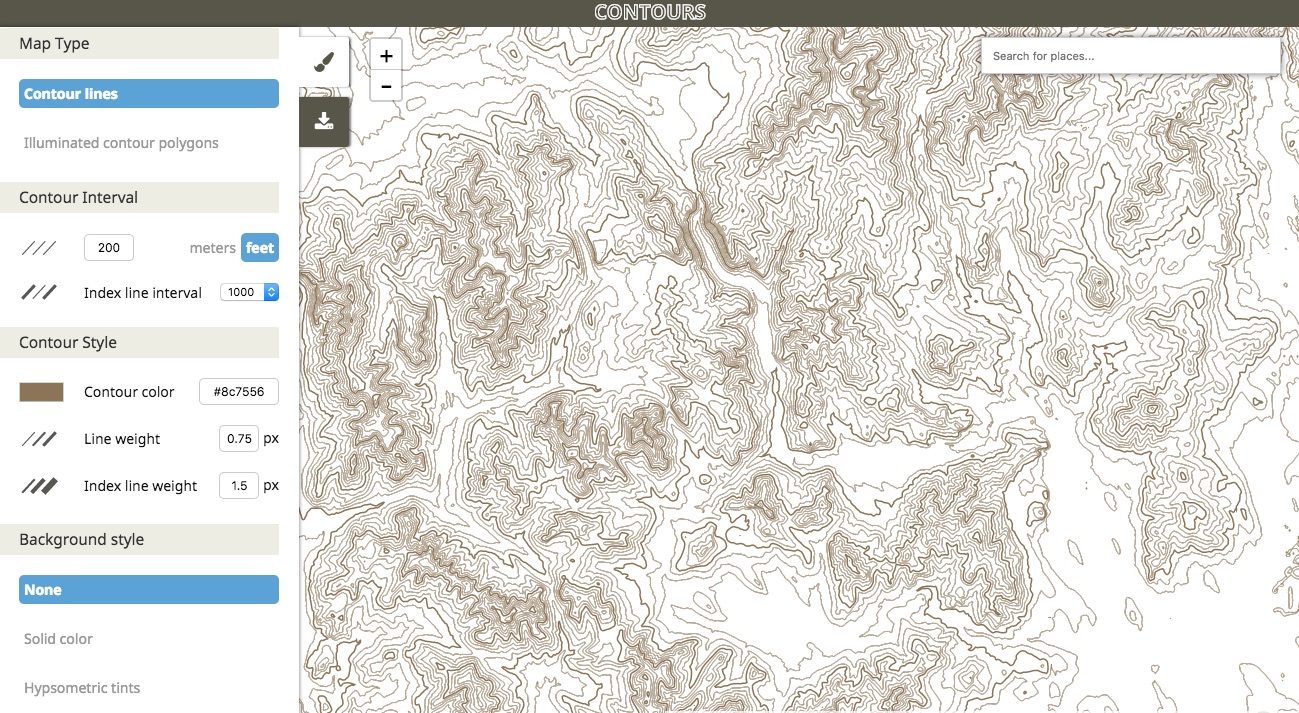
In 2017 Mike Bostock released d3-contour, a d3 module for computing contour polygons from a grid of values, such as raster elevation data. For me this opened a new avenue of fun terrain mapping in a web browser. A quasi-practical product of my efforts is a handy tool for generating and extracting topographic contours for just about anywhere. But it’s the artsy stuff that keeps me coming back.


As you might guess, these are, essentially, a collection on paths that “flow” downhill, something like a static version of the animated flows I did a while back (apologies, that currently has some issues but is still somewhat functional) with some aesthetic differences. Elevation contours are a key part of this one, however.

Attempting hachures… again

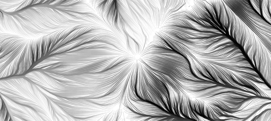
As always, I began with an attempt to draw hachures, a somewhat archaic terrain-shading technique of short, uniformly dense lines running in the direction of slope. Earlier attempts had drawn strokes in a regular grid or from random points, but now thanks to d3-contour I had a proper starting point. Randomly placed strokes running donwhill create a hachure-esque look, but real hachures are arranged in rows along regular contour intervals.

Pseudo-hachures, relatively short strokes drawn from random points. Here, masking around each line helps preserve an appearance of overall uniform density.

Now that I had contours, all I needed to do was draw evenly spaced marks perpendicular to each contour, right? Well as usual, it kind of works but breaks down easily. For me, at least, perhaps hachuring will always stubbornly be the same hand-drawn technique as when it was born (I’m working on that a bit, too).

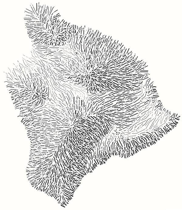
Mount Washington in an attempt at more proper, orderly hachures with some shading. It’s not terrible, but I haven’t figured out how to thin out lines that bunch up nor fill in lines that fan out.

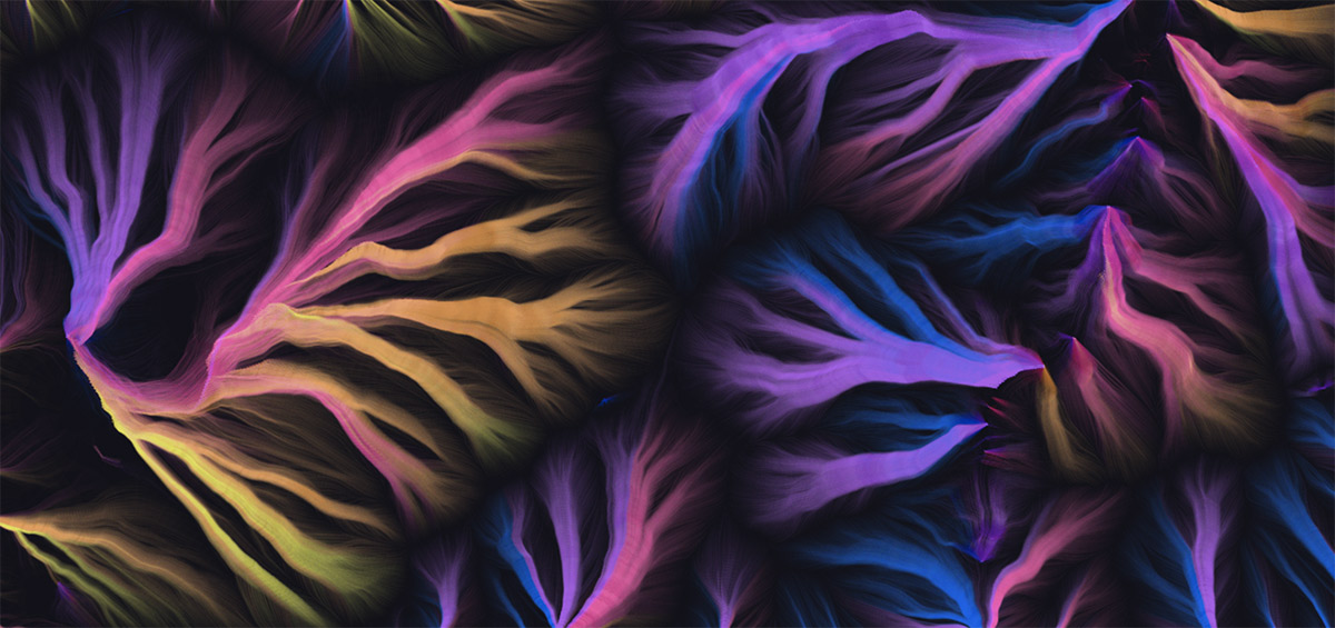
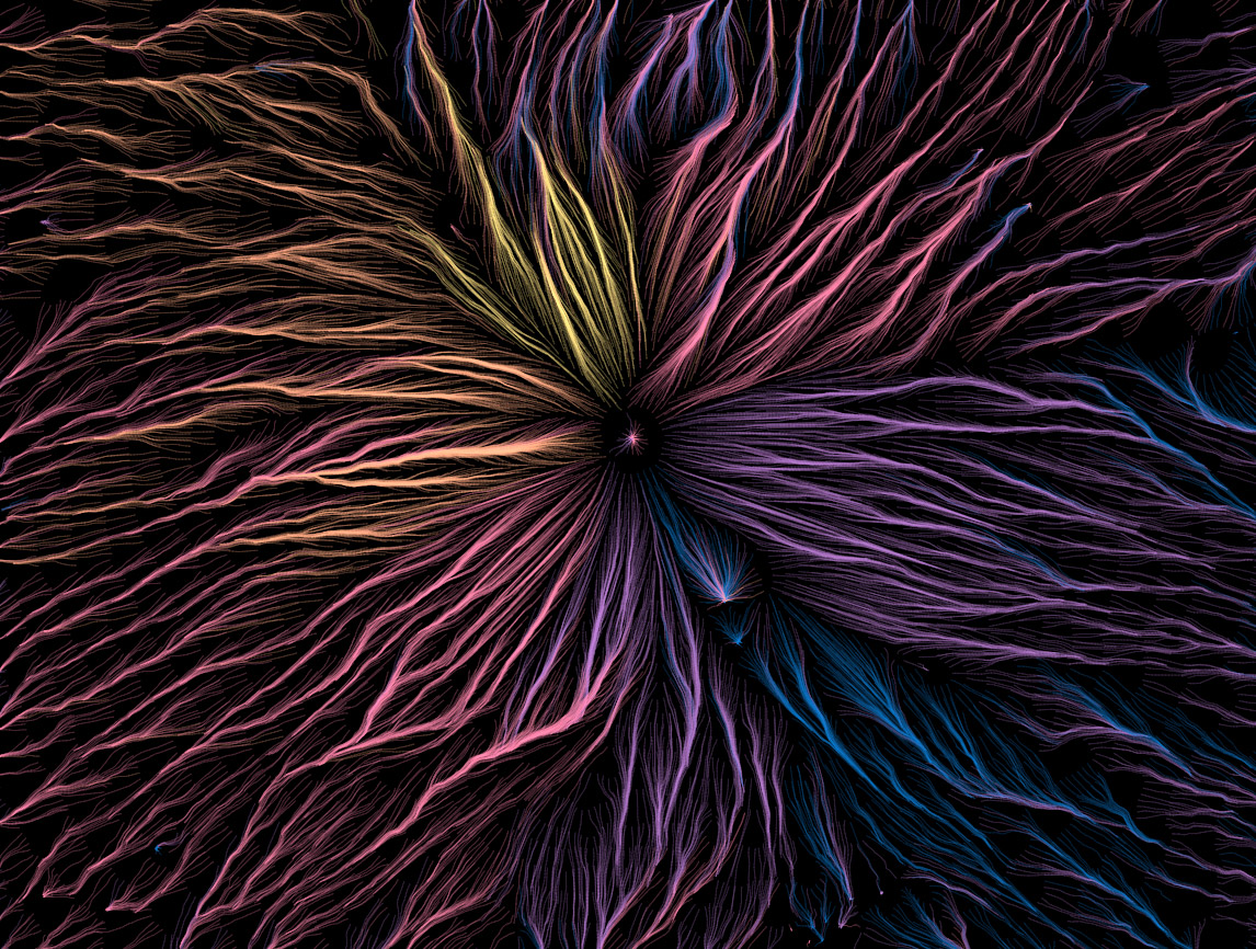
After abandoning the idea of neat, short hachure marks, it’s a short leap to what I’ve ended up with: just keep drawing the paths farther downhill and apply various colors and blending modes. There’s still a hint of order behind it all, though, as the lines still start at regular intervals along contour lines, making a smoother and more pleasing appearance than random placement would.

Same area as above (at a slightly different scale), allowing the lines to continue on downhill.

There are a lot of variables to play with: the contour interval, the spacing along contours, the length of paths, and the color scheme, to name a few. What works best to my eye depends on the scale and particular geography of the map, though as a general rule it’s best in mountainous but not overly rough terrain. If it’s too flat lines don’t really know where to go, and if it’s too jumbled my methods aren’t good enough to keep them “flowing” around all the obstacles—either way it looks messy. As for colors, I enjoy a dark background and somewhat vibrant colors based on the direction of flow, but your mileage may vary!

Once more, with fun colors.

Mount Fuji, if I recall correctly
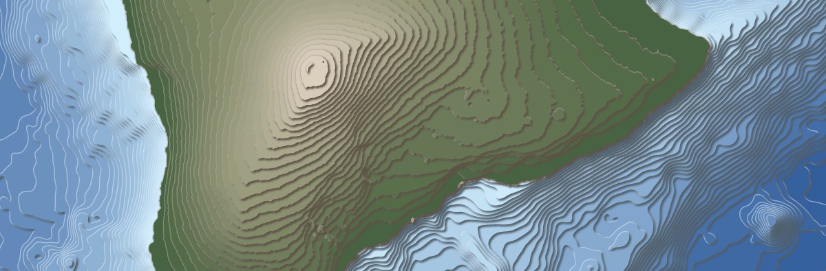
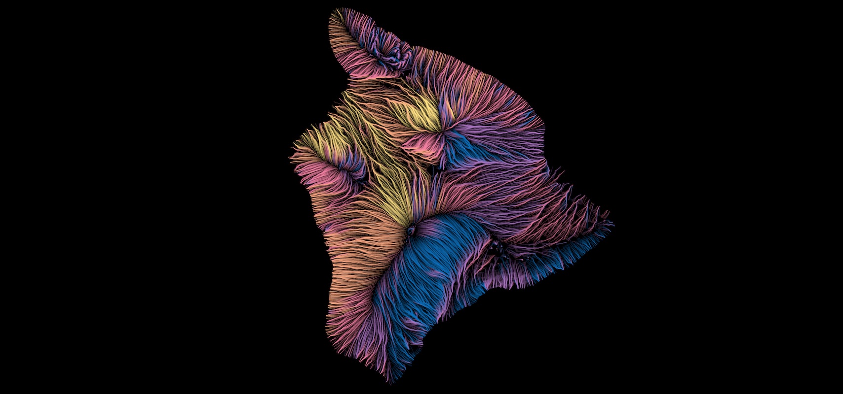
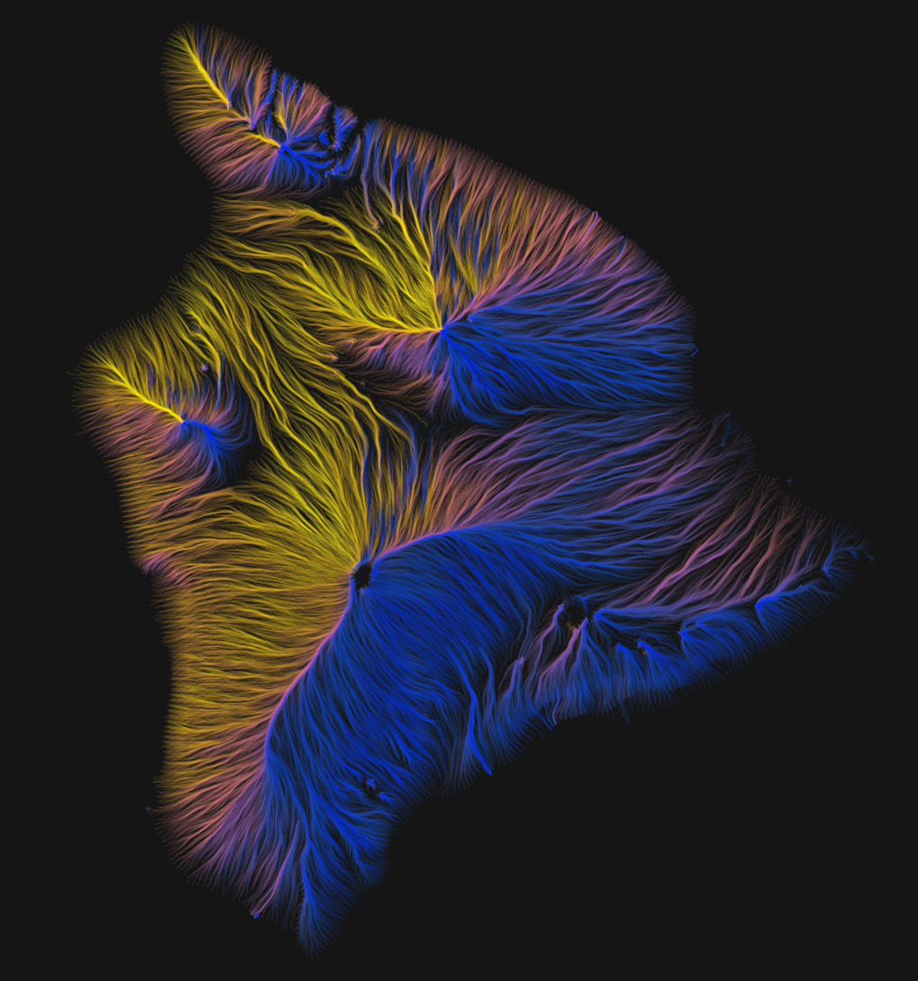
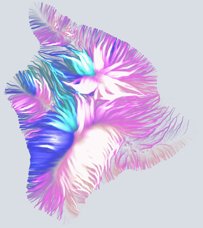
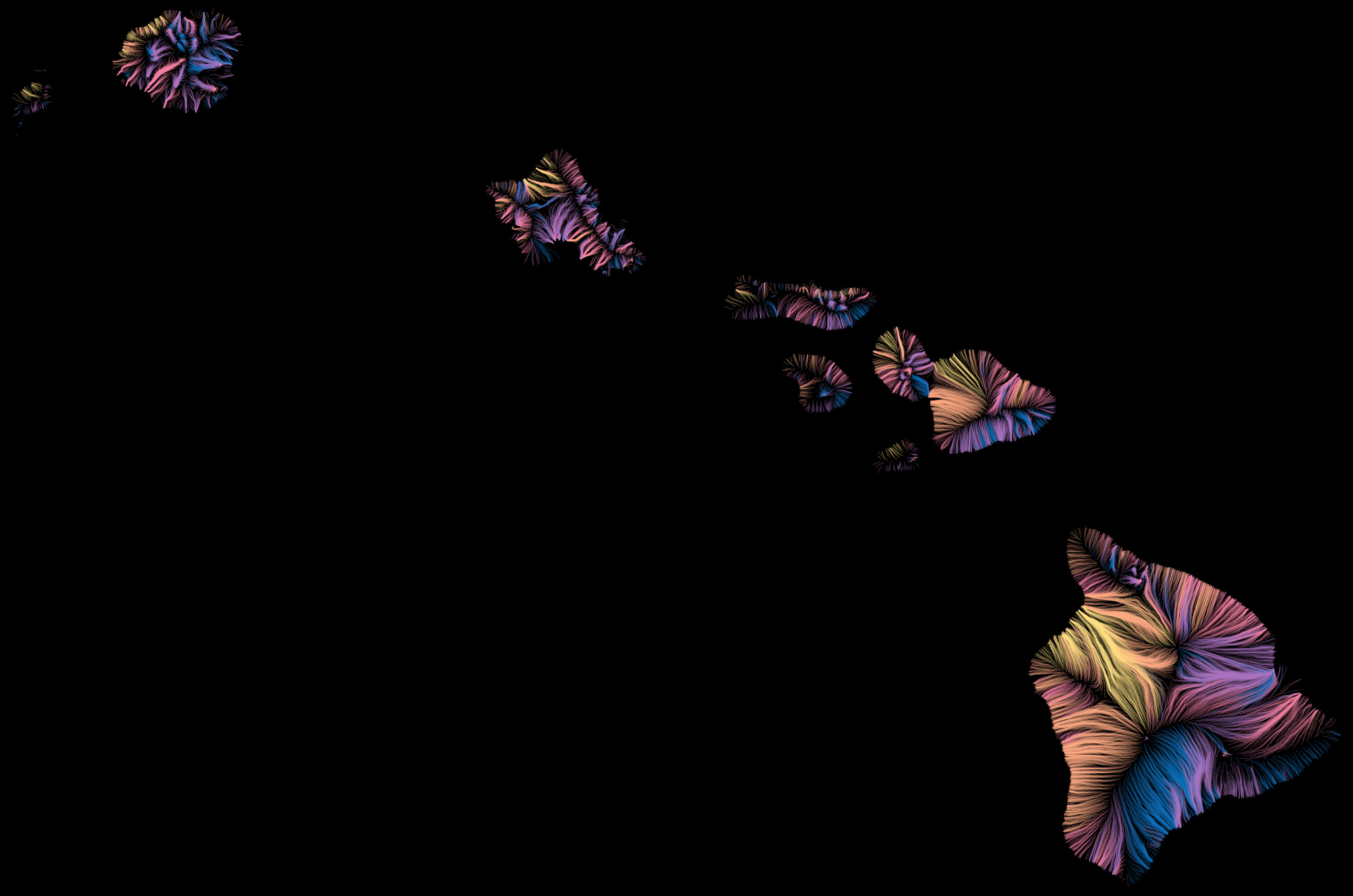
Hawaii

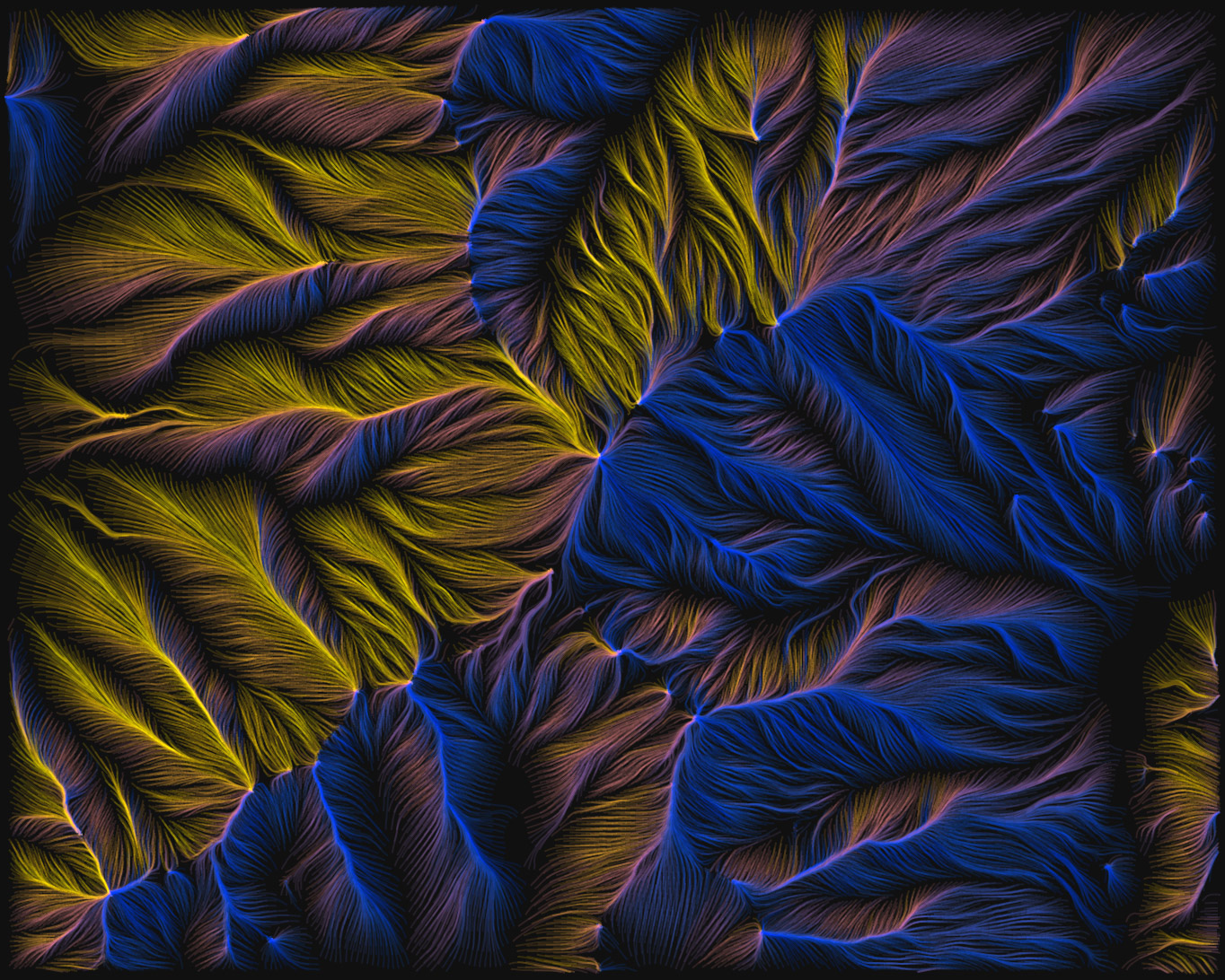
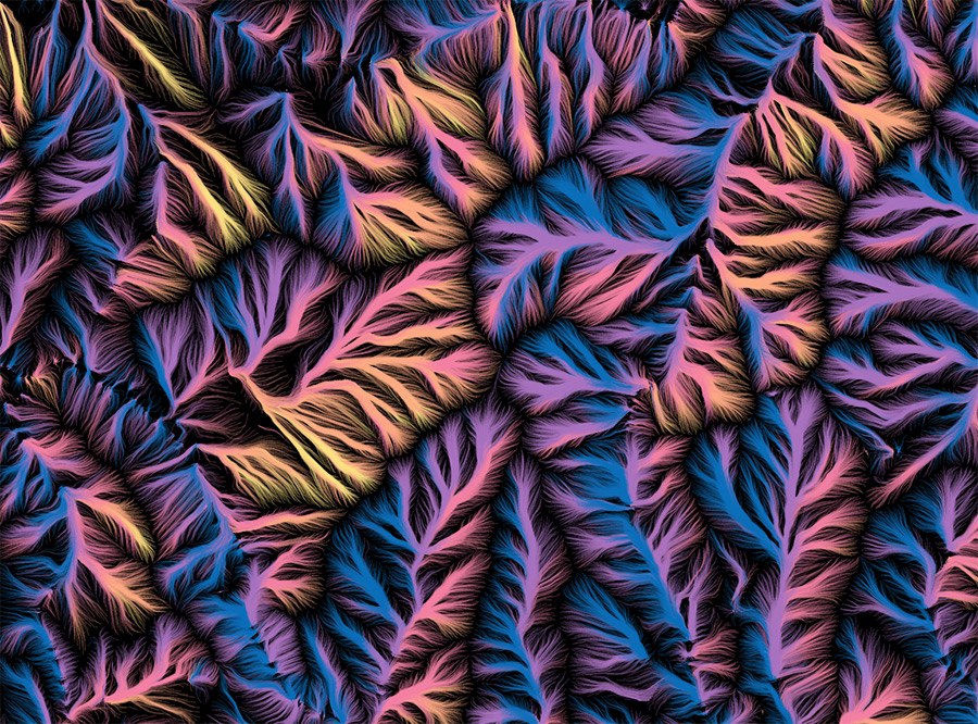
More in-your-face line widths and blending modes.
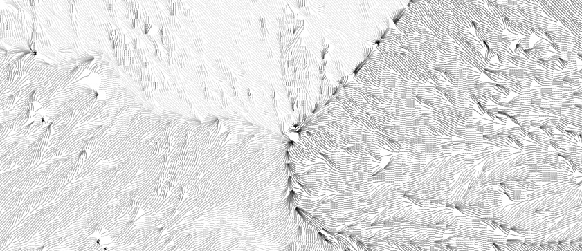
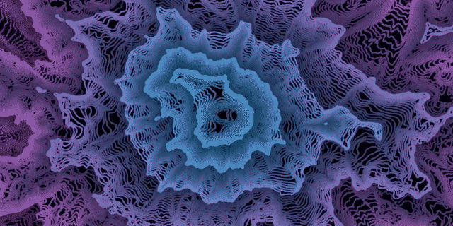
Inversion

As fun and occasionally beautiful as these images turn out to be, what kept bothering me is that most of the time my brain just couldn’t perceive a correct picture of elevation. The flows go downhill and converge into large streams, which makes sense conceptually and looks cool, but no matter what I did with colors or anything else, I could only see an inverted picture of the land. The prominent blank spaces—peaks and ridges—always looked like valleys areas.

It only dawned on me last week that a solution, if one was needed, is simply to draw lines the other way, going uphill from each contour. They start with even spacing at low elevations and begin to converge on ridgelines and summits. Finally I could see the structure of the terrain!

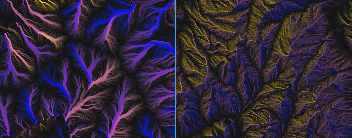
The same map extent drawn with lines running downhill (left) and uphill (right).

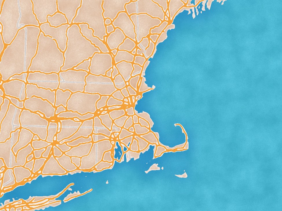
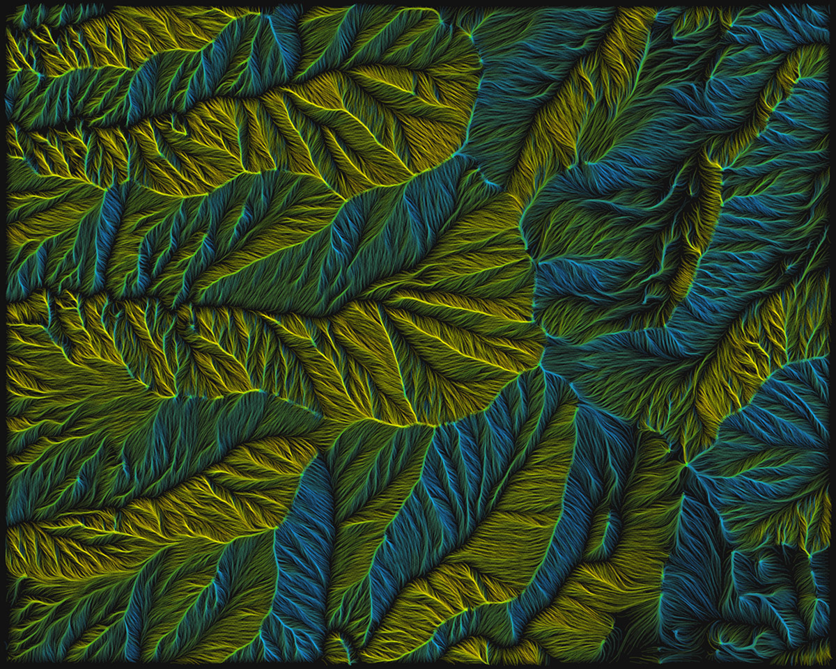
Around White Mountain Peak, California
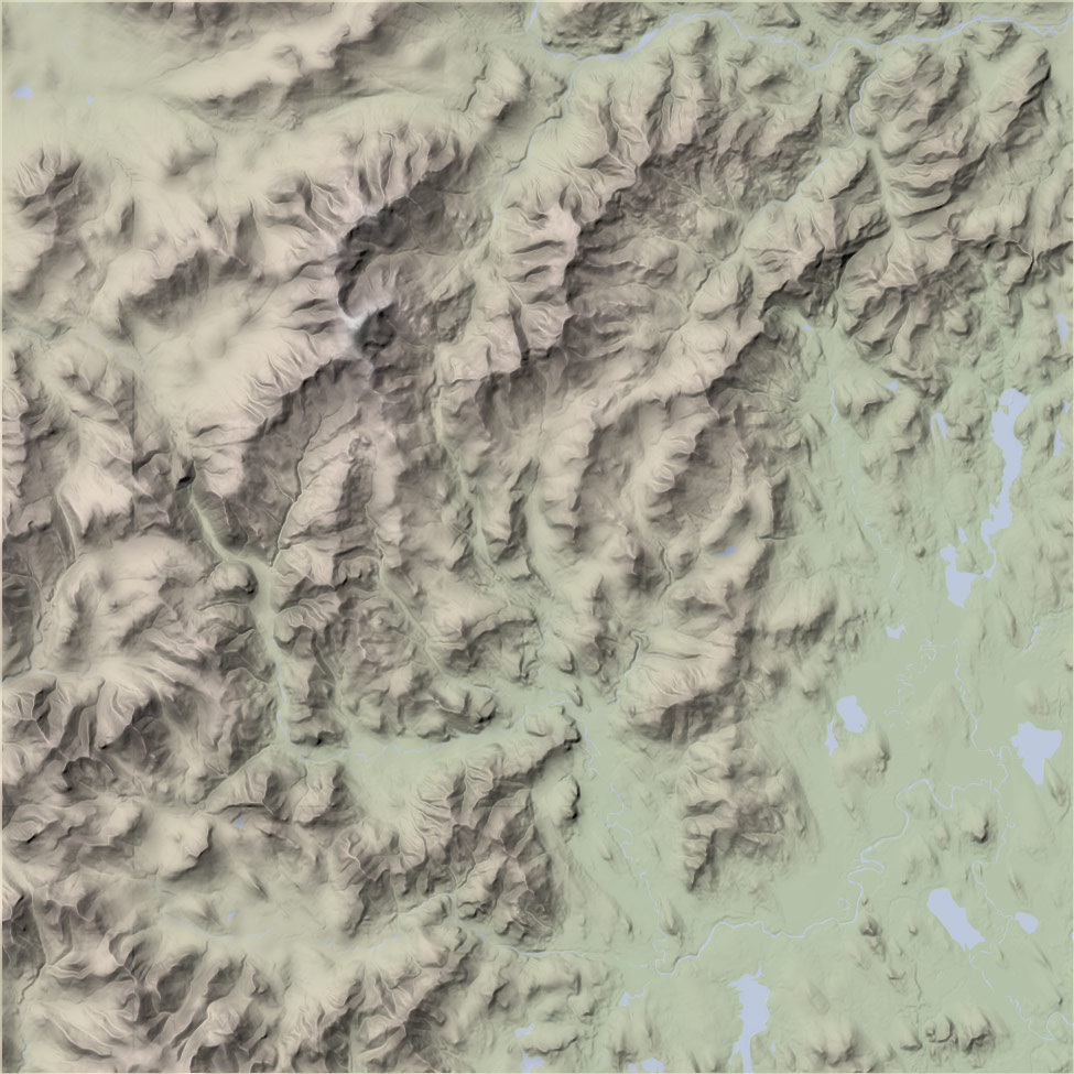
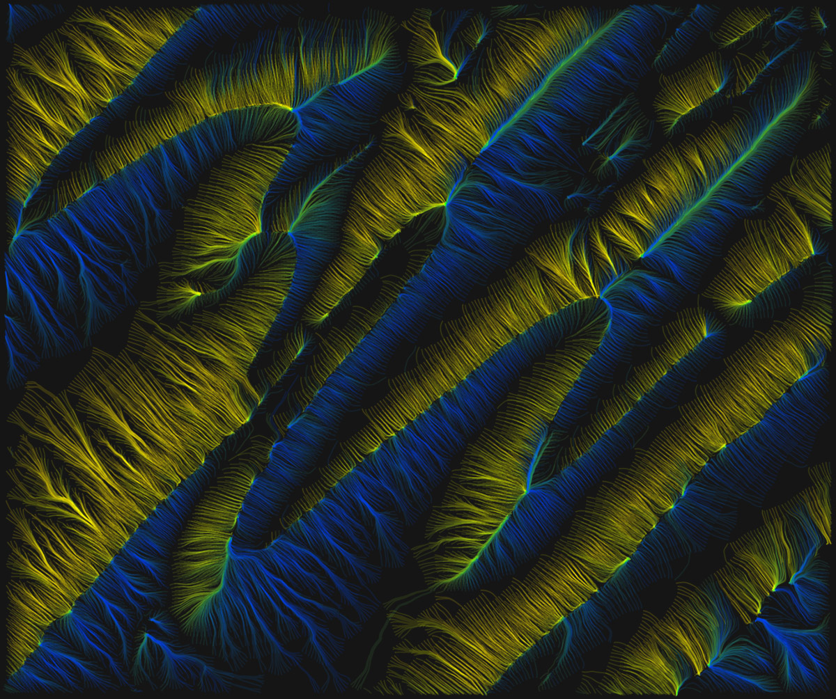
Central Pennsylania

Technically speaking

This is still pretty experimental, and I’m not yet at the point of publishing anything, but eventually I’d like to share source code and have a thing like the contours tool or animated flow viewer where you can render a map for wherever you please. Right now it’s far too slow, and the code is borderline unreadable.

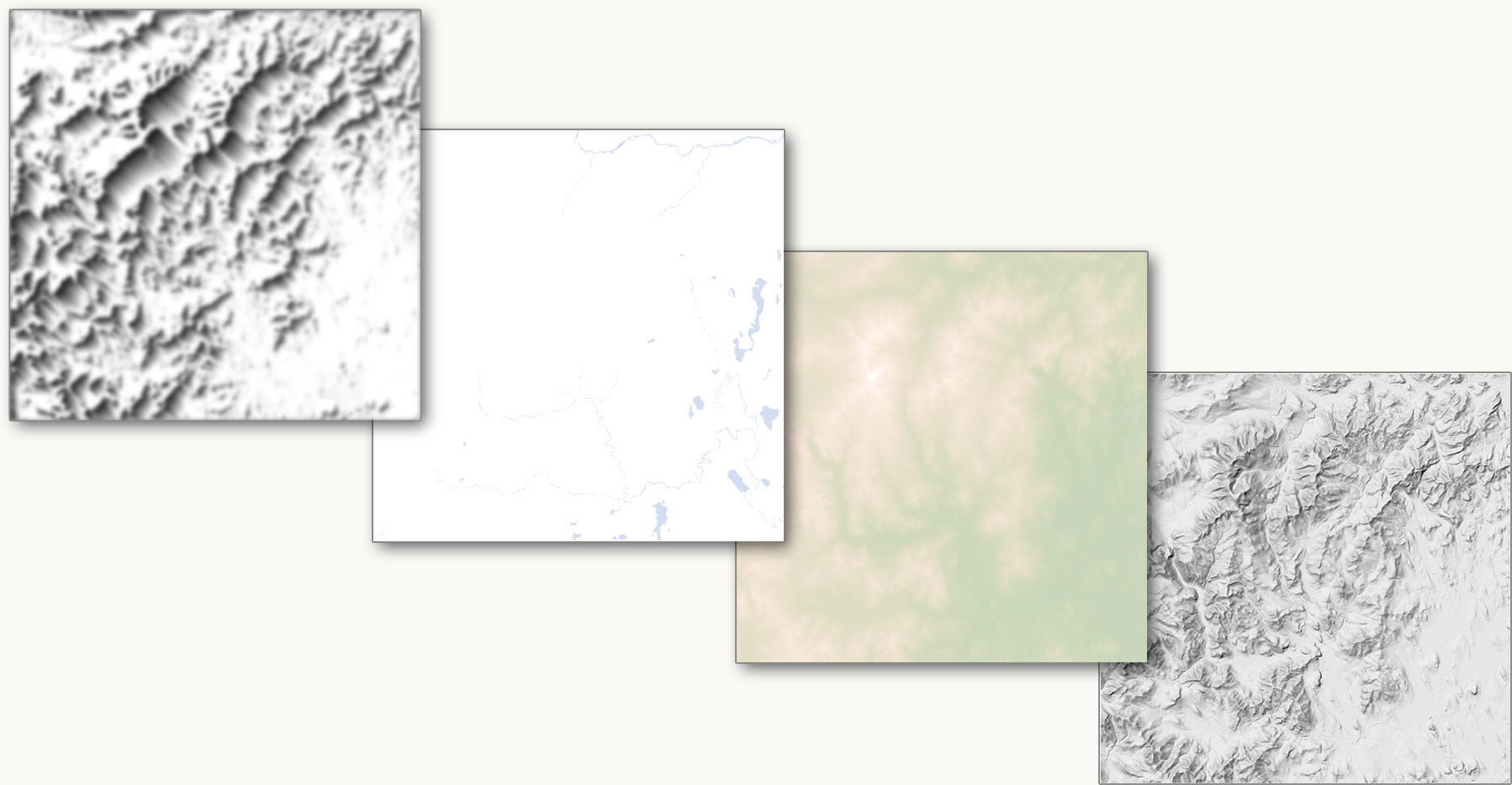
But for those interested, the gist of how this works is this:

  1. Get elevation data from terrain tiles and compute contours (as described in this post about the contours tool)
  2. Draw contours invisibly to SVG and use the getPointAtLength method to find regularly spaced points along each contour line.
  3. From each of those points, start calculating a path up or downhill.
    • Get the elevation and aspect at the point.
    • Proceed to the next point in the direction of aspect (or opposite, for uphill) at some specified segment distance (usually 5 pixels or so).
    • Repeat for the next point, and so on until an ending condition* is met.
    • Calculate a mean aspect value for all the coordinates in the path. I use this for coloring each line according to the general direction in which it flows.
  4. Draw all paths to a canvas by feeding their coordinates to a d3 line generator with some curve interpolation applied.

* Paths could keep going until they reach the highest/lowest point or the edge of the screen, but I’ve found it best to limit them by imposing one or more conditions for ending:

  • A maximum number of segments
  • A maximum elevation change (e.g., a path can only climb/descend three contour intervals)
  • A minimum distance traversed. Some paths otherwise get “stuck” and bounce back and forth in a confined space, resulting in distracting bright spots on the map.

After all that, it comes down to playing around with colors, blending, and some of the variables, as mentioned earlier. Should the lines be sparse or dense? Long or short? Thick or thin? Many of the images here represent my favorite settings, but it’s hard to stop trying different combinations—which is why the code is always “in progress” and messy!


Creating a Quick Interactive House Prices Map with OS Data

This post originally ran on the Ordnance Survey Blog.

In my role as Managing Director, overseeing the operations of Axis Maps, I don’t get to make maps as much as I’d like. Last week I had a free day, so I figured I’d build a quick interactive map to try out some new tools and techniques for use in our future custom interactive mapping projects, and (data willing) show a new or interesting geographic phenomenon. The end result was this map, showing the change in house prices from 2010 - 2018 in England and Wales.

The Data

The primary thematic dataset for this map was the huge price paid dataset from the HM Land Registry. This 3.6GB CSV file contains every transaction from 1995 to 2018 along with price, address, category and other metadata. The address fields are particularly important because I wanted to visualize changing sale prices for individual properties, instead of changing median price for all properties in the postcode. To calculate the value for each postcode, I looked at the earliest sale from 2010-2013 and the most recent sale from 2014-present for each property. For properties that had at least one sale in each time period, I subtracted the prices to get the difference. I then took the median difference for each postcode for the map. This method was a bit more involved than just mapping the change in median price from a postcode, but I believe it is truer to what I was trying to map with the data. Unlike aggregated change, the price change of a single property has had a real positive or negative impact on a real person. It was that positive / negative financial impact I wanted to convey through data on the map.

With my house price data by postcode ready to go, I needed a dataset to turn my implicit geographic data (postcode text) to explicit geographic data (latitude / longitude coordinates). I downloaded Code-Point Open from the OS as point geography is more appropriate than polygons for viewing at the national scale. After transforming the British National Grid coordinates into WGS84 and joining it to my house prices data, I was ready to export GeoJSON and convert it into MBTiles, ready to go on the map.

Open ZoomStack

Thematic data cannot be displayed on its own. It needs to operate alongside a basemap to give it geographic context and help the map readers spatially orient themselves on the map. At this point, it would’ve been very easy to choose a nice pre-existing default and get on with it. However, I still consider myself a cartographer and a practitioner of deliberate and purposeful map design. I wanted the map to be a thoughtfully composed gestalt web-map and not just things (thematic data) on top of other things (base map).

…but I didn’t want to spend more than an hour getting it right.

For me, this was a perfect chance to give OS Open Zoomstack vector tiles a try. It comes pre-packaged as MBTiles (the same format as my thematic data), ready to be uploaded to Mapbox Studio without needing to mess around with the zoom level limits and generalizing required to get a massive amount of data into 500kb tiles. It has some excellent stylesheets that serve as a good starting point for turning the data into a map.

Beyond how easy it is to use, it’s also the right dataset for this particular map. In a thematic map, the basemap isn’t just for orientation and location. It provides crucial context for the thematic data, helping the map reader start to ask and answer questions about what they’re seeing on the map. In the case of this particular map of housing prices, the Open Zoomstack data provided essential context on building footprints and amenities (schools, green space, etc) that can help start to explain some of the data shown on the map.

Map Design: Putting It All Together

Now with the data acquired, processed, and uploaded, I could begin map design. When designing a map, there are 2 key principles that I’m always keenly aware of: visual hierarchy and visual variables. Visual hierarchy is the organization of design such that some things seem more prominent and important, and others less so. For this map, my thematic house prices data was the most important, so I needed to ensure it was the most visible element of the map. Visual variables are the different methods I could use to communicate geographic information through differences in map symbols.

With those principles and a general idea of how I wanted the map to look, I got down to styling. For this dataset, I really wanted to highlight both highly positive and highly negative change while clearly differentiating between them. To do this, I used a diverging color scheme that splits the data at 0 and uses hue (pink / blue) to indicate whether the change is positive or negative and lightness + saturation to indicate the magnitude of change. The end result is areas with high change (positive or negative) are the most visible on the map, while areas with less change are slightly less visible.

Note: With dark base maps, it’s important to choose a scheme that gets lighter in addition to more saturated as values increase, otherwise you’ll have a map where your highest values are lower on the visual hierarchy (i.e., least visible) against the dark background.

While I was iterating on the design of the thematic data, I was also working through the base map design. I started with the OS Dark style and modified it to reduce its visual impact to appear lower on the visual hierarchy and to get it to work more harmoniously with the thematic layer. The first step was to reduce the color saturation of all layers. Using the HSL sliders, I dropped the saturation to 0 on nearly every layer, making the map almost completely grayscale. I left slight hints of blue and green to help water and green space be more recognizable to the reader, but not enough where they would visually dominate other base map elements or interfere with the hues in the thematic map. Finally I went through each layer and tweaked its lightness to make them more or less visible based on how important I thought they were to the story.

With the map design complete, I built a very simple map user-interface with a geocoded search. A data probe (info window) appears when mousing over a postcode point to provide information on-demand about the postcode name and the exact house price values. I also built a few simple slider filters for more motivated users who may want to dig deeper into the data. Since Mapbox GL JS did most of the heavy lifting, this was accomplished in around 100 lines of code.

Wrapping Up

The proliferation and simplification of map-making tools and resources across the cartographic process has made it easier to make maps than ever before, allowing us to make a map that would not have been possible 5 years ago in a day. Open ZoomStack is a perfect example of one of these resources. By handling the tedious tasks of data management and packaging the data in a ready-to-use format, I was able to focus entirely on the creative (and enjoyable) process of cartographic design. I could make a map in a day without sacrificing cartographic principles and compromise on effective visual storytelling.


Deploy your own vector tile server while getting your kids ready for school

TL;DR Go here if you want the instructions without the extended bit about parenting.

Has this ever happened to you?

I need to get some shapefiles online as vector tiles, but it’s my turn to get the kids ready for school.

Fear not! I’m here to tell you it’s now easier than ever to get your data online and ready to go without neglecting your parental responsibilities. I should know. It happened to me.

Prerequisites: Software and Morning TV

You should already have homebrew and NodeJS installed on your computer and the kids should already be awake and downstairs. Get them a drink and put on a 15-minute TV show (Go Jetters if you’re trying to indoctrinate them as geographers) while you install 2 more bits of software:

Mapshaper

You probably know about Mapshaper for generalizing vector data, but it also provides some excellent GIS functionality on the command line. To install it, run:

npm install -g mapshaper

Tippecanoe

Tippecanoe from Mapbox is an exceptionally powerful piece of software for creating vector tiles. We’re just going to scratch the surface of it with example, and installing it is as easy as:

brew install tippecanoe

Now that the software is installed, go make yourself a drink and watch the end of Go Jetters with your kids. Try as hard as you’d like, that disco theme tune is not going to be leaving your head any time soon.

Data Prep: File Conversions and Breakfast

To get your shapefiles into a vector tile format, there are 2 conversions we need to run. You data should already be well-organized with meaningful web-safe names in a dedicated project directory because you’re a responsible adult. How could you look after children if you can’t even look after your data?

Speaking of looking after children, they’re starting to get a little grumpy. Better start breakfast and convert those shapefiles into GeoJSON.

Converting Shapefiles to GeoJSON

Point your terminal to the directory that contains your shapefiles. To keep things organized (thereby proving you’re worthy of your kids’ love), create a directory just for the GeoJSON files next to your shapefiles directory by running:

mkdir ../geojson

Now, you can convert all your shapefiles to GeoJSON with a single command that loops through your directory and takes all the files with a shp extension and converts them into GeoJSON using the same filename as the shapefile:

for f in *.shp;
do
  mapshaper $f -o format=geojson ../geojson/`basename $f .shp`.json;
done

While that runs, put some toast in the toaster or some Wheetabix in a bowl. You know what? You’ve got a little time. Set the table for your kids. Wash them some fruit and put that on the table too. Pour some drinks then call them into the kitchen for breakfast.

Converting the GeoJSON to MBTiles

You have 30 seconds between when the kids sit down for breakfast and when they start bugging you for something else. Quick! Start Tippecanoe running with:

cd ../
tippecanoe -o vector.mbtiles -zg --drop-densest-as-needed geojson/*

That script will add each file in the geojson directory to a vector tileset in vector.mbtiles. It could take a good 15 minutes to run. Go get your kids whatever stupid thing they’re wanting and sit down for some breakfast yourself. Running a few terminal commands is hungry work.

Depending on the size of your dataset, you’re probably going to want to revisit tippecanoe and generating your vector tiles. There are lots of different options for optimizing the size of your tiles at lower zoom levels. Come back to this step when you’re done and iterate on it once you can see your data.

Provisioning a Server While Getting Everyone Dressed

Now the pressure is on, but there’s only 3 steps to go. Run upstairs to lay out some clothes for your kids. While you’re up there, quickly provision a server on Digital Ocean. You’ll want the One-Click Docker App but the smallest size should do. While that’s provisioning, get the kids upstairs and get their teeth brushed. Pro-tip: Brush their teeth before they’re dressed.

Point them towards their clothes. While they struggle to get them on, go back to your machine and look for the IP address of your newly provisioned server. Just click COPY and it’s on your clipboard, ready to go:

An IP address

Copy the address and paste it into the SFTP client of your choice. Log in as root using either your SSH key or a password and upload your mbtiles file to your home directory. If you really want to get fancy, you can do the upload straight from your terminal with:

scp vector.mbtiles root@<server ip address>:/root/vector.mbtiles

While you’re waiting for that to finish, go check on the kids and make sure they’re presentable.

Starting the Server On Your Way Out the Door

It’s the final step. The kids are dressed and their bags are packed. All you need to do is start your server and your status as a legend is secure. SSH into your server (ssh root@<server ip address>) and run this single command:

docker run --rm -it -v $(pwd):/data -p 80:80 klokantech/tileserver-gl vector.mbtiles --verbose

That’s it! Go walk the kids to school. Get a coffee on your way home. When you’re back, just visit the IP address in a browser and click inspect to view your tiles or grab the tilejson URL and start styling in OpenMapTiles!

Vector preview


Relief mapping in 10 easy steps!

Try it at home! Satisfaction guaranteed!

Continuing our recent theme of terrain-related side projects, a few days ago I finished (or, decided to quit working on) a shaded relief map of New Hampshire’s White Mountains that I’d been pecking at from time to time for a few months. Most of our work is with interactive, web-based maps, and although we occasionally get to do more traditional static cartography (with hillshades, even), sometimes the kind of slow, singularly designed cartography we remember from our pre-web days has to be done just for fun.

It’s satisfying to see a map come together piece by piece, as in the above animation showing the main steps and layers in producing this map. Cartography is rarely a matter of throwing data into software and getting a map in return; rather, a single map usually involves multiple tools and data sources, and a lot of attention to small details. (The same is true of web maps, by the way: we write a lot of code for small design details that push beyond defaults.)

There’s no single way to make a shaded relief map, but here’s how this one came together:

  1. Download a good digital elevation model from the National Map.
  2. Genereate a shaded relief image using Blender, per Daniel Huffman’s excellent tutorial.
  3. Set up a QGIS project with land cover data. Reduce it to only a few colors (mainly, evergreen forest and “everything else”) and export it with dimensions matching the relief image.
  4. In Photoshop, add land cover, then the relief layer with a “multiply” blending mode.
  5. Heavily blur the land cover so that it’s not harsh and pixelated. It becomes a subtle base layer, not an essential piece of data.
  6. Add water lines and polygons (via Census TIGER/Line) to QGIS, style, export, and add to Photoshop above land cover.
  7. Use some Photoshop tricks to make relief highlights a bit brigher and warmer-colored, and shadows a cooler color.
  8. Generate and label contour lines from the DEM using QGIS, then export and add them as a Photoshop layer.
  9. Add roads (from OpenStreetMap via Geofabrik’s extracts) to the QGIS project. Export and style them with Illustrator, and place the .ai file as a layer in Photoshop underneath the relief. (Shadows thus fall on roads as they would in real life.)
  10. Label all the peaks, physical features, and towns one by one in Illustrator (no GIS data involved), and place them into Photoshop.

Then just a bit of cropping and cleanup, and it’s done! That list, of course, vastly oversimplifies things, but it gives a good idea of everything that goes into a map. Labeling, for example, is hugely important and takes a lot of time to do right.

Perhaps my favorite touch, briefly visible in the animated sequence, is number 7 from the list above: adding extra punch to the relief map’s highlights and shadows. Daniel Huffman also covers something like this (along with much more!) in his walkthrough of terrain mapping in Photoshop. A brightened, warmer tone is applied to the light side of mountains at high elevations, while shadows are given a blue tint. Not only does this seem to boost the illusion of depth, it also better evokes the temperature and appearance of a warm sun and cool shadows in reality. The effects are applied lightly, but they make a difference.

It’s been fun to practice this kind of cartography and learn new things along the way (Blender is great!), while more deeply studying a region that is somewhat dear to me. Here’s the full final product.


Contour maps in a web browser

A short while ago we received an inquiry about making a tool to draw a simple topographic contour map of any given place in the world and export an SVG file with the lines. There are good global terrain maps with contour lines—Google Maps has them, for example, as do many Mapbox styles—but the interest here was in extracting only the contour lines, for external use. Although the request turned into something else, we were still intrigued by the idea.

“Sounds too hard,” I first thought. The question marks were:

  1. How can we load good elevation data for anywhere in the world? I know how to find some good DEMs, but not on-demand in a web app, and I only know good data in the US.
  2. How the heck do you draw contour lines? That has always been a desktop or command-line GIS operation for me.

Turns out I was wrong; neither of those is terribly difficult. So I built a thing. More proof of concept than anything, this is a tool that lets you draw a contour map for just about anywhere, style it to a certain degree, and export to a few formats—perhaps most usefully, GeoJSON for use in further mapping or GIS work. There is really no fancy technology here. It’s all JavaScript, employing Leaflet and D3.

You can do a handful of things here:

  • Find the place you want to map
  • Choose the contour line interval (in meters or feet), and the thicker index line interval (if any)
  • Specify line colors and weights
  • Use a solid color or hypsometric tints as a background fill
  • Color elevations below sea level with different bathymetric colors
  • Draw maps as basic contour lines or with a stylized raised, illuminated look
  • Export to GeoJSON, PNG, or SVG

Give it a try and let us know if you find it useful for anything! Have a look at the source code too if you’re interested in how it works, which is broadly described below.

Global elevation data

The first big task is finding global elevation data and loading it in the browser without a huge hassle. We have a good archive of SRTM data and briefly thought about writing server functions to deliver it, but my mind had been glossing over a much easier route despite having used it in the past: Mapzen (RIP) terrain tiles.

Terrain tiles are raster map tiles, with the same size and numbering scheme as any ordinary web map tiles, that contain elevation data encoded as RGB color values. The type we use look something like this:

They look insane because they’re not meant to be viewed directly. Instead, a short formula decodes the red, green, and blue value of a pixel to an elevation value, which we can then use as we please. I plopped an invisible canvas tile layer into Leaflet to load the necessary terrain tiles as the map is moved around. After they load, they’re drawn to a canvas from which we can read those RGB values, and thus store a big table of elevation values for the visible map area.

Fortunately, despite Mapzen’s demise, their work on terrain tiles lives on, as the whole set is available via Nextzen or Amazon S3. Mapbox (still alive) also offers terrain tiles. Although the quality of data varies from place to place, these datasets represent work by some dedicated people to piece together the best data they can for most of the world—much better than trying to do that ourselves!

Drawing contour lines

Great, we have elevation data. Now we just need to draw contours.

I do not know how to do this. I do not pretend to know how to do this. I understand a basic hand-drawn method, but my real-world method is to ask GDAL to do it.

Enter, not surprisingly, Mike Bostock and the fairly new d3-contour JavaScript library. All you have to do is give it an array of data values and a set of thresholds (i.e., the values around which you want to draw the lines, in this case specified by user options), and it performs several magic spells and gives you contour polygons. This is useful not only for geographic mapping, but also for other types of charts as you can see in the documentation.

d3-contour returns the contours as GeoJSON, which is quite handy because D3 is also good at consuming GeoJSON and spitting out drawable shapes for canvas. The contours and visible map are based on screen coordinates, not geographic coordinates, but D3 doesn’t care. To export as a usable GeoJSON file, we can use Leaflet’s conversion methods to get back to geographic coordinates.

To recap, then, whenever the map is moved and redrawn, it does the following:

  1. Load terrain tiles
  2. Draw tiles to an invisible canvas and decode to elevation values
  3. Get contour line thresholds based on user options and the current range of elevation values
  4. Get contour polygons with d3-contour
  5. Draw contours to canvas with the specified style options

When style options change, it only needs to redraw the canvas. If the line interval changes, it needs to re-calculate contours but doesn’t need to reload elevation data. If the map moves, it needs to do everything.

Stylized maps from contours

This little tool contains one slightly fancy style, the illuminated contours. These are essentially Tanaka-style contours, where each contour line appears to be raised above the previous one, and illuminated from one direction. They look kind of three-dimensional, like layers of wood cut and stacked up. (Talented people have made plenty of real-life physical maps of that sort.) You can produce these with things like ArcGIS or QGIS, where the methods may be smarter and aware of the aspect of each line segment, but here it’s just a trick with drop shadows. Until now I didn’t know that standard canvas rendering methods include drop shadows! There’s a light stroke around the whole polygon, but it’s obscured on one side by a drop shadow on the fill.

But the stylistic possibilities with contour lines don’t need to stop at contours themselves. I’ve been playing around with some maps that use contour lines as an intermediate step in deriving the final style, while not necessarily appearing on the map themselves.

One example is an attempt at hachures. Contour lines serve as starting points for shorter strokes, which travel downhill perpendicular to the contour, stopping at the next contour line. Contours are somewhat visible as gaps in the map, but are not drawn. I haven’t exactly perfected this, but perhaps it’s an improvement on earlier derailed work with faux-hachures that were based on a grid.

Or we can get carried away with hachures just for aesthetic purposes, starting at contours but letting the strokes flow farther downhill, coalescing and being colored by the general direction in which they flow.

Finally, there are always trippy animations. This one does show actual contour lines, but it’s not exactly an ordinary map. Making useful things is great, sure. But making wacky pretty things is more fun!