A Reasonable Approach to Front-End Testing

We recently got to work with a professional testing company on one of our larger projects and I was blown away by how they handled front-end testing. My approach to front-end testing was always “bang on it enough with enough different devices and you’ll find most of the bugs.” That approach works (mostly), but it’s stupid (totally).

A little while later, I was asked by a client to create a testing plan for a medium sized project. Using the experience of working with the pros (and safe in the knowledge I wouldn’t be the one actually doing the testing), I put together a quick plan. I wanted to share my experiences here because while traditional cartography prepared me for meticulously editing a map, front-end testing is something that was (and honestly still is) a bit of a mystery to me.

What does it do?

The testing plan starts with a thorough rundown of everything the map does.

We use the word map pretty liberally ‘round these parts. Here, it will mean the entire application from map to non-spatial graphics, to controls.

I made a quick flow chart that shows the hierarchy of functionality in the project, listing major controls plus their options (and sub-options). Functionality Flow Chart

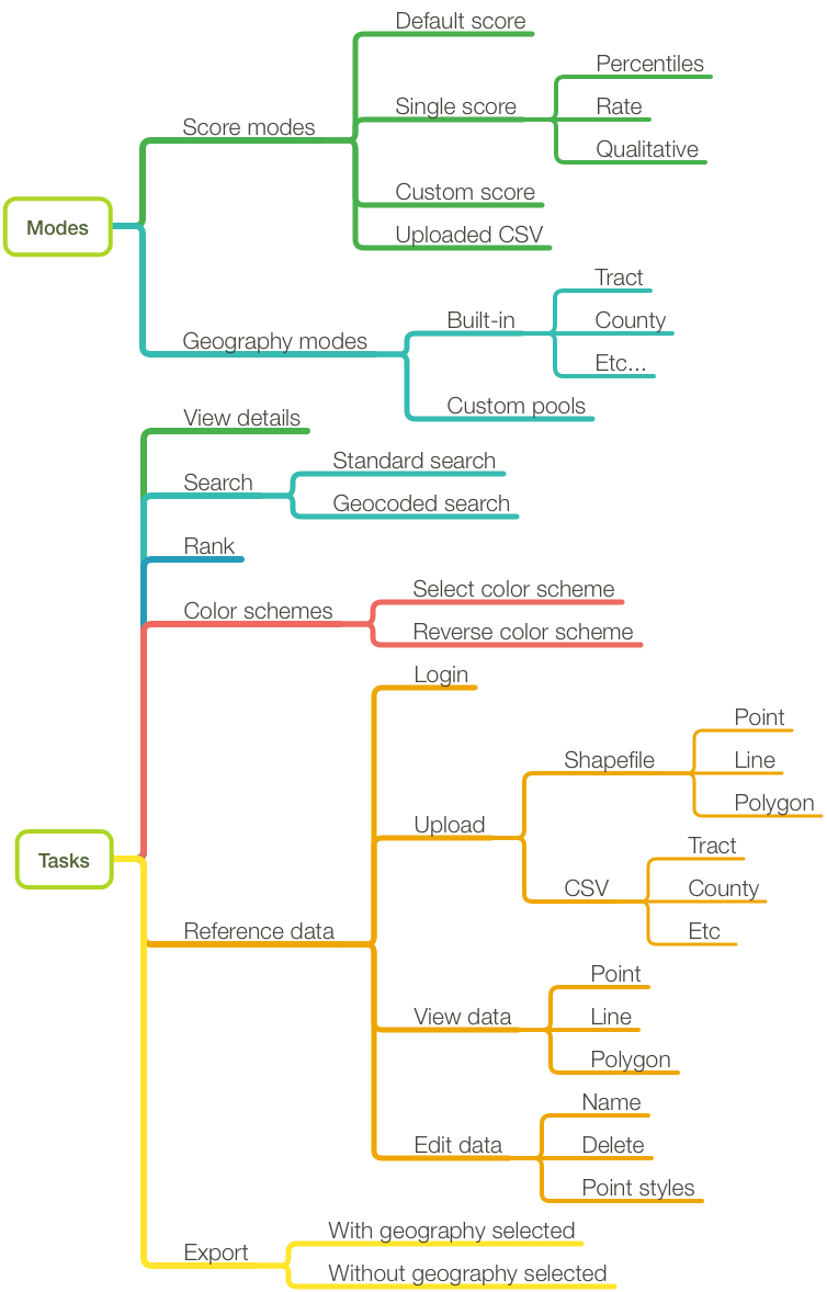
It’s a pretty thorough list but I’ve left off some of the foundational level stuff like panning, zooming, and basemap tile loading. If there’s any confusion about setting up the hierarchy, it’s probably laid out for you to see right in your UI. We have a tab for all the big stuff. Functionality Flow Chart

Modes and Tasks

Listing out the functionality should be really straightforward, especially this late in the development process. What’s a bit trickier is getting the difference between modes and tasks.

  • Only one mode can be active at a time. They usually change the underlying structure of the map or display a different set of graphics. Not every map has multiple modes. Depending on the setup of your system, the order could be significant to testing.
  • Tasks are what a user can do while in each mode. These tasks can be the same across modes or differ between them. The order tasks are performed will almost always be significant to testing.

The Perfect Plan

With the functionality all scoped out, you could theoretically create a testing plan that tests every task in every order across every mode and execute that plan on every browser across every desktop operating system and mobile device. However, that would be a bad idea.

Instead, use your functionality list to create a handful of testing scenarios. These scenarios should:

  1. Cover all of the modes at least once and all of the tasks multiple times
  2. Allow for some randomization where the tester can select a dataset or geography at random
  3. Also allow for randomization on the order certain tasks are performed
  4. Most importantly, be grounded in the reality of your actual users as you understand their workflows and potential uses of the map.

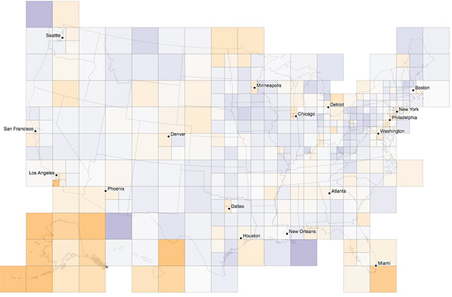
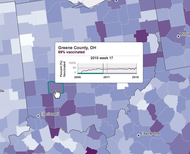
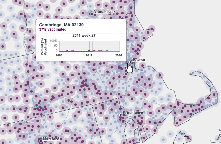
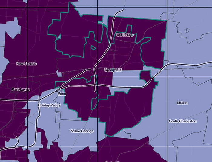
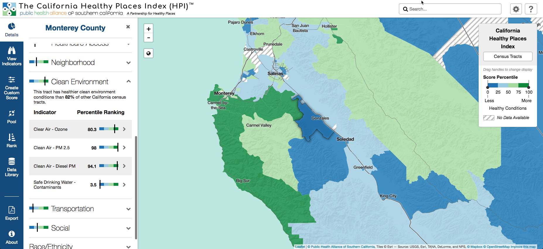
When making a plan for testing your datasets, consider how they were created. Were they created by hand? Conversely, are there any weaknesses in your data generation script that may require manual intervention? If so, instead of randomizing your datasets, create a plan that mandates all of them are tested. If you are randomizing, it’s worth making a note about your datasets and geographies that are outliers. This particular plan for public health project in California requires extra attention to Los Angeles county since it has the highest density of census tracts which could (and did) lead to bugs not present in other areas.

The following testing scenario is based off a hypothetical user that has a specific idea of the indicators they’re interested in, but isn’t sure about which geography to perform their analysis.

  1. Load the map and select any geography
  2. Create a custom score using more than 5 indicators

Perform steps 3 - 5 in any order

  1. Change the color scheme
  2. Click any map unit to view details
  3. Rank the custom score using any geography larger than what is currently selected


  1. Switch to a different geography
  2. Select a geographic unit and export

The other scenarios are based around other (assumed) types of users including:

  1. Total novice users exploring the functionality
  2. Users targeting a specific geographic area with no specific indicators in mind
  3. Expert users working extensively with the data uploading and exporting features

Doing the Testing

Now that the formal(ish) testing is ready to begin, we’re probably not going to be the ones doing it. This is because:

  1. It’s generally not a good idea to test your own work. You definitely know how to operate it properly and you’ll be more forgiving of an issue that’s not quite a bug but definitely not performing as expected.
  2. Off-loading front-end testing to the client is a good way to keep costs down. They usually have motivated staff at varying levels of involvement in the project (and a diverse set of desktop and mobile hardware setups) who are happy to help.

The problem with external testing, especially with first-time testers, is getting effective bug reports and getting them into a system where we can take action on them. To help with this, we created a bug form on Airtable based around Tom MacWright’s excellent guide to bug reporting. It let’s us collect bug reports from a large number of testers and guide them through giving us the information we need.

We then use Zapier to connect to Github so each new submission creates an issue that we can fix using our regular development workflow. The client PM is given access to the bug database on Airtable where they can track our progress through the fixes without needing to have full access to our issues (and occasional salty language) on Github.


Design Evolution of the ImagineRio Map

imagineRio, produced with the Humanities Research Center at Rice University, is one of our most ambitious digital humanities projects. It tracks changes in the development of Rio de Janeiro over the past 500 years. It renders historically and spatially accurate maps combined with iconography, historical maps, and urban plans to give a sense of what Rio looked like and how it imagined itself from its first settlement to the modern day.

Overview of ImagineRio map

Powering imagineRio is iRio, a Node application that facilitates:

  1. Data management and conversion from the shapefiles used by the Rice team to collect data and PostGIS where the data is eventually stored.
  2. Tile rendering and caching with options to select the year and layer visibility.
  3. An API to request metadata and vector data across the entire database.

When our friends at Rice wanted to launch 2 additional maps, it made sense to re-use the iRio platform; not only because the system was already built and tested, but also because their team was already familiar with the intricacies of the data required to power the map. With this knowledge and their existing best practices, they were able to quickly produce new datasets for new maps of the Rice University Campus in instituteRice and Beirut, Lebanon in diverseLevant.

Design Evolution

Having now built 3 iterations of the same concept, it’s tempting to look back and examine how the design evolved. What changed, and why? Generally speaking, the changes fall into two main areas:

  1. Interface look and feel
  2. Interface layout

Look and Feel

The look and feel of an map interface is often connected to trends and styles found on other apps and sites across the Web. These naturally shift over time, which is why it’s not uncommon to look back at an old project, cringe, and wonder why in the world you used all those gross color gradients, drop shadows, and chunky icons. Fashion aside, look and feel can imbue a project with its own unique identity, which can factor into people connecting with it and returning to it over time.

With ImagineRio, we were going for a clean, modern, contemporary look and feel. At the time, this meant doing things like:

  1. Maximizing map space. We talked about wanting to make the map as immersive as possible on a flat computer screen and allow it to fill the entire browser window. Even some interface elements that might otherwise have obscured the map, such as the header and timeline areas, were made semi-transparent, allowing the map to be seen through.
  2. Interface and basemap colors. We chose grayscale colors for interface components so they would not draw attention away from the map. White and gray values were assigned to every panel, button, text, highlight, and hover state. The basemap was intended to be more colorful than the UI, but not too colorful. It consists of a mostly of flat, desaturated palette of earth tones. We wanted colors to look natural and not feel out of place or time, whether mapping the year 1500 or 2015.
  3. Font selection. To stay in line with our design goals, we chose modern san-serif fonts, like Helvetica and Arial, for their legibility as well as their clean, smooth and organized look and feel. On one hand they tend to lack much of a unique personality, but on the other they avoid drawing undue attention to themselves. Much like our color selections, we wanted to avoid fonts that made too strong of a statement.

ImagineRio look and feel

When we began work on instituteRice our goal again was a fresh, clean and modern look and feel. However, it being the second application of the project, and knowing that a third was on the way, the idea of instilling some unique identity into the map was a bigger factor than before. InstituteRice, and deiverseLevant soon after, needed their own look and feel, something contemporary and modern but at the same time noticeably different from each other and imagineRio. This resulted in some design changes, such as:

  1. Updated splash screen. In imagineRio, the splash screen mainly consisted of a large project title and “View the map” button. The redesign for instituteRice and diverseLevant now include an introduction to the maps, a quick way to jump to defined points in time, and a preview of the basemaps themselves. First impressions are important. As successful as imagineRio is, we knew that a more meaningful, positive first impression when arriving at instituteRice and diverseLevant could reflect their quality and sophistication, as well as set expectations that might encourage map use.

    ImagineRio and instituteRice splash screens

  2. Interface accent colors. Like imagineRio, grayscale colors were used in the instituteRice and diverseLevant interfaces, with one notable exception. A unique accent color was assigned to each, serving to brand the maps and signify a difference between them. For institueRice, blue was chosen from a set of client branding materials and then incorporated into the timeline, buttons, text and map highlighting. DiverseLevant followed suit with its own accent color, pink, selected from a significant historical map in the collection.

    instituteRice and diverseLevant accent colors

  3. Interface shapes. The instituteRice and diverseLevant interfaces differ in some more subtle ways as well. For example, in instituteRice circular buttons and circular thumbnail images are used throughout, whereas in diverseLevant, these same elements are styled as rounded rectangles. It’s a small difference, but small changes add up and help reinforce the unique identity of each map.
  4. Custom basemaps. Not strictly an interface component, but a basemap can be a strong identifying feature itself. Who doesn’t recognize the Google basemap when they see it? While a single accent color can be associated with a brand, so can many small stylistic elements used in combination. In instituteRice and diverseLevant, rather than using the same basemap styles as in imagineRio, we created entirely new cartography for each. The instituteRice basemap borders on realism (thanks to an amazing tree dataset provided by the campus arborist), but also due to the use of more saturated natural colors, textures, and shadows. The diverseLevant basemap on the other hand was inspired by the historical map from which we drew an accent color, borrowing its otherwise pale color palette, yellow roads, and pink buildings, and even mimicking its hand-lettered labels with a strong font choice. A significant departure from imagineRio!

    Basemap examples

Interface Layout

Layout is a balancing act. The various elements of a map all need to be worked into a browser window to create something that’s usable and engaging. There are, of course, many factors to consider, relating to users, devices, and a huge range of possible project-specific constraints. In almost every project, as pieces begin to take shape and start competing for space and attention, compromises are necessary to balance it all together.

While designing imagineRio, we tried to prioritize important tasks in the layout. Here are a few of the layout decisions we dealt with:

  1. Navigation bar. Navigating through time was perhaps the number one user task, which led us to position the timeline and date stamp directly above the map near the top of the page where it was easy to see and access. The timeline was also flanked by a dropdown selection menu and a search input box. Although these cut down on space for the timeline, we felt that since they were all related, it was more important to group them together in a single area. (Search, for example, acts on map features in the currently selected year only—not all years).
  2. Map legend controls. It was decided early on that layer control and map customization were very important for understanding and using the map. GIS-ish layer controls, though not our favorite design pattern, gave users the ability to toggle the visibility of geographic features and highlight groups of features via the legend. Historical map images, shown as thumbnails in the legend, can similarly be toggled on and off.

imagineRio legend

The imagineRio layout underwent a number of changes when adapted to instituteRice and diverseLevant. The biggest changes were driven by new thoughts about what was important for users to see and do with the map, as well as what aspects of the content were seen as most engaging. Some smaller changes were also made that attempted make better use of map and interface spaces.

  1. Image browser. Probably the most substantial layout change stemmed from the decision to prioritize viewing historical iconography over customizing the main map via the legend controls. In imagineRio, iconography was somewhat hidden behind points on the map, visible only when hovering the mouse over them. This made access somewhat difficult and browsing could be slow and tedious. In instituteRice and diverseLevant a new, separate panel for browsing iconography was added along the bottom as a filmstrip of image thumbnails. Clicking on a thumbnail focuses the map on the location where it originated and opens the image at a larger size. With the new emphasis on iconography, it made sense that the panel would be expanded when users first arrive at the map, rather than the legend.

    instituteRice and diverseLevant image browsers

  2. Data probing upgrade. In imagineRio, two stage data-probing provided users with a thumbnail image when hovering the mouse on map points and then a much larger, light-boxed image when clicking on a point. In instituteRice and diverseLevant, we sought to improve on this by adding a third, intermediate stage which included a medium-sized image. When clicking on a map point in these maps, instead of entering a lightbox, a new data probe appears anchored to the upper right corner, with the associated point on the map (and image view cone) positioned next to it. This was intended to limit the amount of work it takes to enter and exit a lightbox and encourage more rapid exploration while displaying images at a modest size. In addition to this, diverseLevant includes step buttons with the intermediate data probe, giving users the ability to skip directly from one point-image pair to the next and easily tour all of the content on the map. Like the image browser, this upgrade was driven by the prioritization of viewing historical iconography as a primary map use task.

    instituteRice and diverseLevant data probes

The focus here has been on the desktop, but similar design changes occurred across the mobile versions of the maps as well, to both look and feel and layout. The new image browser on mobile, for example, was added as a modal behind a thumbnail button that floats above the map. The image data probe, which once went straight to a lightbox, now includes a middle step that displays images in the bottom portion of the screen.

Comparison of mobile layouts

We’re in the business of custom cartography, where each project is completely new and different. This was a somewhat unique experience in that three related maps were built using the same map framework. That left design as the main variable. Layout and look and feel changed significantly with instituteRice as some aspects of the design were prioritized differently and a fresh look and feel was needed after 5 years. We got more efficient between instituteRice and diverseLevant which shared interface designs much more closely, making for quicker and cheaper development time. Even so, our custom cartography instincts kicked in with custom basemaps and other small changes to the user interfaces that gave each of the later maps a distinctive look and feel.


Animating a temporal ton in a web map

Boss: "We need an animated map of this data set." "It's by zip code." "Over ten years." "By week."
You:

We faced a challenge along the above lines earlier this year when we set out to visualize usage of rotavirus vaccines produced by Merck. Simple-sounding on the surface, it involved some tricky design and back-end work, notably because weekly data by zip code over ten years means more than 17 million data points: a ton of data for a web map to be loading.

First, a brief overview of this map, which is at https://merck.axismaps.io/ or in a video demo below. It shows the percent of eligible children receiving a vaccine each week over approximately ten years at state, county, or zip code level. More detailed numbers are found in a chart at the bottom and by poking around the map. And that’s about it. Simple, right?

Prototyping

This project involved several prototypes to work through design decisions. Although in the end it became a fairly straightforward choropleth and point map, the client and we wanted to explore some map types that we thought might best show the spatial and temporal patterns. Early on we had a request for the map to appear such that the entire United States, even unpopulated areas, are covered, to avoid suggesting that there are areas that the vaccines hadn’t even reached. To this end we tried binning into grid cells, but that comes with a couple of problems.

There are places that zip code tabulation areas don’t touch—because nobody lives there—so ensuring no blank space means a certain minimum grid cell size, which may or may not be a good resolution for the more populated parts of the country.

Zip code centroids binned to various cell sizes

At one point we experimented with variable cell sizes, where each cell contained approximately the same number of zip codes. Big squares mean sparse populations, and small cells mean dense population, where there are a lot of zip codes in a small area. I’m still a little intrigued by this idea, but cartographically the effect is kind of opposite of the intended representation: all cells are meant to be “equal” in a sense, but the larger, sparser cells carry a lot more visual weight.

Variable grid cell sizes with approximately equal numbers of zip codes

A second problem with binning is that it requires aggregations that depend on actually having the necessary data. In this case, we had vaccination rates already aggregated to geographies like zip codes, but we did not have the actual number of vaccinations and the total number of eligible children. Without those, we weren’t able to display actual vaccination rates in a grid. Instead it was something like “percent of zip codes with rates above 50%,” so for example if a cell had 100 zip codes and 40 of them had vaccination rates above 50%, the map would show the cell as 40%. This is a bit too convoluted and may not do a great job at showing real spatial patterns anyway.

Data overload: time

As previously mentioned, weekly data for thousands of geographies over ten years is a boatload of data, way too much for a simple web map to load up front. The default county map would be well over a million values, and that’s one chunky CSV. A more efficient way to handle animated data is to deal with change in values, not values themselves. If a value for a county doesn’t change from one frame to the next, there’s no need to store data for that frame for that county. By pre-processing all the data with some fancy SQL to pull out changes, we can cut down significantly on the amount of data being sent to the map and improve rendering performance.

For states and counties, we use a 10-class equal interval classification, and for zip codes only two classes. Whenever a unit’s vaccination rate moves it from one class to another, we store the date (week), FIPS code, and new class number. If it changes to, say, class 8 and stays that way for six weeks, we don’t end up with six rows of data, but rather just one with the week when the class changed. A snippet of data looks something like this:

date,fips,newclass
...
200951,12015,1
201236,22107,6
201550,53031,3
...

Detailed data with actual vaccination rates is loaded on demand through a simple API to get values for a specific geographic entity.

Probe for actual data values

To further reduce file size and smooth out the animation, we mapped 12-week rolling averages instead of single-week snapshots. The data tends to be unstable and noisy when and where there were lower populations of eligible children, so our hope was that averaging values over time would present a better picture of trends, while also resulting in fewer rows of change in our final CSV.

Data overload: space

Besides the attribute data load, a national map at the level of something like zip codes means too much geographic data. For one, it’s another file size problem; for another, it’s a legibility problem.

Legibility concerns led us to the zip code point map. At a national scale, even county polygons are pushing it in terms of crowding, and most zip code polygons are definitely too small to be discernable. Thus we make you zoom in pretty far before zip codes resolve to polygon representations; before that they’re shown as centroid points, which are still crowded on a national map but are a bit easier to pick out.

Most of the map is drawn as SVG using standard D3 methods, but the zip code point layer is an exception. This many points, some 33,000, do not perform well as vector graphics and instead are drawn to a canvas element. It means some extra work to account for things like interactivity (we can’t just attach mouse handlers and have to search for nearby points on mouse move), but it’s worth it to avoid completely choking on rendering.

Zip code point probe

At the scale where we do show zip code polygons, the problem remains that this is a ton of geographic data. For this we built a simple Node vector tile server that sends the polygons in tile-sized chunks as topojson (and caches them to S3). We calculated and stored zip code centroids in a PostGIS database ahead of time, then can get the tiles by querying for centroids that fall within a tile’s bounds. We use centroids instead of polygon intersections so that each polygon is only drawn on one tile—it’s fine if it spills out into other tiles on the map as in the highlighted example below, but we don’t want it being drawn multiple times.

Zip code in multiple tiles

On the front end, when the user zooms past a scale threshold, the map switches to a standard web Mercator map (using d3-tile) onto which we can load zip code tiles as the map is panned. (As a bonus we can also easily load reference basemap tiles underneath to help with orientation.)

Zip code vector tiles

Recap

A few things we learned about animating a ton of data over time:

  • Animation can be hard to follow especially with so many data points. Explore ways to aggregate data (both spatially and temporally) that might be better than exact data values at showing trends. They may not work out, but it’s worth investigating.
  • Instead of loading all values, try loading only changes in values to cut down on file sizes; let exact values be retrieved in smaller doses on demand.
  • Generalize! Different scales call for different complexities of geometry, and this can go beyond polygon simplification to things like collapsing polygons to points.
  • Don’t be mystified by vector tiles! It’s not too difficult to make your own vector tiles for excessively detailed geodata.

Updated Map Server Instructions

About 4 years ago we wrote a post about setting up a map server with Mapnik and PostGIS. It’s still one of the most popular posts on the site but it’s VERY OLD. I wanted to update it with a slightly easier install method and some newer software. What’s in the stack? I’m glad you asked!

The pancakes again

Unlike the previous guide, this one won’t cover basics of Linux and the command line. It’s also written for a Red Hat Enterprise Linux (RHEL) 7.2 server instead of Ubuntu. Let’s do it.

Read more...

Updates to the San Francisco Typographic Map

San Francisco Poster

Ever since the San Francisco map sold out over the holidays we’ve been eager to get it reprinted and back up for sale. Of course, before doing so, we couldn’t resist making a few changes to refresh and update the design. The new version, pictured above, is the third in six years. Read down the page for a quick rundown of what’s new, or skip it and go straight to the typographic maps store where you can check out the map of San Francisco and our collection of other typographic cities.

Read more...

Probing on a Tiled Map

For the past few weeks, we’ve been working through the soft launch of imagineRio, a project we’ve been working on for a couple of years with Rice University. Fun fact: The Portuguese translation of imagineRio is imagináRio which directly translates to imaginary. There’s more background information about the project on the Rice Humanities Research Center website, but in short, the goal of the project was to create a platform to display spatially and temporally accurate reference of Rio de Janeiro from 1500 to the present day. The current front-end for the project uses these maps to display a range of iconography, including maps, plans, urban projects and images of the city (with viewsheds).

The project has numerous technical challenges (which of course pale in comparison to the challenge of digitizing all that historical data), but I just wanted to focus on one of them for this post: data probing and feature identification on a raster map. I’ve always considered data probing in the browser to be something that is exclusive to vector maps. Raster maps are just a collection of pixels. We don’t know the features that are there so we can’t interact with them. Usually that’s OK. Interactive maps are vector thematic data on top of raster base tiles, right? Not always (and yes, we’ll talk about vector tiles another time, this project started 2 years ago):

  • What if the thing your map is about is the type of thing usually reserved for basemaps (roads, buildings, natural features, etc)?
  • What if you need more map rendering oomph (compositing, labels, etc) than the browser can provide?
  • What if your dataset is just too big for the browser to handle as vectors?
Read more...

Little Design Details in a Simple Map

I wanted to title this post: You Won’t Believe This Cartographer’s 4 Weird Tricks for a Nicer Map. That seemed like a bit much (plus the length of this post got away from me so it’s now more Longreads than Upworthy), but the sentiment isn’t entirely untrue. Design (big-D Design—I would’ve capitalized it even if it didn’t start the sentence) is an intimidating and amorphous topic. Academic cartography provides good guidelines for thematic cartography, but interactivity and user-interface design are often “I know it when I see it” type of things. What follows are 4 quick design concepts and techniques that can be applied in many situations to improve the look and feel of an interactive map.

These concepts were taken from a map we made for the Eshhad project tracking sectarian violence in Egypt. It’s a relatively straightforward map with:

  1. A point dataset with a handful of attributes of various types (date, categories, short / long text, URLs)
  2. A Leaflet implementation with basemap tiles
  3. A responsive design for mobile

These are 3 very common circumstances for an interactive map, which should make these tips transferrable to a wide variety of projects.

Read more...

SVG Effects in Leaflet

We recently finished work on a live election map as part of The Tahrir Institue for Middle Eastern Policy’s parliamentary election coverage. Egypt’s complex (and ever-changing) election laws made this an interesting and challenging project, one that required novel mapping techniques to represent the data.

Stripes

The overview map uses value-by-alpha to display the results. Each district is colored according to the party that won the most seats. Transparency is controlled by the number of seats won in that district (not the number of seats available). Because Egypt uses a proportional system representation for each district, a party wins seats in proportion to how much of the vote they won. This leads to lots of ties, especially in the individual results list where the districts are very small with only 2 - 4 seats up for grabs, and many candidates running unaffiliated with any political party.

Stripes!

Read more...

Zooming In On History

Last weekend saw the close of a six-month exhibition by the Norman B. Leventhal Map Center at the Boston Public Library titled “We Are One: Mapping America’s Road from Revolution to Independence,” a piece of which we at Axis Maps had the pleasure of creating. A commemoration of the 250th anniversary of the Stamp Act, the exhibition featured an impressive collection of contemporary maps from the years prior to the American Revolution through the early years of the new nation, documenting and providing context for the events leading to American independence.

A few maps from 'We Are One'

Read more...

Quick tip about Javascript architecture

Most of the work we do here at Axis involves coding Javascript interactive maps. Frequently, the map will have elements controlled by UI components and/or charts and/or timelines. Calling each of the map functions after a UI component gets interacted with (or chart/timeline/etc…), can get exponentially convoluted if you aren’t careful.

If you are fairly new to coding you may not be familiar that code can have design patterns. Just like there are cartographic principles that help with everything from layout to typography to color, there are coding principles that help with code clarity, maintainability, and efficiency.

Read more...