For the past few weeks, we’ve been working through the soft launch of imagineRio, a project we’ve been working on for a couple of years with Rice University. Fun fact: The Portuguese translation of imagineRio is imagináRio which directly translates to imaginary. There’s more background information about the project on the Rice Humanities Research Center website, but in short, the goal of the project was to create a platform to display spatially and temporally accurate reference of Rio de Janeiro from 1500 to the present day. The current front-end for the project uses these maps to display a range of iconography, including maps, plans, urban projects and images of the city (with viewsheds).
The project has numerous technical challenges (which of course pale in comparison to the challenge of digitizing all that historical data), but I just wanted to focus on one of them for this post: data probing and feature identification on a raster map. I’ve always considered data probing in the browser to be something that is exclusive to vector maps. Raster maps are just a collection of pixels. We don’t know the features that are there so we can’t interact with them. Usually that’s OK. Interactive maps are vector thematic data on top of raster base tiles, right? Not always (and yes, we’ll talk about vector tiles another time, this project started 2 years ago):
- What if the thing your map is about is the type of thing usually reserved for basemaps (roads, buildings, natural features, etc)?
- What if you need more map rendering oomph (compositing, labels, etc) than the browser can provide?
- What if your dataset is just too big for the browser to handle as vectors?
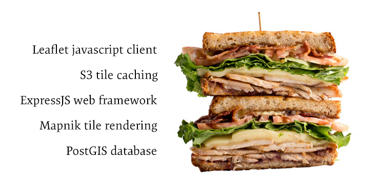
These are all cases where you might choose to render your maps as rasters, but still want to give your users the ability to identify features through data probing and get information on-demand. First, a little background on the tools (or stack) being used for this project. Here they are as a sandwich:
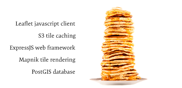
Delicious! And here they are as a literal stack of pancakes:
Tasty! All of geographic data is stored in the PostGIS database. Each feature is tagged with a start date and end date, base on its first and last appearance (in that particular form) in the primary source documents. Map tiles are rendered using Mapnik (through Tilelive) based on:
- The layers requested by the user (all is the default)
- The features available for those layers at the requested year
Once delivered to the browser, the tiles are cached on AWS S3 so they won’t be rendered again (unless the data in the database changes). The API (outside of the tile requests) is handled through ExpressJS.
Hopefully that provides enough context for the technical side of this post. I imagine it’s a stack that’s pretty familiar to lots of you. Personally, I prefer it in sandwich form. The basic flow of data probing on a raster map involves 4 separate functions:
- The user clicks the map, requesting features at the lat / lon coordinates under their mouse
- The API uses PostGIS to identify which features exist at that given location and returns those features back to the browser
- The user selects the specific feature they’re interested in and requests details by the feature’s ID
- The API returns the outline of the feature to the browser so it can be highlighted
Requesting from the client
In order for the client to request intersecting features from the database, we need to know 2 things:
- The coordinates the user clicked
- The radius to search for features
First, setup a function that runs every time the map is clicked. The event object that gets passed to that function contains the coordinates we need:
map.on( "click", probe );

function probe( e ){
  var lng = e.latlng.lng;
  var lat = e.latlng.lat;
}
Because this probing will operate on a multi-zoom map, we need to account for difference in zoom levels while the user is probing. At lower zoom levels (more zoomed-out), we need to search a larger radius because the tiny pixel at the very tip of the mouse pointer literally takes up more geographic space than it does at higher zoom levels. Furthermore, because this isn’t as seamless as vector zooming where we can instantly highlight features on mouseover and there is a small amount of waiting involved, we want to cast the widest net so users get the features they’re looking for. We set the search radius on a zoomend event like so:
map.on( "zoomend", function(){
  var zoom = map.getZoom();
  switch ( zoom ){
    case 15:
      probeZoom = 0.0005;
      break;
    case 16:
      probeZoom = 0.00035;
      break;
    case 17:
      probeZoom = 0.0002;
      break;
    default:
      probeZoom = 0.0006;
      break;
  }
});
The units assigned to probeZoom are decimal degrees (which is why they are so small). This was determined mostly by trial and error and you may want to go with smaller numbers depending on the density of your features.
The last thing we should do on the client side is provide a little bit of feedback to the user. Since the request to the server may take a small amount of time, we can prevent duplicate requests and frustrations by letting the user know their request has been received (and we’re working on it, OK). We display a very small animation where the user clicks that runs until the response is received.
It’s built using pure CSS so it loads much faster than an animated GIF. It can be places at the mouse cursor if it is appended to the #map div using the x and y properties of the event object passed to the click function.
Finding intersecting features in PostGIS
At this point, we know the geographic coordinates and the search radius for our query. Now, it’s just a matter of asking the database what exists at that location. We’re using ExpressJS to setup the framework for the API. This makes it easy for us to structure our API URLs using a single line of code:
app.get( '/probe/:year/:radius/:coords/:layers?', geo.probe );This defines the URL pattern, where each variable preceded by a : is a variable that will be available to us in the request object in the geo.probe function. The actual request made by the client is a jQuery $.getJSON() request to http://imaginerio.rice.edu:3000/probe/2013/0.0005/-43.1941,-22.9286/.
With all the parameters delivered to the probe function, we can use the node-postgres client to run our PostGIS query:
SELECT id, name, layer
  FROM basepoly
  WHERE ST_DWithin(geom, ST_SetSRID( ST_MakePoint( -43.1941, -22.9286 ), 4326 ), 0.0005 )
  ORDER BY layer
There are a few PostGIS functions at work here:
ST_MakePoint()creates a new point geometry that the given lon, lat coordinatesST_SetSRID()defines the spatial reference system for the coordinates passed to the pointST_DWithin()searches the table for all features with geometry (geom) that is within0.0005of the point we created inST_MakePoint()
Once the query has ended, it’s just a matter of packaging the data up into an object the client can work with and sending it back as a JSON response.
Letting the user choose their own feature
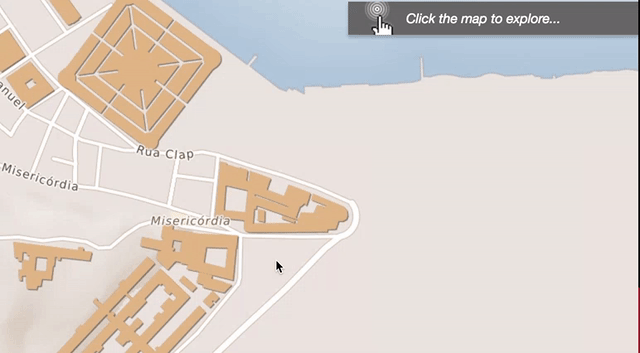
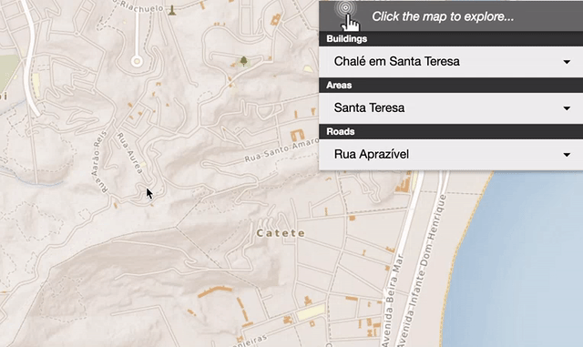
We’ve returned all of the matching features to the browser, with each feature’s name, layer, and unique id. This allows us to present them in an organized way to the user like this:
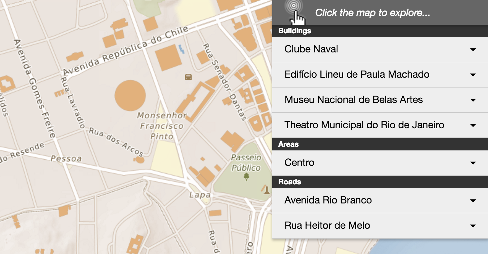
It’s important to organize them by layer if the type of feature they are isn’t immediately apparent by its name.
It’s good to note that this step isn’t 100% necessary for all datasets. Our data is dense enough and diverse enough that immediately drawing the vectors for each of the 7 features would be overwhelming and visually messy. Furthermore, it wouldn’t accomplish the user’s task of giving them information on the 1 feature they clicked on (it’s not their fault a lot of stuff occupies the same geographic space). Instead, we’ve given them the tools to browse through the list of matching results which supports the tasks of those who want information on a specific feature, and those who want details on everything nearby.
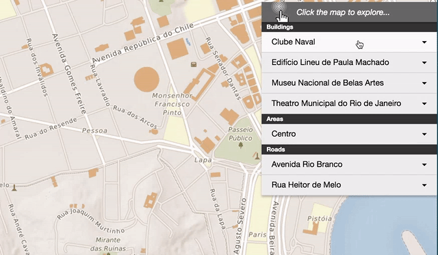
This type of probing is also really good for displaying features that otherwise wouldn’t draw on the map because of their size and potential visual dominance. Check out the final feature Centro chosen from the list. It’s a neighborhood / area so it is labeled on the map, but not drawn because the complex borders would be distracting. By adding it to the list of probe-able features, we’re given users a way to see it’s exact boundaries.
Drawing a feature on the map
The final step of the probing process is to highlight the selected feature on the map. This tiny bit of user feedback is really important. It connects the information displayed in the window to the feature it represents on the map. It also makes the user feel like they’re actually interacting with the features on the tiles. To “highlight” a feature on the map, we request a vector data (GeoJSON from the server) and draw it on top of the tiles.
The request from the server uses postgeo (it’s since been updated to dbgeo), to package the geometries returned from the server as nice GeoJSON that can be read into Leaflet using omnivore. The server-side code is very simply:
exports.draw = function( req, res ){
  postgeo.connect( conn );
  var id = req.params.id;
  postgeo.query( "SELECT ST_AsGeoJSON( geom ) AS geometry FROM basepoly WHERE id = '" + id, "geojson", function( data ){
    res.send( data );
  });
}
The ID parameter is passed to the API using a similar URL structure as we setup with ExpressJS before. Outside of its use here, this is an excellent function to have as a part of your API to render GeoJSON for features on-demand. Once it’s drawn in Leaflet, the highlight looks like:
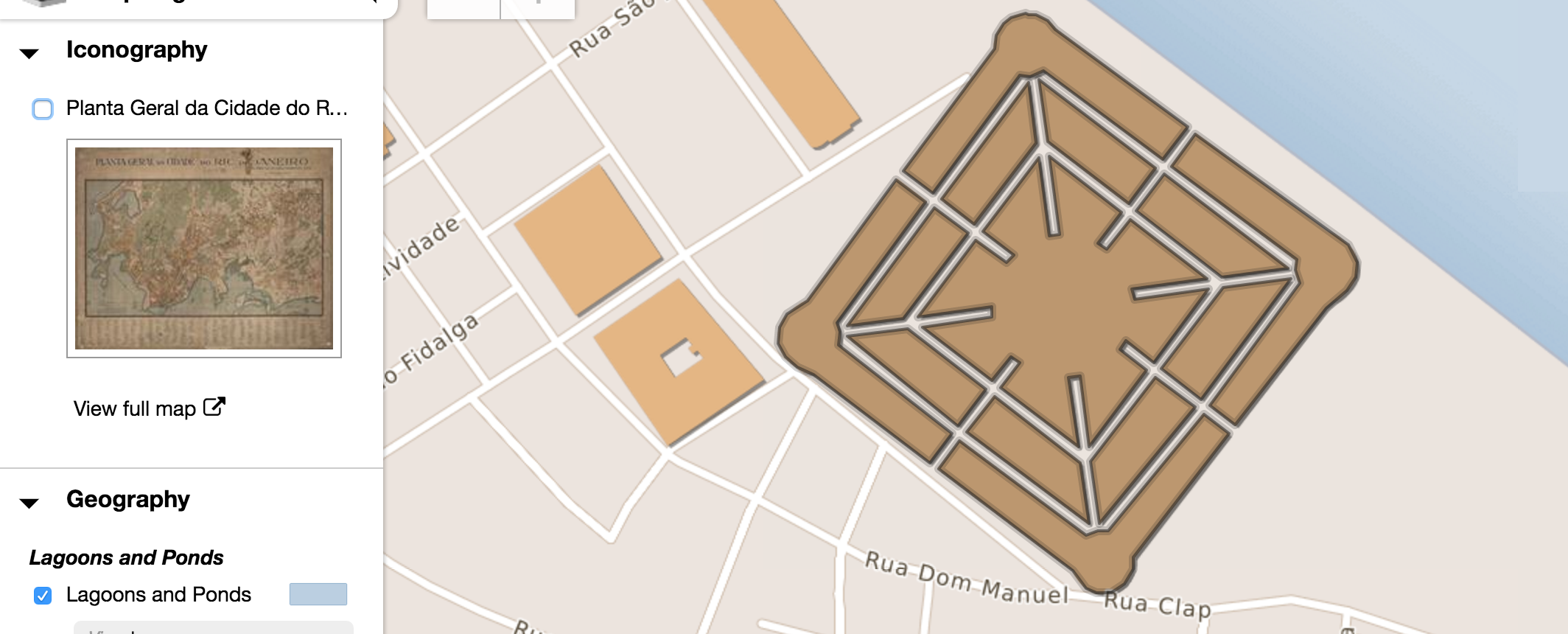
We’ve added a small pseudo-halo around the polygon by drawing the vector twice. It gives it a little more depth and makes it seem less out-of-place when drawn on the pseudo-3D elements on the map. The styling object we use is:
var topStyle = {
      color: color,
      fillColor: color,
      fillOpacity : 0.2,
      weight : 2,
      radius : 4
    },
    bottomStyle = {
      color: color,
      fillColor: color,
      fillOpacity : 0,
      opacity : 0.2,
      weight : 6,
      radius : 4
    };
If you use this, make sure to put your mouse interactions on topStyle since that’s the one with the fill.
Wrapping up
There’s a few more steps involved here than the simpler layer.on( "mouseover", showProbe ) that we usually do. However, none of the steps taken on their own are that complicated. If you’re building a medium to large-scale application (at least one big enough to justify PostGIS and Mapnik), you probably have a lot of these functions built into your API already. In fact, this is much more acutely a design and UX problem. How do we deliver the functionality that the user is expecting, without getting them bogged down in the different data formats we’re using to display the data? How do we design an experience that gives them access to the information without needing to understand the minutiae of mapping?
…and those vector tiles I didn’t want to talk about? This is all going to change in 6 months, tops.
imagineRio - Rice University
Temporally and spatially accurate maps of Rio from 1500 to now