I wanted to title this post: You Won’t Believe This Cartographer’s 4 Weird Tricks for a Nicer Map. That seemed like a bit much (plus the length of this post got away from me so it’s now more Longreads than Upworthy), but the sentiment isn’t entirely untrue. Design (big-D Design—I would’ve capitalized it even if it didn’t start the sentence) is an intimidating and amorphous topic. Academic cartography provides good guidelines for thematic cartography, but interactivity and user-interface design are often “I know it when I see it” type of things. What follows are 4 quick design concepts and techniques that can be applied in many situations to improve the look and feel of an interactive map.
These concepts were taken from a map we made for the Eshhad project tracking sectarian violence in Egypt. It’s a relatively straightforward map with:
- A point dataset with a handful of attributes of various types (date, categories, short / long text, URLs)
- A Leaflet implementation with basemap tiles
- A responsive design for mobile
These are 3 very common circumstances for an interactive map, which should make these tips transferrable to a wide variety of projects.
Use color sparingly
This is a concept that I first encountered with Edward Tufte, but I think has been best put into practice time and time again by NYT Graphics. This map is hugely effective in its judicious use of color because:
- Elements with color draw more attention than elements without.
- The most important things on the map should attract most of the reader’s attention.
- Therefore, the most important things on the map should have color, while less important elements should not.
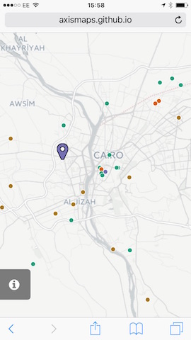
What’s the most important thing on the map? It’s the thing that the map is about. For this map, it was the point dataset of sectarian attacks.
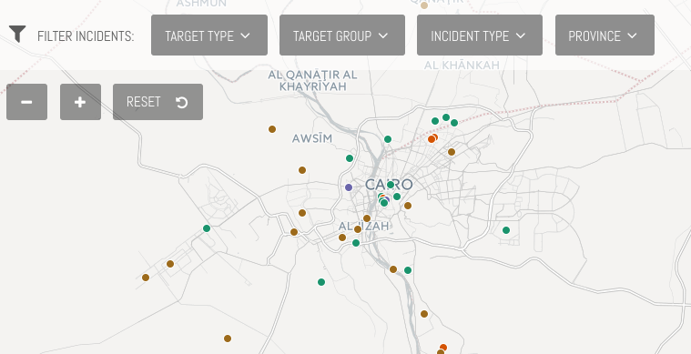
While the UI elements are certainly necessary for using the map, their importance is communicated through their size and position. The Positron basemap from CartoDB), though necessary to provide geographic context for these points, fades into the background and does not compete for visual attention. It’s great to have so many nice basemaps to choose from!
Color variation
Not only are the points one of the few elements on the map that are colored, they also use a categorical color scheme to display the target type. We decided to map this particular variable for the sole reason of bringing color variation to the map. In doing so, we greatly reduce visual intimidation for the users of the map as lots of 1 kind of point on the map becomes a few groups of slightly less points. Egypt’s geography, clustered around the Nile River and delta, make this even more important. The color variation allows users to more easily pick out single points for probing when they are tightly clustered together.
Color echoes
Color is also an extremely useful tool for reiterating connections between different features in the map. When color is used sparingly, you can easily communicate to the user that things that are the same color are related in some way. We’ve used a colored heading in the fixed data probe, not only to give it some visual weight, but also connect it to the point and tell the user this text here is about that point there.
Also—and there’s more on this below—because the fixed data probe is so heavy with text and categorical attributes, we’ve used a subtle color variation to break up the text box from the other attributes in the fixed probe. This is partly to highlight the longer text, but mostly to create visual differentiation to the probe and reduce the text intimidation.
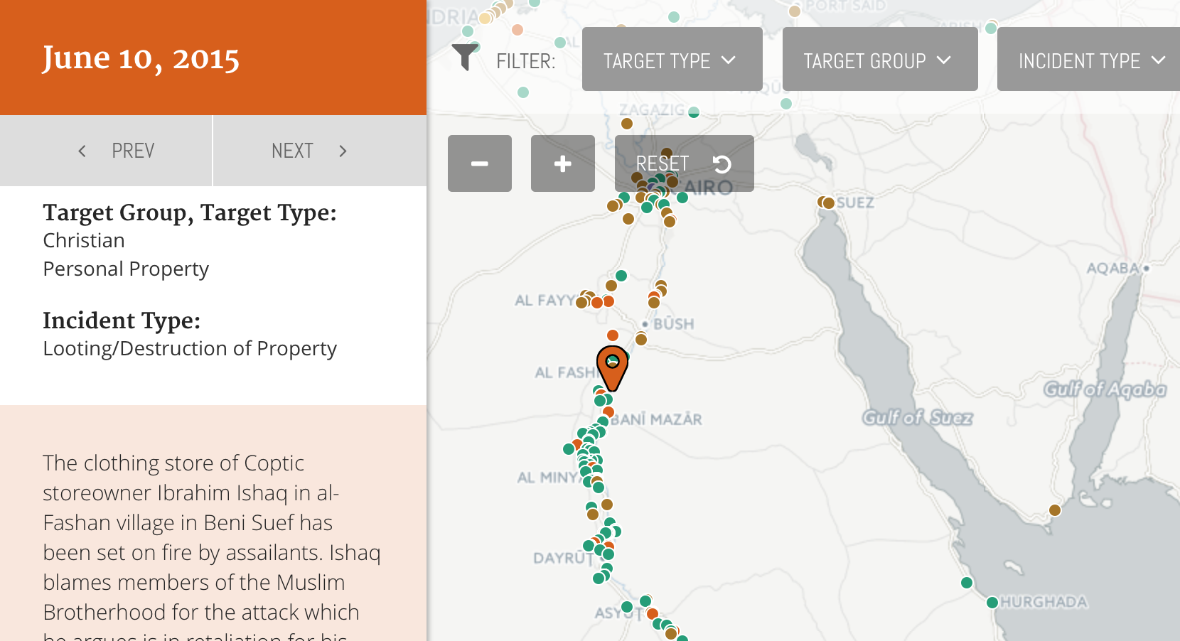
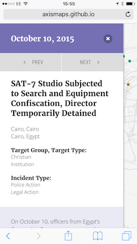
Data probes
Data probes provide information to the user on-demand. For a more in depth look at their design, this post by Ben is still fantastic (though the examples are showing their age). This map uses a 2-stage data probe technique that we’ve been using more and more in out maps that have a similar level of attribute detail.
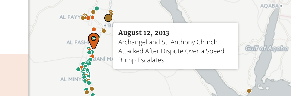
Floating probe
The floating probe appears over the map. It is visually connected to the corresponding point through its position and a small change in state (larger, highlighted) for the selected point. It appears on an investigative action (mouseover) and shows just a few details, enough for the reader to decide if they’d like to get information about the point. We often include a call-to-action here (click to read more), but given the simplified nature of the map, didn’t feel like us was necessary.
Fixed probe
The fixed probe appears on the left side of the screen. Its large height allows it to contain scrolling text, which removes the limits on the length of content it can contain. It’s activated through a deliberate action (click) and the corresponding point increases in size again, changes state, and remains persistently active.
To avoid text intimidation (in addition to the small color variation), we’ve used headings and changes in font to break the text up into smaller visual chunks and organize it for easier reading.
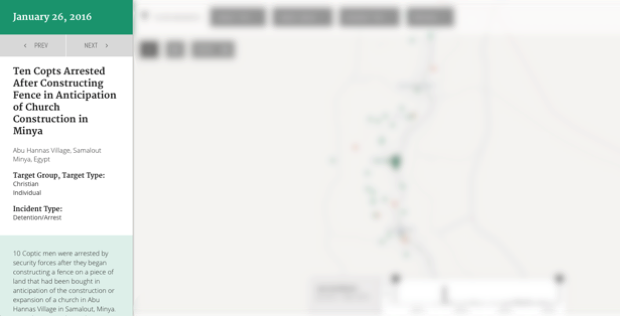
Mobile probing
For the mobile version of the map, we had to make a few simple changes to the probe:
- The floating data probe is removed. More accurately, it’s still there, but you can’t activate it because you can’t hover on a touchscreen. Fortunately, the data is replicated entirely on the fixed probe.
- The fixed probe now covers nearly all of the map. It’s not fully modal because we wanted to keep the reader still somewhat connected to the map while they were viewing the details on the probe.
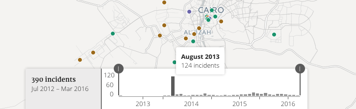
One more data probe
One more thing on data probes! It’s not just the thematic features on the map that should be probe-able. Any time you use a visual variable to encode data, a data probe can quickly answer the first question about the graphic: How much is that exactly? We’ve added a small little probe to the histogram to quickly clarify both the quantity and the bin (time period) for the selected bar.
Integrated legends
Not every map needs a legend. This map doesn’t need a persistent legend because:
- The categorical color scheme was done for its own sake, to create color variation amongst the points
- All of the attribute data (including the categories used to color the map) is available in the data probe
However, this doesn’t mean we should throw the legend out entirely, just be clever about how much space we give it. For this map, we present the legend to the user when they first load the map. After that, it is available integrated into the filter menu for the attribute that we’re mapping.
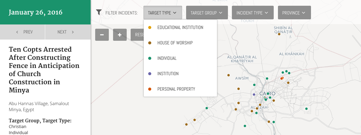
By integrating it into an existing control, not only do we save valuable map / UI space, we reinforce the connection between the controls and the map.
Non-map controls
The final thing I wanted to point out is the prev / next buttons at the top of the data probe. These buttons are used to move between points in the map. Clicking this button will activate the next / prev point in time, mirroring a click event that populates the fixed data probe and changes the point to the active marker.
We like including these alternative browsing methods in our maps because—as much as we hate to admit it—not everyone wants to access this information using a map. Some users are interested in a narrative that is entirely non-spatial (and since our data has a temporal element, that’s even more likely). Furthermore, not everyone is comfortable with the basic mechanics of interactive maps (panning / zooming / probing), and we want to make sure the content is still accessible to them.
Eshhad Map - TIMEP
Mapping religious conflict