D3 web maps for static cartography production

We’re a mapping company that’s most at home on the web. So when a more traditional static cartography job came along, we even took that to the web.

The ongoing project involves producing a set of four maps for each of thirty-three different countries, showing GDP along with flood and earthquake risk. To make 132 maps, clearly we need to set up a good, easily-repeatable workflow. Because the map themes and symbologies are the same for each country, essentially we need a set of templates into which we can throw some data and get an appropriately styled map that we can export for refinement in Illustrator, and finally layout in InDesign.

Ordinarily that’s where GIS software like QGIS or ArcGIS comes in. But using GIS can be a slow, repetitive task. In the interest of creating a faster process suited to our purpose specifically, we thought it would be easier to develop our own web-based tool to handle the parts of the workflow normally handled by GIS. Fortunately, it’s easy to do such a thing with D3.

Read more...

Cartography with an actual blindfold

Last month, Andy gave a talk at the OpenVis Conference entitled Blindfolded Cartography. Essentially, things to look out for when designing maps (especially interactive ones) so that when real data comes in, the map/design/page doesn’t get wonky. Things like too long text, missing data, skewed data, etc… The last week or so, we’ve been working on adding accessibility features to one of our projects and wanted to share a few thoughts and lessons on Cartography with an actual blindfold.

First off, what are accessibility features and why should you care? Accessibility features are features and general design patterns that allow people with disabilities to view and interact with your content. This can range from simply allowing keyboard navigation all the way up to screen readers. Now, why should you care? We can get fairly pedantic about whether a font size should be 16pt or 18pt, should this light brown text be #f2e1cb or #f8f1e7, should this div have a margin of 20px or 22px? If we as developers take that much care about things that a lot of users aren’t going to consciously notice, shouldn’t we take at least some care with things that some of the users are really really going to notice?

Read more...

Blindfolded Cartography

This is an adaptation of a talk I gave at the 2015 OpenVis Conference in Boston, expanded in a few spots and abbreviated in others. You can see slides and, ugh, video from the talk.

At Axis Maps, a rough napkin sketch of our projects often looks like this:

Map viewer sketch

We're tasked with designing and building interactive maps of data that, for one reason or another, we can't yet see. Sometimes the client doesn't have data ready soon enough. Sometimes we expect data to change or be added after our work is done. Sometimes it's just too vast for us to lay eyes on all of it. Whatever the reason, this reality of web mapping is a significant departure from what we knew back in cartography school.

Read more...

Three mobile map design workarounds

We recently built a map for Napa Valley Vintners, a nonprofit trade association with 500+ members located in one of the most well known wine growing regions in the world. The map is meant to help people locate wineries, plan a visit to the region, and then send directions and a trip itinerary to a phone for easy navigation while driving. Two versions of the Web map were developed, one for the desktop and another for mobile phones. We ran into a couple of issues while working on the mobile version, in particular, that were solved with a design workaround or three. They’re relatively small things, but should have a positive impact on how users experience the map.

Read more...

Mass Observation Basemap

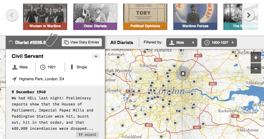
We recently worked on a project with Adam Matthew Digital mapping British diarists in the UK who wrote during the first half of the 20th century. Most of the 500+ entries deal with observations about the impact of WWII on everyday life.  The map allows users to search and filter diarists by gender and date of birth or view them in smaller groupings by theme (e.g., "Political Opinions", Women in Wartime", "London During the Blitz"). Brief bios and excerpts from the diaries themselves are also viewable, as shown in the screenshot of the interface below:

Mass_Observation

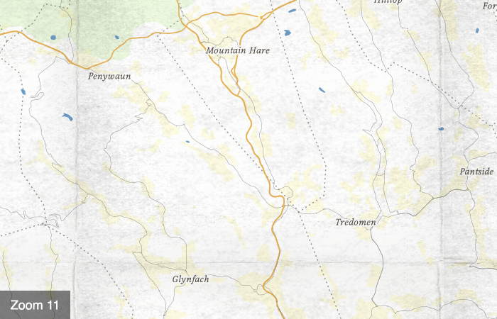
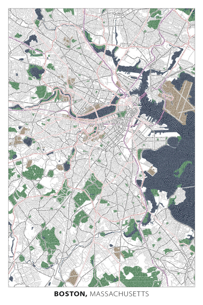
One of the fun challenges of the project was designing a tiled basemap that resembles other maps from the time period in terms of look and feel. We needed something that would help set the tone and mood for the project without using an actual historical map made in the 1940s. Although we've used actual historical maps for other projects, in this case doing so would have caused too many accuracy issues around the locations of the diarists. Instead we turned to TileMill, where we brought together modern-day data from OpenStreetMap, the Ordnance Survey, and Natural Earth and applied our own design.

mo_animation

After spending some time online browsing maps made in 1930s-40s England and the UK, such as those out of the British Ordnance Survey, we narrowed down a few of the salient design elements we found. Of course, we saw a lot of variability, but typography seemed to have one of the greatest impacts in terms of evoking the look and feel we wanted. Serif fonts with good contrast between thick and thin strokes were common, as was the liberal use of italic for map labels. Map symbol colors were similarly impactful. They ranged across the spectrum but were generally desaturated and flat on light-colored backgrounds (very few gradients, glows, drop-shadows or other effects). We took note of a few other elements too, like line weights, which tended to be thin (not overly chunky), and line styles, which varied greatly--we found all kinds of dashes, dots and dash-dot combinations.

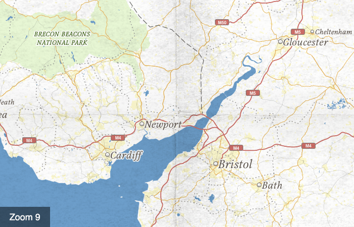
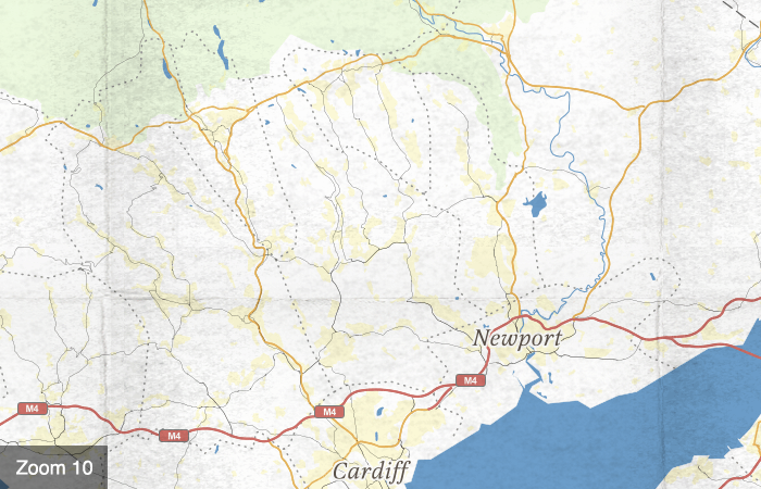
One other element having a big impact on look and feel was the paper the maps were printed on. Textures in the maps gave the impression of something old and used. They also added a tangible and personal quality, which seemed a perfect fit for our map of diary entries. Of course, tiled basemaps with textures that look worn or folded are not new  (e.g.,  Geography Class map) but we couldn't resist making a version of our own since it seemed so applicable for this project. Here is a closer look at the paper texture at zoom levels 9-11:

zoom9zoom10zoom11
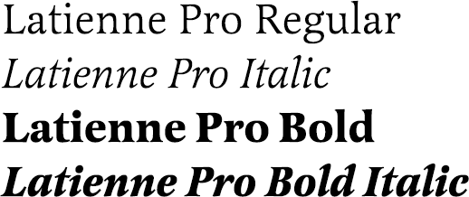
We tried a bunch of different fonts for the map (e.g., Cochin, Magneta, Playfair, Essay) and settled on Latienne Pro in the end. It's not quite as high contrast as some of the others, but thicker strokes help it hold up well at smaller sizes on screen. And its available on TypeKit!

latiennePro

The color palette we arrived at is made up of mostly desaturated colors that become even more so when made semi-transparent on our light-colored background, as is the case with the national parks (green) and urban areas (yellow) on the map.

colors

Finally, our background texture was made using scanned images of folded paper and cardboard. After a good bit of trial and error, we worked up a seamless version of the image in Photoshop that could be repeated throughout the map.
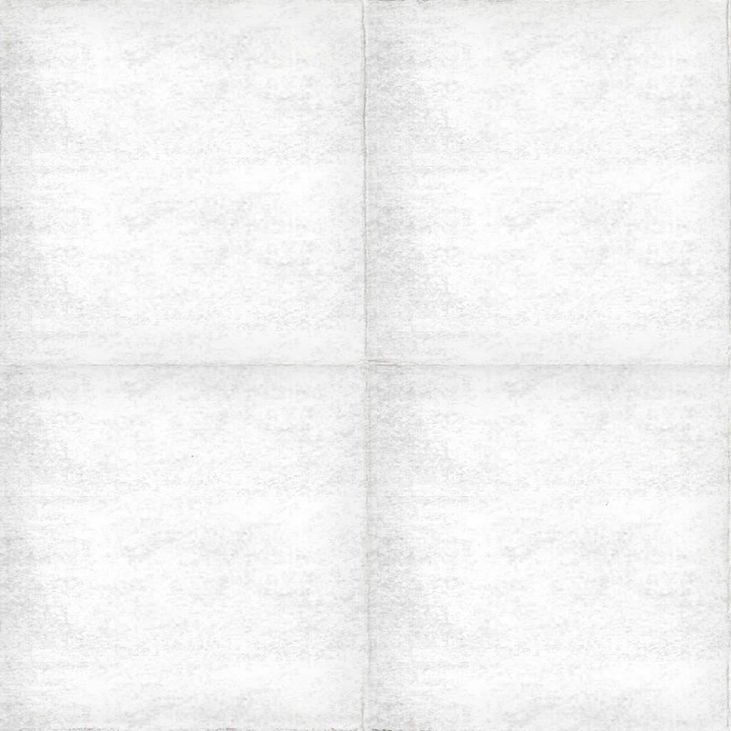
texture


FatFonts World Population Map

We're excited to announce that we're bringing the work of some of our friends to the Axis Maps Store. We've always been interested in new ways to encode and represent data. Also, typography. We ♡ typography big time. It was both of these interests that lead us to the work of Miguel NacentaUta Hinrichs, and Sheelagh Carpendale and the FatFonts project. From their site:

Fatfonts are designed so that the amount of dark pixels in a numeral character is proportional to the number it represents. For example, "2″ has twice the ink than "1″, "8″ has two times the amount of dark ink than "4″ etc. You can see this easily in the set of characters below:

Blockfont onelevel cut1

Read more...

2nd edition of the Boston typographic map

It's been five years since we first introduced our map of Boston. The popularity of that map started us down a course of typographic mapping that has since expanded to 11 cities. Given the special place that Boston has in our hearts, we felt it was well deserving of a redesign. And to prove just how much we love this city, we started from scratch. In other words, we started at the beginning with a blank canvas, imported a fresh copy of Open Street Map geography and place names, determined a new map extent and layout, and chose new fonts, colors, and character styles. The new Boston, 2nd edition poster is still 24 inches wide by 36 inches tall, but looks and feels dramatically different.

Boston 2nd ed. typographic map Boston 2nd ed. typographic map Read more...


AskCHIS NE map: All D3 Everything

Last week saw the launch of AskCHIS Neighborhood Edition, a product of The California Health Interview Survey and the UCLA Center for Health Policy Research, with whom we worked to develop map and chart components for this new interactive tool. The short story of AskCHIS NE is that it is a tool for searching, displaying, and comparing various California health estimates at local levels such as zip codes and legislative districts. Take a look at it if you feel like setting up an account, or you can watch a demo at its launch event (demo begins at 14:00).

AskCHIS Neighborhood Edition

Read more...

Offline Web-Maps

Recently I said something silly to a client:

...and because we're not using a database, you'll be able to run this map offline on your local computer.

Great! They give lots of presentations where they want to show off the map and this means they wouldn't have to rely on conference wifi, the most overstretched resource on the planet. We delivered the completed map to be deployed on their site along with the instructions:

Just open index.html in your web-browser and you'll be up and running.

Nope.

Read more...

Geography of Jobs: animated mapping with D3

One of our recently completed projects is a new Geography of Jobs map for TIP Strategies. Have a look at it, and read what they have to say about it.

Geography of Jobs

It's a month-by-month map of job gains or losses over the prior twelve months for most (or all?) of the metropolitan areas of the United States, from 1999 to present. Proportional circles are colored to indicate gain or loss, and the map can either be animated or controlled by moving a slider.

Read more...