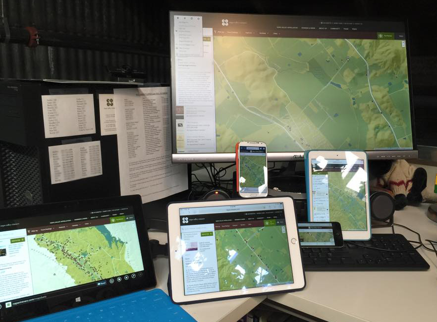
We recently built a map for Napa Valley Vintners, a nonprofit trade association with 500+ members located in one of the most well known wine growing regions in the world. The map is meant to help people locate wineries, plan a visit to the region, and then send directions and a trip itinerary to a phone for easy navigation while driving. Two versions of the Web map were developed, one for the desktop and another for mobile phones. We ran into a couple of issues while working on the mobile version, in particular, that were solved with a design workaround or three. They’re relatively small things, but should have a positive impact on how users experience the map.
Browser chrome - minimize before entry
The browser chrome is all the stuff that appears around a window, taking away screen space from what you’re trying to look at. On a phone, when maximized, it usually appears as an address bar at the top and tool bar at the bottom for various things like page navigation, sharing and bookmarking. The bottom bar can obscure content, which isn’t great if you want to use that space for other things, like parts of a map interface, or if you simply want more map area showing on the screen. Typically, the browser chrome minimizes automatically when scrolling down a normal web page via tap+drag down. However, because our map is fixed to the viewport, scrolling down pans to the south instead, and the chrome doesn’t minimize.
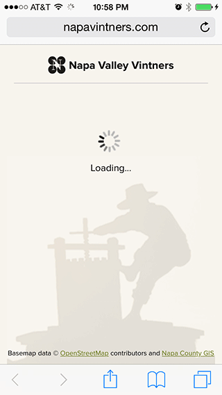
What’s the workaround? How do we minimize the chrome so that when users get to the map they as much of it as possible? By forcing people to scroll down a separate introduction page. The page doubles as a loading screen and also includes some branding, a background image, and an attribution line. When the map finishes loading, a big up arrow with the words “Pull up to view map” appears. Pulling up, which scrolls down, sends people to the map with a minimized chrome.
The HTML is structured with a few special elements:
<body>
   <div id="loading">
      // 100% width / height
      // loading screen content
   </div>
   <div id="treadmill">
      // absolutely positioned div with height of 100000%
      // no matter how much you scroll, you'll never reach the end
   </div>
   <div id="wrapper">
      // div containing all the map content
      <div class="pane">
         // each UI is given its own div
      </div>
   </div>
</body>
There’s only two bits of javascript you need to get it to work:
$( window ).scroll( function( e ) {
   // wait until the map is loaded to allow scroll
   if( load === false ) return false;

   // check for scroll distance
   if( $( window ).scrollTop() > 100 ) {
      // transition the wrapper into view with CSS
      $( '#wrapper' ).addClass( "visible" );
   }
});

$( ".pane" ).scroll( function() {
  // prevent scrolling on the UI frames and scroll their contents instead
  return false;
});
Of course, it can come back later! For example on our map, entering a search term will maximize it again. Complicated matters, Safari on iOS doesn’t report it’s window height differently when the state of the chrome changes so it’s not something we can detect in code. For this reason, we decided to position key map ui elements, like the winery ”list” button, higher in the window so as not to be obscured. Sure, a little scroll from the header would shrink it again, but it’s not obvious.
Geolocation - ask if the browser can ask
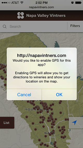
Geolocation is great for plotting your location along a route, fixing your location to the center of the map while driving, or plotting a route from your location to a winery. But none of this works unless you first grant the browser permission to track the phone’s physical location. The problem is that the browser only asks once. Furthermore, that request doesn’t tell people the advantages of accepting. If the one browser request is denied, you get none of the good stuff… ever. Or, at least not until you reset your security preferences, which isn’t obvious and is too complicated to explain in a short help message.
What’s the workaround here? How can we 1) encourage people to allow their location to be tracked, and 2) if it’s denied, still ask for it again later to see if they change their minds? Essentially, we did it by asking if the browser can ask for permission in the first place. In other words, we used a custom notification that both explains the advantages of allowing your location to be tracked and asks if you would like to enable GPS. If the custom notification is denied, we can ask again next time… the browser hasn’t blocked anything because it hasn’t asked anything and the user is sent to the map. If the custom notification is accepted, the user is asked again by the browser. Yes, it is an additional click, but we see this as better than the alternative of a user potentially not having geolocation enabled at all.
Data Probe - animation indicates more
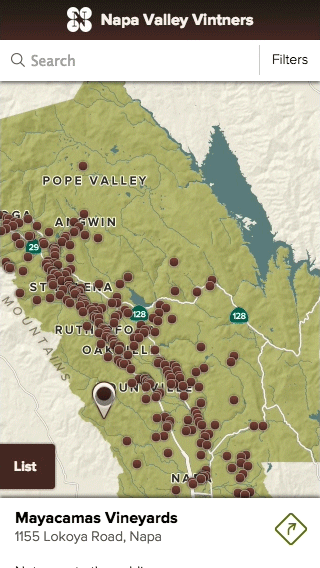
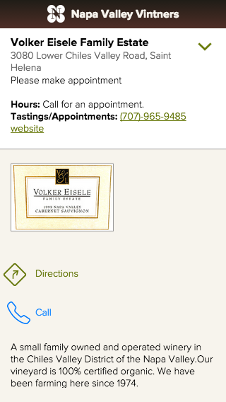
Every time a winery point is tapped on the mobile map we display a set of attributes, such as name, address, phone, hours, and appointment details. These show up in a small data probe panel fixed to the bottom of the screen. In addition, the panel includes a button that generates a mapped route and step-by-step directions to the selected winery. Together, the details and button take up all the space available in the data probe panel. A lengthier text description and logo also exist, but flow off the bottom of the screen. This information is accessible by swiping up from the small data probe. The problem was that in user testing no one knew to swipe up and this extra information was rarely even discovered.
We needed a visual cue that would make it clear that more information existed without using up any space in the data probe itself. There was no room for an obvious up arrow here. However, we did find a nice bounce animation at animate.css that served as a good workaround. With each tap of a point, the probe panel bounces up and down a couple times from the bottom of the screen, then stops. It’s a subtle way of showing that more information can be accessed by swiping up.
Swiping up yields the full details for the winery:
Lessons Learned
With a huge push towards responsive web design, this is something we’re going to be doing more and more as users expect to have content tailored for whatever screen they’re using. Mobile maps present a lot more challenges than a standard webpage of long text content. Elements can’t reflow and reposition with a grid scaffolding and some basic CSS width queries and you often feel like you’re fighting against the tendencies of the browser. However, by making mobile design a key part of the total map design process, you can force yourself to think about how mobile users use the map differently; which features are important to them and which should be left for the desktop only. It may feel like building two separate products but the results mean that everyone gets what they need wherever they are.
PS - Get ready to buy a bunch of extra phones off eBay because each one is a unique little snowflake which makes testing a nightmare.
Napa Valley Winery Map - Napa Valley Vintners
Exploratory map and trip planner for visiting Napa Valley wineries