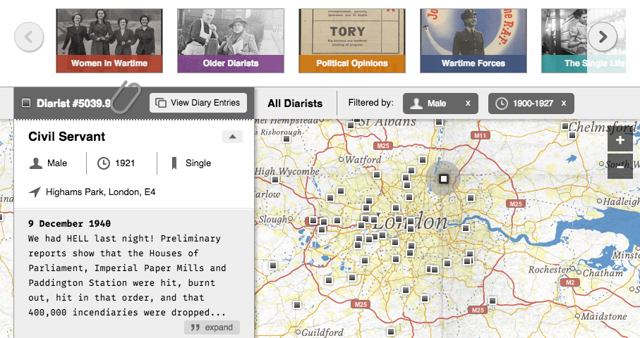
We recently worked on a project with Adam Matthew Digital mapping British diarists in the UK who wrote during the first half of the 20th century. Most of the 500+ entries deal with observations about the impact of WWII on everyday life. The map allows users to search and filter diarists by gender and date of birth or view them in smaller groupings by theme (e.g., "Political Opinions", Women in Wartime", "London During the Blitz"). Brief bios and excerpts from the diaries themselves are also viewable, as shown in the screenshot of the interface below:
One of the fun challenges of the project was designing a tiled basemap that resembles other maps from the time period in terms of look and feel. We needed something that would help set the tone and mood for the project without using an actual historical map made in the 1940s. Although we've used actual historical maps for other projects, in this case doing so would have caused too many accuracy issues around the locations of the diarists. Instead we turned to TileMill, where we brought together modern-day data from OpenStreetMap, the Ordnance Survey, and Natural Earth and applied our own design.
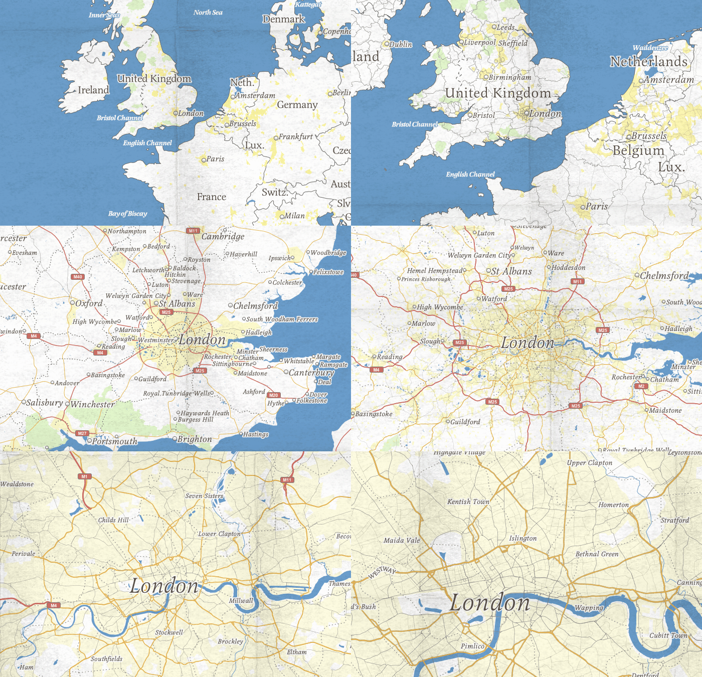
After spending some time online browsing maps made in 1930s-40s England and the UK, such as those out of the British Ordnance Survey, we narrowed down a few of the salient design elements we found. Of course, we saw a lot of variability, but typography seemed to have one of the greatest impacts in terms of evoking the look and feel we wanted. Serif fonts with good contrast between thick and thin strokes were common, as was the liberal use of italic for map labels. Map symbol colors were similarly impactful. They ranged across the spectrum but were generally desaturated and flat on light-colored backgrounds (very few gradients, glows, drop-shadows or other effects). We took note of a few other elements too, like line weights, which tended to be thin (not overly chunky), and line styles, which varied greatly--we found all kinds of dashes, dots and dash-dot combinations.
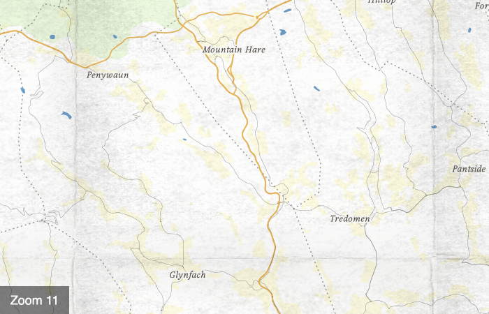
One other element having a big impact on look and feel was the paper the maps were printed on. Textures in the maps gave the impression of something old and used. They also added a tangible and personal quality, which seemed a perfect fit for our map of diary entries. Of course, tiled basemaps with textures that look worn or folded are not new (e.g., Geography Class map) but we couldn't resist making a version of our own since it seemed so applicable for this project. Here is a closer look at the paper texture at zoom levels 9-11:
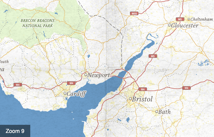
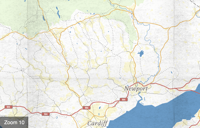
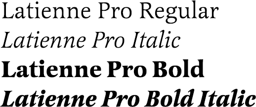
We tried a bunch of different fonts for the map (e.g., Cochin, Magneta, Playfair, Essay) and settled on Latienne Pro in the end. It's not quite as high contrast as some of the others, but thicker strokes help it hold up well at smaller sizes on screen. And its available on TypeKit!
The color palette we arrived at is made up of mostly desaturated colors that become even more so when made semi-transparent on our light-colored background, as is the case with the national parks (green) and urban areas (yellow) on the map.

Finally, our background texture was made using scanned images of folded paper and cardboard. After a good bit of trial and error, we worked up a seamless version of the image in Photoshop that could be repeated throughout the map.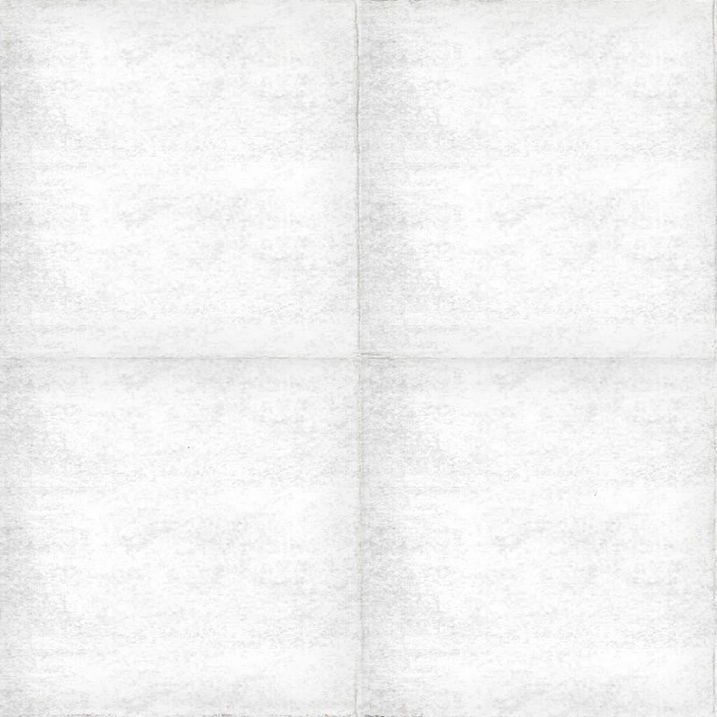
Mass Observation - AMD
Mapping everyday life in mid-century Britain
