Last week saw the launch of AskCHIS Neighborhood Edition, a product of The California Health Interview Survey and the UCLA Center for Health Policy Research, with whom we worked to develop map and chart components for this new interactive tool. The short story of AskCHIS NE is that it is a tool for searching, displaying, and comparing various California health estimates at local levels such as zip codes and legislative districts. Take a look at it if you feel like setting up an account, or you can watch a demo at its launch event (demo begins at 14:00).
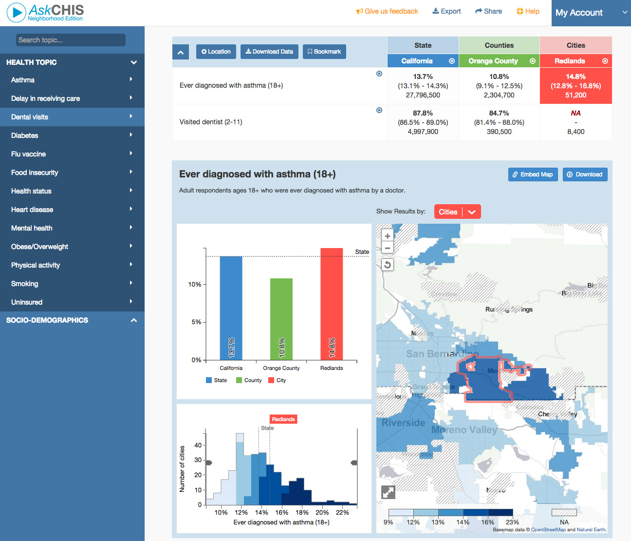
The long story is interesting too, as this is fairly sophisticated for a public-facing tool, so we'd like to share a few details of how the map and charts were made.
We built that big component with the map, bar chart, and histogram. It lives in an iframe, and as a user makes selections in the table above, various URL hash parameters are sent to the iframe telling it what data to load. The map and bar chart then make requests to a data API and draw themselves upon receiving data. Almost everything here uses D3, either for its common data-driven graphic purposes or simply for DOM manipulation. As usual, this much D3 work made it a fun learning experience. And it once again expanded my awe for Mike Bostock and Jason Davies and their giant brains: more than once during this project, I asked about apparent TopoJSON bugs far beyond my comprehension, and each time they fixed the bug almost immediately.
![]()
Tiled maps in D3
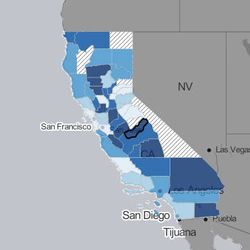
The map shows one of six vector layers on top of a tiled basemap that is a variation on Stamen's Toner map, derived from Aaron Lidman's Toner for TileMill project. Normally we use Leaflet for such tiled maps, but our needs for the vector overlays were complex enough that it made more sense to adapt the basemap to the vector layers' framework (D3) rather than the other way around. Tiled maps in D3 are pretty painless if you follow the examples of Mike Bostock and Tom MacWright. The six vector layers are loaded from TopoJSON files and drawn in the usual fashion in the same Mercator projection as the basemap.
Dynamic simplifcation
The most interesting technical detail of the map (to me, anyway) is that it uses dynamic scale-dependent simplification. This is a nice design touch, but more importantly it ensures that the map performs well. Zip codes need to have reasonable detail at city scale, but keeping that detail at state level would slow panning, etc. tremendously. We took (once again) one of Mike Bostock's examples and, after some trial and error, got it to work with the tiled map. Here's a stripped-down example. Simplification is based on the standard discrete web map zoom levels. As the user zooms, the vector layers redraw with appropriate simplification when those thresholds are crossed, with basic SVG transformations for scaling in between those levels. Keep your eye on the black-outlined county in the gif below, and you should be able to see detail increasing with zoom.
Pooled entities
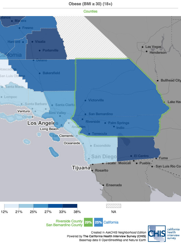
One of the more sophisticated capabilities of this tool is combining geographies for pooled estimates. For example, maybe you want to look at Riverside and San Bernardino Counties together as a single unit:
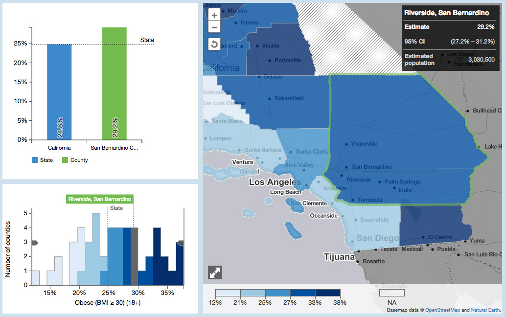
The API does the heavy lifting and delivers pooled data; our challenge was to display pooled geographies as a single entity on the map. Although TopoJSON seems to support combining entities (after all, it does know topology), I had no success, apparently because of a problem with the order of points. Instead we use some trickery of masking, essentially duplicating the features and using the duplicates to block out interior borders, as outlined below. If you wonder why we couldn't just skip step 2, it's because our polygons are somewhat transparent, so the interior strokes would still be visible if we simply overlaid solid non-stroked polygons.
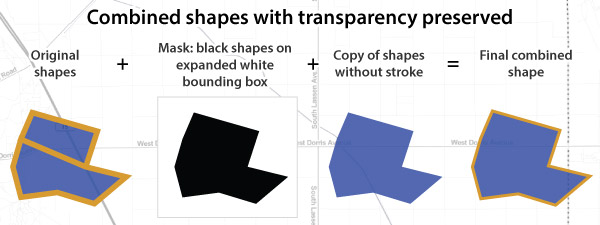
Image export
The biggest source of headaches and discovery was the image export function. Users can export their current map or bar chart view to a PNG image, for example the map below. (Click it.)
I learned that converting an HTML canvas element to PNG data is built-in functionality, but getting this to work in a user-friendly way was not so simple. For one thing, our map is rendered as SVG, not canvas. Luckily there is the excellent canvg library to draw SVG to canvas, so we build the entire layout above in SVG, then convert the whole thing to canvas (except the basemap tiles, which are drawn directly to the canvas). Pretty cool. Thanks, canvg!
The nightmares begin when trying to trigger a download, not just display an image on screen. Firefox and Chrome support a magic "download" attribute on <a> elements, which does exactly what we want, downloading the linked content (image data, in this case) instead of opening it in the browser. If only everyone used those browsers! Cutting to the chase, we couldn't find any way to ensure the correct download behavior across browsers without sending the image data to a server-side script that returns it with headers telling the browser to download. The final task was showing a notification while the image is being processed both client-side and server-side, which can take long enough to confuse the user if there is no indication that something is happening. Failing to detect the download start through things like D3's XHR methods, we ended up using a trick involving browser cookies.

Phew! Turns out making a static graphic from an interactive is complicated! But it was a valuable experience—subsequently I've even used JavaScript and D3 deliberately to produce a static map. It works, so why not? (Most of this dot map was exported from the browser after drawing it using this method.)
ALL the D3
For all of the above, it's hard to post code snippets that would make sense out of context, but we hope that the links and explanations are helpful, and are happy to talk in more detail if you are working on similar tasks. There's a lot more going on than what I've described here, too. Suffice it to say, D3 is a pretty amazing library for web mapping!
AskCHIS NE - UCLA
California health dashboard visualization