 Interactive maps and charts are part of a health data dashboard
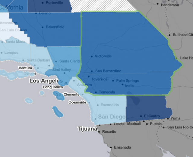
 Geographies can be combined to get pooled health estimates
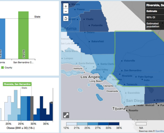
 Maps can be exported to static images for printing
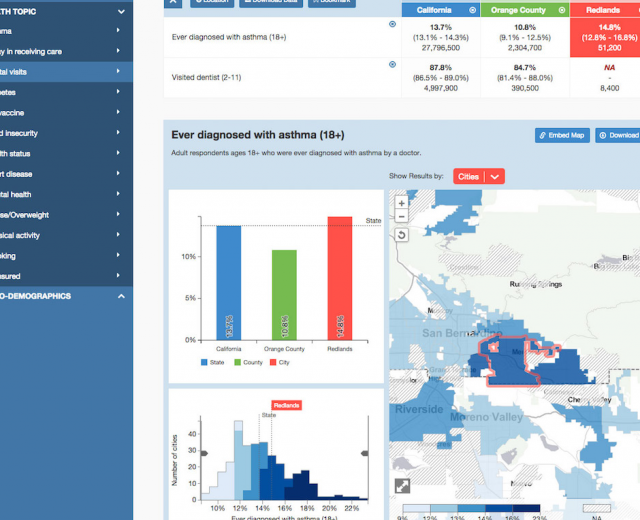
AskCHIS Neighborhood Edition is a product of The California Health Interview Survey and the UCLA Center for Health Policy Research, with whom we worked to develop map and chart components for this interactive public health tool. AskCHIS NE is a tool for searching, displaying, and comparing various California health estimates at local levels such as zip codes and legislative districts.
A data API powers everything. Users select data and locations in a table above the map. Those selections send parameters to the map and chart components through a hash in the URL of an iframe. Given the specified health measure, geography type, and selected entities, we build a query and request data which in turn draws the map and charts.
We designed the map and charts to fit into a larger dashboard of AskCHIS NE, connected to the selections a user makes in a table that appears above. Each piece is a separate component, but all are linked by data. A categorical color scheme distinguishes different types of geography. Beyond the web dashboard, specific views can be exported as static images for print or other use, separate design that focuses on just the map and a handful of relevant statistics.
We used the D3 library extensively for almost everything, as this is precisely the kind of data-driven document for which D3 is meant. Unlike most tiled “slippy” maps, the map itself is built with D3, allowing us to make use of some sophisticated features like dynamic polygon simplification. We also dove deeper into SVG than in many projects, devoting a lot of code to perfecting pattern fills, masking, and image exports.