Taking advantage of IPRO’s Pellucid database of healthcare indicators and built with HTML 5 and JavaScript, this second-generation map allows users to explore numerous indicators of care at the state, county, HRR, and hospital level. Users can view and filter data distributions via the histogram, add hospital and physician overlays, and control the classification and color scheme applied to the choropleth map. The new map is fully integrated with the Why Not The Best site, allowing users to link out to more detailed reports and return to the map exactly as they left it.
IPRO’s Pellucid database contains data for many quality of health care measures in counties, states, hospitals, and hospital regions. We designed the map to be fully driven by this database for both data values and metadata. Any changes made by staff are instantly reflected on the map, without the need to update the code.
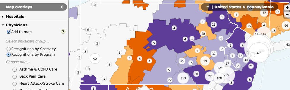
The central design challenge was to make a map that can support any number of variables for different levels of geography and different types of geometry (points and areas), all without being overwhelming and confusing to the user. We designed an interface that is fairly simple for basic usage but can grow more complex if the user dives deeper by adding overlays, zooming to a street-level map, or changing symbolization options.
Originally built in Flash, the map was rebuilt from the ground up using HTML and JavaScript. Powering the map is the open source library Leaflet, which is supplemented by tiled canvas layer to draw the choropleth layers. The geographic data is served by TileStache and symbolized according to data retrieved from remote data services.