Update, Dec. 22: A few variations of the map technique are posted here.
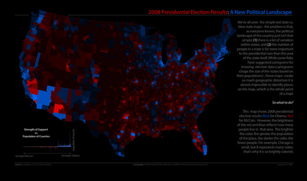
We spent some of our spare time last week exploring data from the 2008 presidential election and thinking of some interesting ways to visualize it. Above is one map we put together.
One thing we sought to do was present an alternative to cartograms, which are becoming increasingly popular as post-election maps. Cartograms are typically offered as an alternative to the common red and blue maps showing which states or counties were won by each candidate, wherein one color (presently, red) dominates the map because of the more expansive—but less populated—area won by one candidate. Election cartograms such as the popular set by Mark Newman distort areas to reflect population and give a more accurate picture of the actual distribution of votes. A drawback of cartograms that we're very aware of, however, is that in distorting sizes, shapes and positions are necessarily distorted, sometimes to the point of making the geography virtually unrecognizable.
Our map is one suggestion of a different way to weight election results on the map while maintaining correct geography. What we've done is start with a simple red and blue map showing which candidate (Republican and Democrat, respectively) won each county in the lower 48 states. Then, to account for the population of those counties (or, the approximate distribution of votes), we've adjusted opacity. High-population counties are fully opaque while those with the lowest population are nearly invisible. Against the black background, the highest concentrations of votes stand out as the brightest.
We'll let viewers be the judge of its cartographic effectiveness, but we hope you'll at least agree that it looks pretty cool!
Click on the image at the top of the post to view a larger version, or see it in a Zoomify viewer, or download the full size (suitable for printing).

