I made mention of 3D pie charts in an earlier post and thought I'd outline exactly why they are such a bad idea. As both a teacher and designer I campaign hard against "chart junk" and the needless and confusing eye candy tricks that software companies create to clutter-up our lives. I know these companies need to offer something to try and convince us to upgrade to the new version, but let's be clear: drop-shadowing every element on the page, or adding an outer glow to the text isn't going to make your message any clearer, and will most likely distract from the very thing you're trying to show. My design philosophy can be summed up as:
In cartography, aim to be clear, not cool.
Anything that doesn't contribute to the message, or worse, distracts from it, probably doesn't need to be on the page. Since maps are small and the world is large, every inch on the page and every pixel on the screen has to count and we can't afford to waste any of them. Draw what you need, and no more. Fans of Edward Tufte, Presentation Zen (recent post on 'chart junk'), or old-school cartographer's like J. K. Wright and Arthur Robinson will recognize all of this - this is hardly a new message. But it is one that still needs to be heard, apparently. For a quick overview of many of these arguments I'd strongly recommend reading John Krygier's excellent post "How useful is Tufte for making maps" (his 20 Tufte-isms is a great crash-course in Tufte).
Consider this graph (from here):
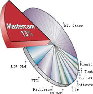 Pure chart junk: This pie chart commits a half dozen major design mistakes rendered it as little more than visual junk food (looks tasty at first, but isn’t that good for you).
As an information graphic, let's step back and think about what a pie chart is suppose to do and how it works at a perceptual level: Pie charts are used to tell us (1) how much of something exists, and (2) how much that is compared to the other categories. 'How much' is encoded by the size of the pie (or segment) and 'relatively how much' by the internal angles of the pies and/or their relative sizes. To extract data from the graphic you have to be able to quickly visually compute both areas and angles.
The bad news: Years of testing has shown that most of us are really bad at estimating the areas of even simple shapes - just try visually estimating how much carpet you'll need for a room, especially if the room isn't square if you don't believe me - and we're pretty bad at eyeballing and comparing angles too.
Not convinced, you say? Looking at the pie chart above:
- What percent of the total does DP Tech have?
- Is that more or less than IBM?
- How much more/less?
Now think about presenting those data as a boring old table: DP Tech 4%, IBM 5%. Done. Simple. Think about the difference in mental workload, and the confidence you have in your answer when the data are presented as a 3D oblique pie chart and when they're numbers sitting in front of you. This problem is so commonplace (and yet ignored) that most folks resort to putting numbers on pie charts because the graphic itself is not sufficient, which is waste of ink, their time and mine. If you have that little confidence in your charts, just give me the numbers!
Here's a rule of thumb I like to use:
If a map/graphic needs 'crutches' like number labels and can't stand on its own, don't use it. It's the difference between "A Tale of Two Cities" and "A Tale of Two Cities: A Novel."
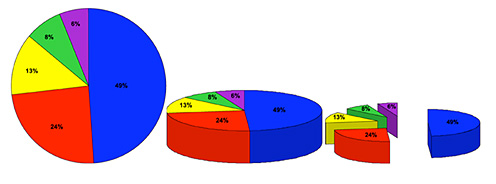 People read the simple 2D pie faster, with greater accuracy AND greater confidence.
The same data is presented three different ways above, and each change made to "enhance" the simple 2D pie chart makes it worse because the two basic perceptual tasks - 'how big is something' and 'what are the angles' - are much harder to perform when the pie is lying down. This is exactly what happens when design decisions are made in a vacuum and based simply on "it looks cooler this way" rather than an understanding what we need from a graphic to make it readable/work.
Problem 1: Adding the 3rd dimension adds no new information to the graphic. That's bad because it is wasted ink (that could be doing real work) and it requires the tilting of the pie so the designer can show off the 3D effect. If the height (z-dimension) added some additional data (i.e., a second data variable), it might be worth adding, although I would caution against that since we're even worse at estimating volumes than we are at estimating areas (which is why "how many jelly beans in the jar" contests or "how big a moving van do I need?" continue to challenge us - we're terrible at numerically estimating volumes beyond the crude level of "bigger / smaller").
Problem 2: On both oblique pies the scale is not consistent across the graphic. In other words, the same pie segment will look larger or smaller to you the observer simply based on where it lands in the circle...things closer to us will look larger, even if they're not. This couldn't be more counter-productive when we're simultaneously asking the viewer to estimate areas. This is an absolute rule: If you expect people to judge the size of things, don't change the scale of the objects on them.
Problem 3: Splitting the pie apart makes matters worse because the further objects are from each other, the harder it is to compare them (which is why we like to hold things side-by-side if we want to carefully compare them). Why? The extra time and effort it takes for your eyes to search for and acquire the now-separated segments uses-up your precious (visual) working memory and requires more eye trips back-and-forth to make the same estimation. Cognitive scientists call those back-and-forth trips extraneous cognitive load which cut the available brainpower (working memory) that can be devoted to the real task of comparing segments (intrinsic and germane cognitive load).
Solution? Simple: Stop using oblique, exploded, jazzed-up 3D pie charts. 2D work better, are easy to read, faster to read, and easier to make. Importantly, they also can be drawn much smaller and remain legible - as cartographers we're always looking for ways to do more with less ink. If your powerpoint slides feel naked without fancy transitions and giant 3D graphics, you'd do better to work on the substance of the talk, rather than bury your good ideas in a pile of chart junk.
I'll leave with one of my all-time favorite spoofs - the Gettysburg Address as Powerpoint.</div>