The first time I used Google Maps I knew that the world of cartography had just gotten a lot more interesting. It blew my mind. What really struck me then (and still does today) is that I didn't have to learn how to use it: It just worked. It didn't come with a manual, and I didn't need a class in it. Rather, I would think, "Hey, I wonder if..." and sure enough it did just that. First try. It worked. What was happening was that my expectations of the map and the feedback it gave—and the speed at which it gave that feedback—left me feeling empowered to explore more, rather than frustrated or confused.
This is true of all the best tools in our lives: they make us feel confident (even smart), not intimated or confused or frustrated. And they quickly become completely transparent. The master violinist, photographer, or painter all work so comfortably with their tools that they are able to translate their powerful and nuanced intentions into a physical reality. We've all experienced this – when the interface between our cognitive and emotional selves and the world around us disappears and we are able to lose ourselves in a great book or a great movie (you cease to realize you're sitting in the theatre watching reflected light on a screen or scanning printed characters on page).
When our tools disappear and become transparent, we are at our best. Psychologists call this 'flow' and I think it is the singular defining state of creativity: it's what happens when we are so deeply engaged with the work we love that we lose track of time and need to be prompted by loved ones to stop and eat occasionally. Mozart had this problem, Newton had this too, and to a lesser extent, so do I every time I fire up Google Earth. I often joke that Google Earth should come with a warning label: You will be here happily for hours. Proceed with caution.
Now reflect on how rare that experience is in the world of software and web interface design. Why is that? Why are we content to create maps that merely don't crash? Below I outline how we might, as designers, aim a little higher.
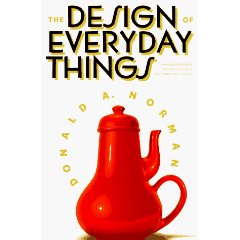
The problem is, as design guru Donald Norman points out in his classic must-read The Design of Everyday Things, most people expect to be flummoxed by new technology, that'll it be hard to learn, that it will be unpleasant at best.
Why else would people refuse to upgrade software despite obvious problems with their current version — because they've done the math, and the current flaws are better than having to learn a new version. Indeed, most people blame themselves when something doesn't work, saying, "I must be stupid because other people know how to use this," when in fact it's most likely a counter-intuitive UI and poor or missing affordances that are to blame. The only reason why other folks know how to use it is because they've learned, through trial and error, how to work around those flaws. If software elicits "That made no sense, but I guess it worked...I'll try to remember that for next time," it is badly designed. If it elicits "I bet I can do x by using y," you've earned your paycheck (ironically, most payroll systems I've seen are horrendous).
 How do you know this isn’t your interactive map or web site?
Success in UI design is not measured by "Did the person get something at the end?" but rather by "Did they grasp what the tool was capable of and how to use it quickly? What was the mental and physical workload required? How many dead ends did they go down before they found success? Did they enjoy the experience?" among other important questions. The TLX scorecard (designed by NASA) and the GOMS test are two such approaches used by savvy designers to score how well people use their tools, not merely if they can use them (or, as we often see, only use them if they've taken lengthy training courses).
Case in point: A Big Ten university I know reserves a mandatory full afternoon to show every new employee how to use the phone message system, representing millions in lost productivity. Uh, Houston, I think you might have a problem, and it's not your employees. This isn't just design snobbery it's massive waste of money and time.
THE IMPORTANCE OF FLOW
Let me propose that the best user interfaces (UIs) become transparent because they engender "flow." For me, this is the holy grail of good design. The 9 components of flow, based on Csikszentmihalyi's work (see his TED Talk) in the 1970s, can be used as a scorecard for any UI we design or use:
- Clear goals (expectations and rules are discernible and goals are attainable and align appropriately with one's skill set and abilities).
- Concentrating and focusing, a high degree of concentration on a limited field of attention (a person engaged in the activity will have the opportunity to focus and to delve deeply into it).
- A loss of the feeling of self-consciousness, the merging of action and awareness.
- Distorted sense of time, one's subjective experience of time is altered.
- Direct and immediate feedback (successes and failures in the course of the activity are apparent, so that behavior can be adjusted as needed).
- Balance between ability level and challenge (the activity is neither too easy nor too difficult).
- A sense of personal control over the situation or activity.
- The activity is intrinsically rewarding, so there is an effortlessness of action.
- People become absorbed in their activity, and focus of awareness is narrowed down to the activity itself, action awareness merging.
HOW DO WE GET THERE?
There is no simple magic formula, I suspect, for what defines a good interactive map (or any user interface) but I think some salient qualities include the following:
1. Give Them Something Quickly. Nothing boosts confidence like finding the power button immediately or sliding your credit card in the reader the correct way the first time (aside: omg card reader designers— after 30 years this is the best you can do? Seriously?!!). I've always liked Apple's "welcome" movie that plays the first time you start up your new Mac - all you've done is find the power button but already you feel like you're off to a good start. A blinking c: prompt is no way to greet your clients.
2. Adapt to the Skill-Level of the User. Maps and software should be smart enough to adapt to the level of the user, from offering pro-level shortcuts to revealing more advanced features as needed — not when they can't be used and simply clutter up the screen and taunt the user with "shame you don't know how to activate me cause I'm all grayed-out."
3. Understand Affordances. All interfaces, from airport signs to lawnmowers, live or die by them. If you are a designer, you need to eat, breathe, and sleep this stuff for the world already has too many "Norman Doors." Named after Donald Norman (who talks about them in his aforementioned book), these are doors that have a horizontal bar across them and thus suggest that you're suppose to push them, when in fact you have to pull them (RULE: horizontal bars to push, graspable vertical handles to pull). In the panic of a fire, such design flaws take on new significance.
4. Eliminate Features Ruthlessly. My two current favorite UIs are the Google Search Engine and the iPod. Both are the model of simplicity and both burst onto the scene and quickly dominated their markets by doing the incredibly counter-intuitive thing: offer the user less. They both removed a whole bunch of features the competition thought were essential. Why? Because we are all swamped with too many choices in our lives (see "The Tyranny of Choice") and simpler tools are (1) faster to learn, (2) faster to use, (3) cheaper to make, and (4) and less likely to break.
Unlike just about every product ever, over time the iPod has in fact gotten less complicated: The Gen 1 iPod had twice as many buttons as the Gen 3. The iPod shuffle? It got rid of the screen! Heck, the shuffle even eliminated the power jack and let folks recharge directly through the headphone jack (I still don't know how they did that one). And it sold like hotcakes because it was cheaper to make and easier to use — they killed the features that were underused and kept just the stuff that really mattered to most casual users (pro users can still buy the more powerful models of iPod). And most folks learned, hey, you know, I really didn't need all that stuff after all, and I just saved a bunch of money...and that is a happy customer.
5. Build a Well Labeled Emergency Exit. If the user feels like at any moment they might break it, they won't venture far. The best UIs increase confidence by providing reassuring feedback that progress is being made and encourage the user to keep going. We've all been stopped by cryptic warning messages that leave us feeling unsure of whether to proceed or cancel (I usually cancel, unless I'm feeling dangerous or it's not my computer). Good ideas include a big reset button, unlimited undos, and lots of sign posts such as "Before we close the window, would you like me to save your work for you?" More advanced users can turn off such warnings once they're weaned off of them. I have archiving software that asks me three times in three ways if I really, truly want to erase a drive and overwrite it. Given the cost of a mistake (10 years of my entire digital life) this five seconds of forced careful thinking is a suitable insurance premium.
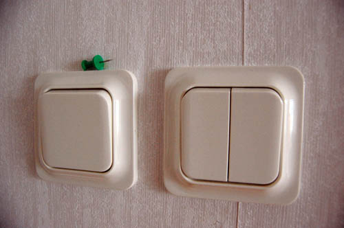 Ben’s pick for UI of the week: Swedish light switches.
I asked Andy, Ben, and Dave to name their current favorite UIs and Ben suggested these cool light switches in his apartment in Sweden. He writes "(1) really big and square, (2) in the dark, just start smacking the wall, and (3) feels really good to smack the wall in the dark." Hard to argue with that. Compared to the light switches we have here in North America these are easier to use (less effort) and result in less fumbling (faster to use, fewer mistakes) and they remind us even the humble light switch can be improved with some careful thinking.