Lots of maps are coming out that document when, where, and how stimulus money is being spent through the ARRA, like these at the Foundation Center. With all of the reporting, accountability, and transparency required of ARRA grant recipients, I'm sure we'll only be seeing a lot more of these in the future. Recovery.gov directs traffic to states' Web sites where some of this data is appearing. I'm looking forward to seeing more and more mash-ups and interactive maps and graphics as developers and designers get their hands on this stuff and data from other sources that track stimulus money.
Our Map
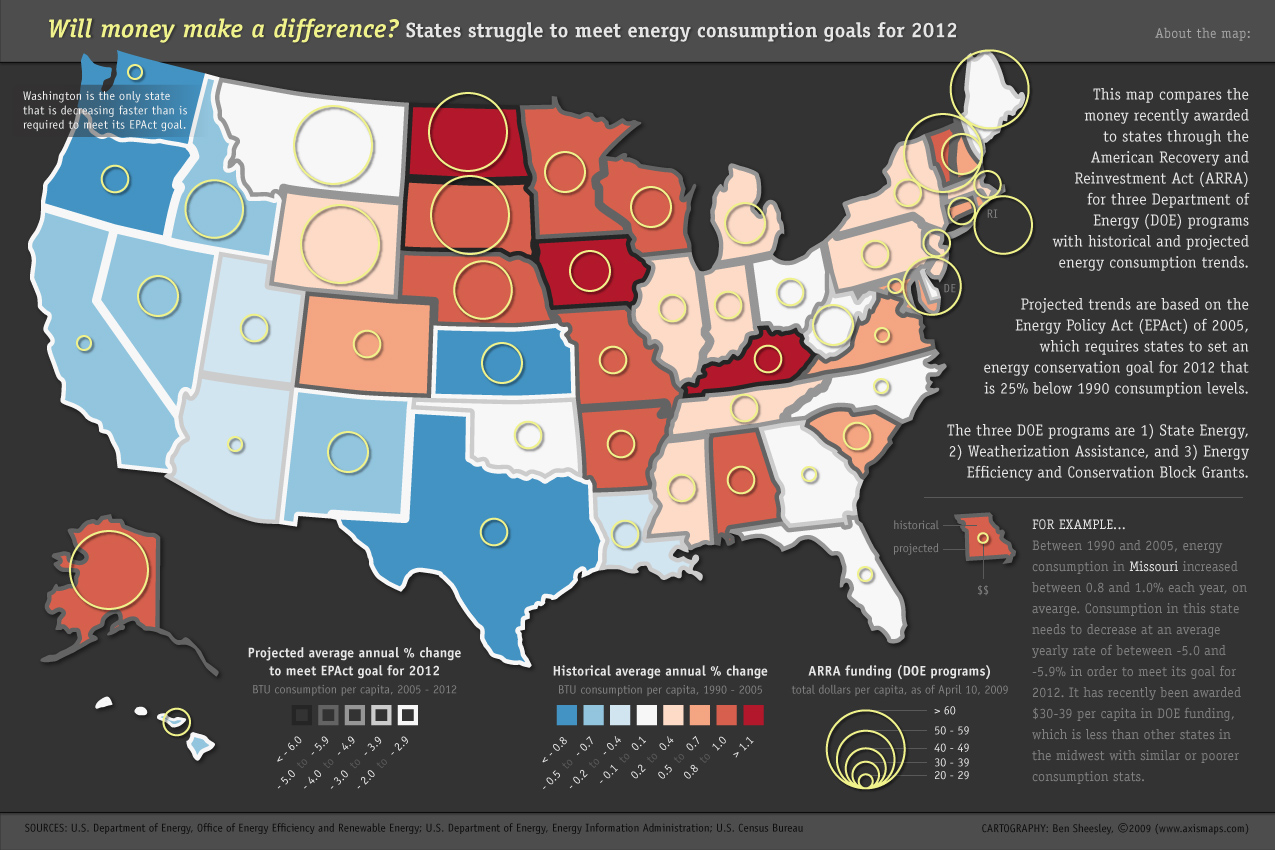
For now, we decided to get involved by putting together a static map that shows where our ARRA tax dollars are going for energy-related programs administered by the DOE. As underlying layers, the map shows states' historical energy consumption trends and their projected trends required to meet consumption goals set for 2012.
I'm sure we could all talk about the politics around ARRA funding and energy consumption and how this might or might not be shaped by patterns that the map does or doesn't show. But to me, a few of the most interesting things about this map are related to its design:
1) Encoding data in state boundaries
I've always been attracted to National Geographic political reference maps, with their countries each outlined in a different color. On those maps, outline color clearly helps distinguish one place from another. Plenty of other maps use enumeration unit outlines to represent data, too, like those that categorize administrative boundaries using line weight, dashes and dots, etc. I wondered what was to stop the application of this idea to a thematic map? Why not try to take it one step further and encode numerical data, as opposed to nominal data, in unit outlines? I haven't seem many examples of this.
The main limitations here are line weight and unit size. Line weight has to be heavy enough so that color can be seen and read. For my map, this seemed to work best above around 4 pts. Only thing is, as enumeration units get smaller, the outline can eat up more interior space and obscure the presence of a second data set, which in this case is the historical energy consumption trend, encoded using unit fill color. So, I had to cheat a little bit with some small states and states with small pieces (e.g., Delaware and Maryland) and decrease the line weights a bit under 4 pts. I don't see this approach working very well with really small enumeration units like US counties, unless the map scale is really huge.
2) Color selection
The challenge here was to select colors for three data sets (historical energy, projected energy, and ARRA money) that not only encoded data properly but were harmonious (i.e., not competing or ugly). The historical energy data set has a natural midpoint around zero, so it needed a diverging color scheme. On the other hand, the projected energy data, having no midpoint, required a sequential scheme (thanks to ColorBrewer 2.0 for both sets of specs). Proportional rings for ARRA money just needed to be readable and look nice on top of the other colors.
Here are some earlier attempts at getting color right. In my first try, I used a grayscale sequential ramp for the historical data (state fill color), matching the middle value to the map's background for a pseudo-diverging ramp feel. But this seemed overly subtle and downplayed the importance of clearly distinguishing states with decreasing and increasing energy consumption trends.
 First attempt at color.
So, my next try was to replace the grayscale ramp with a true diverging ramp. Yuck. The mix of red outlines and fill colors bothered me on an purely aesthetic level. Other diverging ramps with other hues in them produced similarly ugly results.
 Second attempt at color.
The final colors for historical energy consumption trends (blue-white-red) seem to best emphasize the data's midpoint, with red doing its part to connote "alarm" in the states with a poor track record. The projected energy consumption data set is now lower down in the visual hierarchy (shown using a grayscale color ramp on state outlines), but this seems to be acceptable compromise. Using gray prevents these two ramps from competing for attention or overlapping and confusing the map reader. From my perspective, at least, it also results in an (yes, subjective) improvement in overall color harmony.
Other thoughts about the ARRA funding map? Please add them to the comments.