Google Earth is amazing. As we've commented here before, it continues to blow our minds and has also done wonders for the popularity of maps. And let's be honest, it looks super cool. There is no doubt that Google Earth is much sexier than that boring old atlas collecting dust on your shelf: It's interactive, seamlessly integrates distributed data sources, animates the surface of the earth over time, facilities virtual communities, can be customized by both developer and user, etc, etc. It's hard to not be impressed.
So all of our maps should be in Google Earth, right?
Wrong.
In fact, despite recent efforts to create a suite of thematic mapping approaches, Google Earth is a terrible environment for presenting many kinds of thematic maps. I'd go so far as to say that the 3D prism maps and 3D graduated symbol maps we see popping up in Google Earth are pure chart junk, of the kind Tufte warned us about repeated for past 25 years.
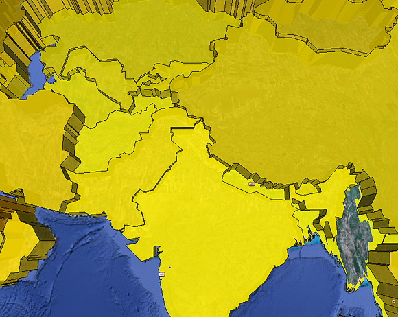
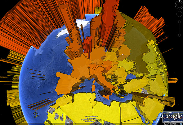 3D prism map in Google Earth (blog.thematicmapping.org)
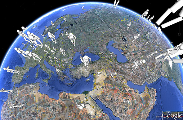 3D human figures as proportional symbols (blog.thematicmapping.org)
CHART JUNK
Chart junk takes what should have been a simple-to-read graphic and makes extracting information (1) slower, (2) more difficult, and (3) more prone to reading errors, because of excessive ornamentation and unnecessary design additions—like adding a 3D effect that communicates nothing in and of itself but simply "looks cool." This is not idle speculation: Research consistently shows chart junk and "redundant ink" hurt otherwise fine graphics.
Want to see for yourself? Download these two example KML/KMZ files from blog.thematicmapping.org and run them in Google Earth. While you're looking at them try to extract numbers or compare places: KMZ File 1 | KML File 2
"BUT THEY LOOK COOL": A TECHNOLOGY IN SEARCH OF A PROBLEM
As Abraham Maslow said, "If the only tool you have is a hammer, you will see every problem as a nail." This seems to be the case with virtual globes and the developers who love them and insist that any and all kinds of thematic data belong there. Instead, I'd challenge us to take a step back and ask,
WHY DO WE MAKE THEMATIC MAPS?
For a long time folks like Robinson, Dent, and MacEachren have been arguing that thematic maps exist to support two basic tasks: (1) the ability to extract numbers/facts about specific places (e.g., 15C in Paris) and (2) the ability to judge those values in geographic relation to other places (e.g., 5C warmer than London, about the same as Milan). In other words, we want both specific details and overall patterns to be obvious on our thematic maps. And we want all of that AT A GLANCE.
The problem with digital globes (as with all globes) is you can't see half the planet and, due to curvature, really only about a 1/3 of the planet clearly at once. Which leaves us with a conundrum: If you're only mapping a small place (e.g., a country), why do you need to have it on a globe? And if you have a global dataset, why would you allow your readers to only ever see ½ the data at once? They can rotate the globe (more on this later) but they'll never be able to see the entire dataset at once. That makes understanding overall patterns very difficult, and asking folks to "remember" half of a global dataset while they spin the globe to the other side is far, far beyond the meager limits of our working memory. If you're not convinced, just try it.
KNOW YOUR HISTORY
What makes these recent developments even more frustrating is that in the 70s and 80s, with the advent of digital map making, cartographers flirted with, and largely rejected, faux 3D prism maps and 3D graduated symbol maps (like the two examples above) since they suffered from several limits:
- visual occlusion (not all of the map can be seen at once since some places hide others)
- people suck at estimating volumes, especially of complex shapes (e.g., try estimating the size of moving van you'll need for your home)
- mental rotation of complex shapes is extremely hard, so hard that it is often used as a measure of intelligence in IQ tests.
Many a thesis and dissertation was written in the past 40 years demonstrating these limits to human visual processing.
The nice thing about Virtual Earths is that you can rotate them, so the problem of visual occlusion is solved, right? Yes and no. Yes, interactivity and the ability to rotate the globe can help reveal hidden places, but no, these virtual globes introduce a significant extraneous cognitive load because the user must now think about controlling the globe (not always easy with a mouse) while also trying to focus on the thematic content. In fact, adding a complex task, like visually acquiring the Google Earth controls and then trying to figure out how to move/scale/reposition the globe between two other tasks effectively "flushes" short-term working memory. It's a kind of mental sorbet, which is why giving folks something distracting to do is a common trick in memory tests (they lose their train of thought). Why would we deliberately do this to our map-readers?
BIG PROBLEM: INCONSISTENT SCALE
In the examples above it is really hard to judge relative sizes. Why? Because the scale of the symbols is constantly changing, and the ones closer to the viewer are much larger (and at a different scale) than the ones far away. Given that it has been long established in cartography that people are terrible at estimating sizes, and even worse at estimating volumes, it is utterly inane to compound this failure by drawing the symbols at different scales. Of course it is worse than this: Rotating the globe slides each symbol through its own scale transformation path, changing in size with every pixel the maps are moved.
This is an absolute rule: If you want to give people the best chance to judge the relative sizes of objects, they should all be drawn at the same scale.
STILL NOT CONVINCED? LET'S DO SOME USER TESTING
 Judging height is critical to the success of this map, yet most heights are obscured
TASK #1: As quickly as you can, how does Nepal compare to Uzbekistan?
TASK #2: As quickly as you can, find all of the other places on the map similar to Nepal? Which place is most similar? Which one least?
Hard, isn't it? To be honest, it shouldn't be: A regular 2D classed choropleth map or proportional symbol map would make short work of those questions. So what did we gain by extruding the countries up into space? Not much that I can see.
- The Lack of a zero-line referent makes it hard to judge absolute magnitudes.
- The "fish eye lens" effect mean each prism is viewed from a different angle than its neighbors, making comparison just a little bit harder as we have to mental account for these differences in our estimates.
- It is hard to judge the height of something when you are staring directly down at it. This matters because height is the visual variable that does the "work" in this graphic—it's how the data are encoded visually. Why obscure the very thing map-readers need to make sense of the graphic (e.g., the side-view height of each polygon)?
SOLUTIONS?
I need to be convinced of two things: (1) something is fundamentally wrong with our proven and highly efficient planimetric thematic maps, and (2) that reprojecting this data onto a virtual globe somehow solves those problems. Otherwise, we truly have a cool new technology in search of an application, and that's just putting the cart before the horse.
Some suggestions: First, unless the 3rd dimension communicates something and isn't merely redundant data already encoded in the colors, sizes, etc., do not include it (for all the reasons outlined above). Second, if you want folks to perform "analytical map reading tasks" such as estimating relative sizes, distances, or densities, keep scale constant. Third, do not obscure parts of the map behind other parts if that isn't inherently relevant to the data (e.g., this is fine for terrain visualization). Fourth, and most importantly, do some user testing before presenting a new technique as the best thing ever: It's how research works and why it is important.
So what things are Google Earth (and other Virtual Globes) good for? The consensus around here is (1) to engender, quite powerfully at times, a qualitative "sense of place" or "immersion"; (2) for virtual tourism (e.g., sit on top of Mt Everest) or virtual architecture/planning; and (3) to perform a kind of viewshed analysis and see what can and cannot be seen from locations (line-of-sight). All of those are inherently 3D-map reading tasks in which the immersive, 3D nature of the map is important. By comparison, population data (one number per country) is NOT inherently 3-dimensional and is only made to suffer when dressed-up in prism maps and 3D figurines.
Cartography, like all good design, is about communicating the maximum amount of information with the least amount of ink (or pixels). The world is just too complex and interesting to be wasting our ink/pixels on non-functioning ornamentation.