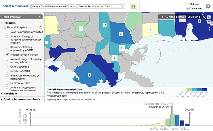
We're pleased to mention our most recently completed project: an interactive quality-of-health-care map for Why Not The Best, done in conjunction with IPRO for the Commonwealth Fund. This is actually the second incarnation of this map, which is now built with more modern technology and is better integrated with the Why Not The Best site.
We first built the Why Not The Best map in Flash about two years ago, using the Flex-based indiemapper framework we had developed for ourselves. Flash was a good solution the time, as this was a relatively simple vector thematic map. However, the map's functionality and features later grew to the point where it incorporated multiple shapefiles, several layout modes, and embedded Google Maps—resulting in a very complex project and a large SWF for users to load. At the same time, non-Flash web mapping technology was improving rapidly, opening new doors for building this kind of map. As such we again worked with IPRO and completely rebuilt the map in HTML 5 and JavaScript.
We've learned a few things from this and similar projects and thought we'd share some experiences from this map, in case other folks just getting into this kind of work can benefit from the same tricks.
Leaflet
The web mapping library I've settled on as my choice lately is Leaflet, which is developed by CloudMade. Leaflet offers "slippy map" and overlay basics but also a lot of opporunity for easy custom extensions. While there is little built-in support for thematic cartography like choropleth maps (although the very recent release makes more strides in this direction), it's not difficult make it happen in completely custom ways. Below is an overview of what we did in this case.
Choropleth
Our choropleth map, in brief, is drawn from tiled GeoJSON served by TileStache and colored by data requested from IPRO's database. Although I suppose it will be part of the Leaflet release some day, there's currently no built-in support for tiled GeoJSON layers; however, as you'd expect with an open-source project, third-party developers have come up with solutions. We used this TileCanvas layer with some additional modifications.
GeoJSON is commonly drawn to SVG, but just as we learned long ago in Flash, a ton of vectors rendered on screen at one time can really bog things down. We wanted to try the canvas element instead, rendering the vector data as static rasters and faking the mouse interactivity that SVG would have allowed. Sure enough this did seem to perform better, especially when we needed to draw our county layer in high detail. Thus the GeoJSON TileCanvas layer, which builds upon Leaflet's canvas layer, was handy.
To make this all work interactively and allow on-the-fly coloring based on data, we had to perform a couple of behind-the-scenes tricks. The main technique was introduced to us by our friend Jeremy White, a Graphics Editor at the New York Times whose fantastic interactive work you have undoubtedly seen and who has explained this in a couple of talks. Basically, it's this:
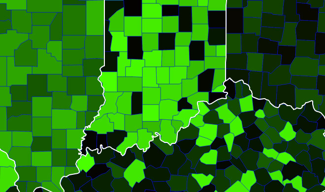
Beautiful, right? This green thing is a map layer that ordinarily is invisible underneath the actual choropleth layer. It draws each enumeration unit (counties here) with a unique color based on a unique ID number for that unit. That number could be its position in an array, or in our case an arbitrary number included in the original shapefile (again, though, it's just the row number of each record). On a canvas element we can't do much more with the mouse than detect the coordinates of the mouse position and the pixel color under the mouse. By assigning colors this way, we can read that pixel color and turn it back into the ID number, thereby learning which county is under the mouse.
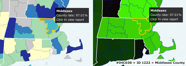
Our method for assigning colors, also more or less following Jeremy's tips, was to use the red and green channels, each of which has 256 possible values. It works like this for my county of residence, which had an ID number of 1222:
- 1222/256 = 4.77. We only want the integer for this part, so Red = 04.
- 1222 mod 256 = 198, or in hexadecimal, C6. Green = C6.
- Blue = 0.
In other words, we just run down the sequential list and increment the green value by 1 until reaching maximum green (255), at which point red is incremented by 1 and green rolls over to 0. In our code, a feature's color looks like this: "rgba('+Math.floor(feature.properties.ID/256)+','+feature.properties.ID % 256+',0,1)"
Having detected a color on the map (#04C600 here), we can reconstruct that ID number.
- Red = 04. 4 * 256 = 1024.
- Green = C6 (198). 1024 + 198 = 1222.
- Looking at our data, we find that 1222 is Middlesex County, Massachusetts.
The blue channel is not used at all for the counties and is instead reserved for drawing borders between them. Some confusion of pixel color can happen where two or more counties come together, sometimes appearing as a totally different color that belongs to a unit elsewhere. We draw blue over the borders as a kind of buffer. If any blue is detected while moving the mouse around, we know that it's very close to a boundary and we don't try to discern a county. Using only the red and green channels in this manner, 65,536 unique colors—and thus unique map units—are possible. If the blue channel were also used, it would be more than 16 million.
Our map doesn't actually store a list of the all the counties and ID numbers. Instead we store the JSON attribute information along with the geometry on the custom TileCanvas layer. On a county mouseover, we loop through the features on the tile to find which one matches the ID number of the detected color. That way we know both the attribute information and the geometry, allowing us to display the name, etc. and also redraw the choropleth tile with a yellow highlight added to the correct county.
Proportional symbols
Marker symbols in general are easy to implement in Leaflet, but using them thematically is not straightforward. For one thing, it's difficult to maintain an association between the symbol and the data that it represents. Again, though, it's not hard to extend Leaflet's capabilities, so we just added our own modified type of marker layer that allowed us to pass in data to control the symbol size and label. We shied away from SVG here too and used div elements for the symbols, something which was also just introduced in this week's new Leaflet release. The CSS border-radius property can be used to make circles.
Multi-scale mapping
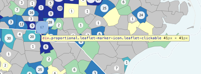
Even though raster basemaps tend to be designed for multiple scales (often 18ish unique scales), it's easy to overlook the importance of doing this for vector data in web maps, too. Our map needed to work from continent level all the way down to street level, at 15 or so scales, half of which include the vector choropleth layer. We ended up using three levels of generalization, thanks of course to MapShaper.
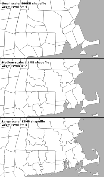
Beyond good practices, generalization was important for performance. Note the file sizes on the image above. At the smallest scale, all of the country is visible, meaning we need to download and render all of the vector data. If we didn't generalize the geometry, that would mean the whole 13MB!
Each of the three generalization levels is a different layer in TileStache. Rather than implementing three separate layers in Leaflet, we added a couple of methods to the TileCanvas layer to allow for several different source URLs, automatically switching between them as the zoom level changes. We could give it an object like this and not worry about it thereafter:
var countiesURL = [

		{url:tilestacheBase+'counties-smallscale/{z}/{x}/{y}.geojson',min:0,max:4},

		{url:tilestacheBase+'counties-medscale/{z}/{x}/{y}.geojson',min:5,max:7},

		{url:tilestacheBase+'counties-largescale/{z}/{x}/{y}.geojson',min:8,max:20}

		];
Thematic web maps: getting better!
There's much more to the new Why Not The Best map than has been described above, so go check it out. To say nothing of the many design challenges, these were just a few of the most interesting technical challenges, which, thankfully, Leaflet and TileStache made it pretty easy to solve. (Now if only it were as easy to avoid the Mercator projection in choropleth web maps!) It's been a good experience in learning how non-Flash web mapping libraries have improved for thematic cartography, even if they don't support it natively. If you're new to this, check out the Leaflet documentation and tutorials, as well as TileStache and our blog post tutorial on how to set up a tile server.

