Poking around on Twitter today I saw a couple mentions of this map from ESRI, next in what I'm sure will be a long line of maps about Superstorm Sandy. This was the first thematic map I've seen about the storm but it struck me as hugely ineffective. Comparing 2 variables (census statistics vs. storm impact) requires a bivariate map. Mapping one variable and hiding the other one behind a mouse action makes it impossible to see any trends or gain any meaning from the two datasets as a whole. Unless you're interested in just a couple of counties or having the clicking abilities of a 14-year old Farmville addict, the relationship between the data will be lost.
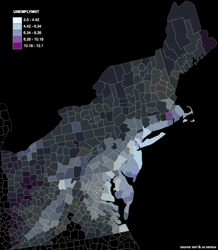
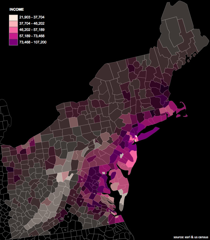
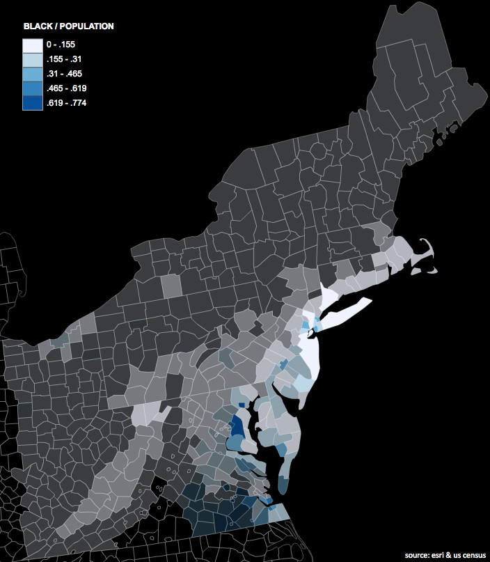
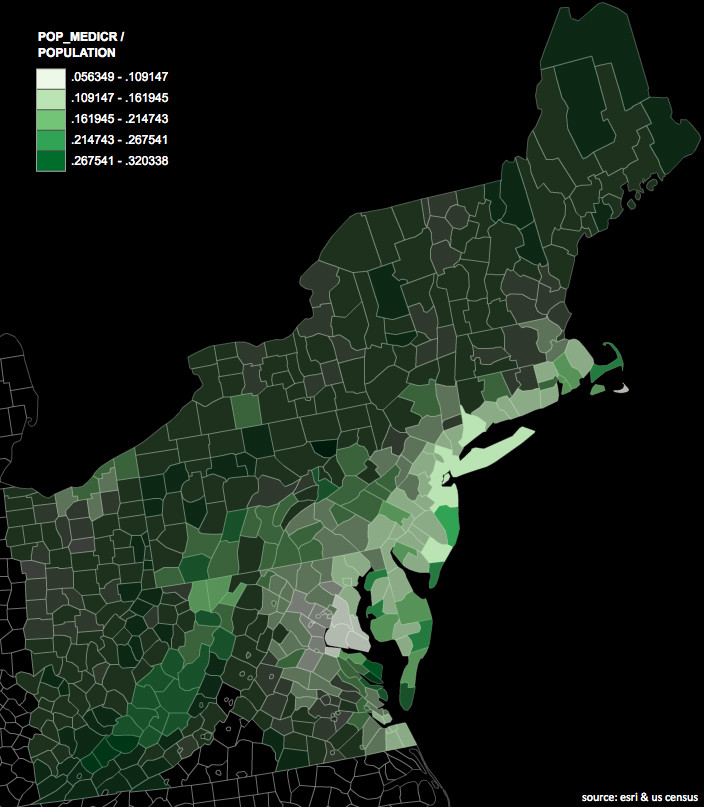
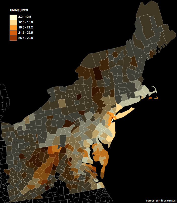
After manually replicating the data from the map, I put together some quick maps of a few value-by-alpha maps (here's a stellar though academic introduction from its inventors) using indiemapper. VBA maps were originally conceived to visualize election results by visually-weighting (using alpha) red / blue colored counties by their relative populations. The end result gives you an overall sense of the election by making those counties which contributed more to the result (because of their higher population) more visually prominent.
These maps use the same technique except now alpha is controlled by storm impact. Areas with a higher level of impact are more visually prominent that areas of less impact. These maps hopefully quickly give you an understanding of the population affected by the storm. While I'm sure this was the intention of the ESRI map, because of some misplaced interactivity trumping thoughtful cartography, it can't say the same.
Median Income
Black Population
Percent Residents on Medicare
Percent Uninsured
Unemployment Rate
