Yakkin' 'Bout Mappin'

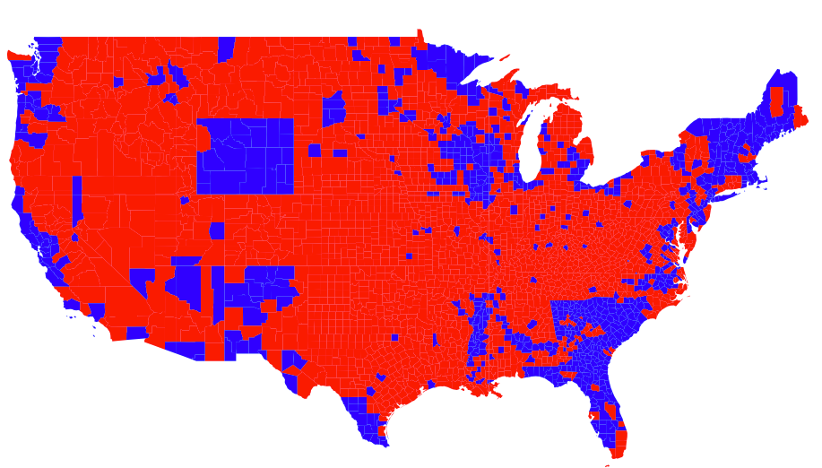
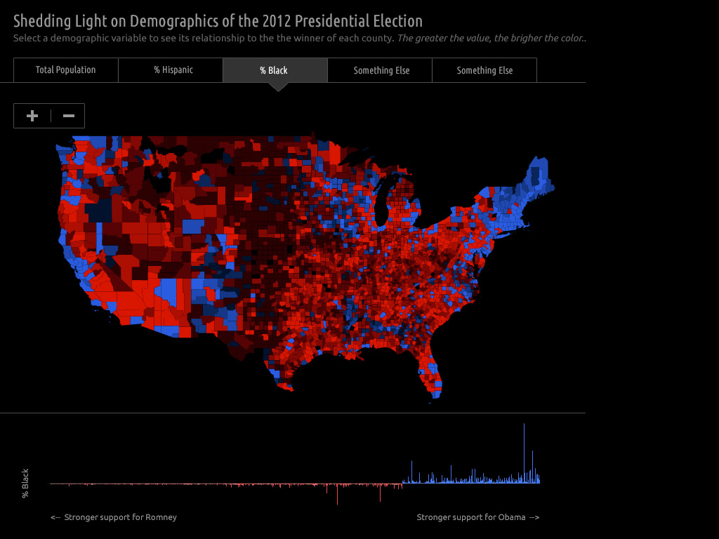
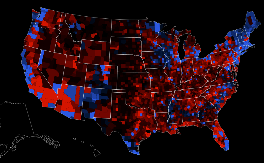
Last week, we made an election map that shows how counties voted in relationship to several different demographic variables. It gave us a chance to take value-by-alpha (VBA) mapping one step further than we did after the 2008 election. Back then, we produced a nice little static map. Our new, interactive map is a bit more substantial, having a user interface, loading data, including a charting component, and displaying a data probe with details on mouseover.

Unlike our typical interactive mapping project, this one was rather small in scope. We wanted to make something that could come together quickly and easily and be seen before people stopped caring about the election. There was also no client, so we were free to work however we pleased in order to get done fast. In other words, no one was telling us that we had to make this work in IE7! All said and done, we devoted twenty-eight hours to the map before sharing it on Twitter.

Because the project was short and received a sustained, concentrated effort from each of us, a behind-the-scenes look at its development seems like it might be of interest to other mapmakers. If nothing else, it serves as an example of how three people, working in different parts of the world, interact together online to get work done. Something for the human geographers out there, at least, if not for the cartographers.

What follows is our Campfire transcript covering the duration of the project. Outside of this transcript, there was no video, voice or other written communication between us. The language here has been smoothed out and edited somewhat in order to reduce each thought, question, or decision to its essence, although there are some direct quotations thrown into the mix.

We think about every project, large or small, slow or fast, client or not, in terms of three primary components: data, design, and code. They are essential ingredients of web cartography and what any aspiring cartographer should learn. To that end, the transcript below has been tagged with colored dots that represent the predominant component in play at any given moment in time, plus a yellow dot for instances when our thoughts were mostly on project planning or management issues.

As you scan through, some patterns to note are:

  1. Entries pertaining to all three components, as well as a basic project plan, are found in the first 30 minutes.
  2. The number of entries about data start out heavy and all but disappear on Day 2.
  3. Entries about code pick up steam toward the middle and end of the project.
  4. Entries about design appear rather consistently throughout the project, with a run of back and forth data-design entries in the middle of Day 1 and a similar back and forth run of code-design entries at the end of Day 2. Interesting!

Planning = Planning
= Data
Design = Design
Code = Code

Day 1 - November 7, 2012

8:15 AM Planning "Want to make a map?" -Dave
8:15 AM Planning "Maybe just this one last time. Then I'm retiring." -Andy
8:20 AM Design How about an election-by-demographics map using the value-by-alpha (VBA) technique?
8:25 AM Code What's the best technology setup for this? (Polymaps? CSS?).
8:25 AM Planning Let's get started this way:</p>
  • Andy: prepare the data
  • Dave: get interactive setup going
  • Ben: put together an interface design
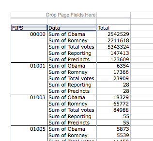
8:30 AM Data I'm exploring election data from The Guardian in Excel.
9:05 AM Data What kinds of demographic data would be worth mapping? Which are effected by geography?
9:05 AM Design What kind of chart should accompany the map?
9:15 AM Design Margin of victory versus demographic variable by county sounds like a decent chart.
9:25 AM Data Here's a Shapefile with geographic and election+demographic data.
9:25 AM Planning We need to share this file with the world.
9:25 AM Data Let's explore the Shapefile in indiemapper.
9:30 AM Design We should wait and share this data once it's all cleaned up.
9:40 AM Data Here's a second version of the Shapefile with our map data.
10:00 AM Data What's the best way to store the data? A series of JSON files?.
10:05 AM Data What scale is appropriate for the county boundary data? Will we need to zoom in?
10:10 AM Data There's no need for detailed, large-scale county data.
10:10 AM Data Let's store data and geography separately.
10:10 AM Data I'm preparing the data in Google Refine.
10:20 AM Design Anyone have good red/blue color specs?
10:25 AM Design Here are two 5-class sequential color schemes, one for red and one for blue.
10:30 AM Data Looks like there are problems with this data.
"It has Obama winning most of Wyoming handily." -Andy
10:40 AM Data "In Colorado, that's showing the Constitution Party candidate!" -Andy
10:55 AM Data I'm fighting with pivot tables in Excel. Trying to get sums into columns instead of grouped in rows.
11:00 AM Planning "Back in a moment... need to go do something to my car before it starts raining." -Andy
11:45 AM Data Here's a third version of the Shapefile with our map data.
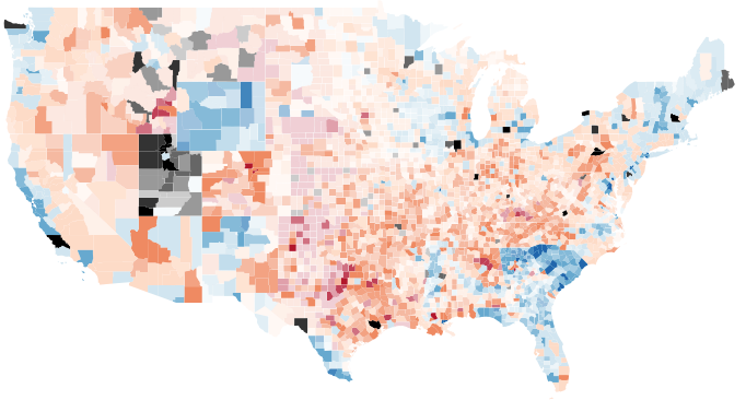
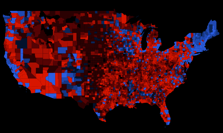
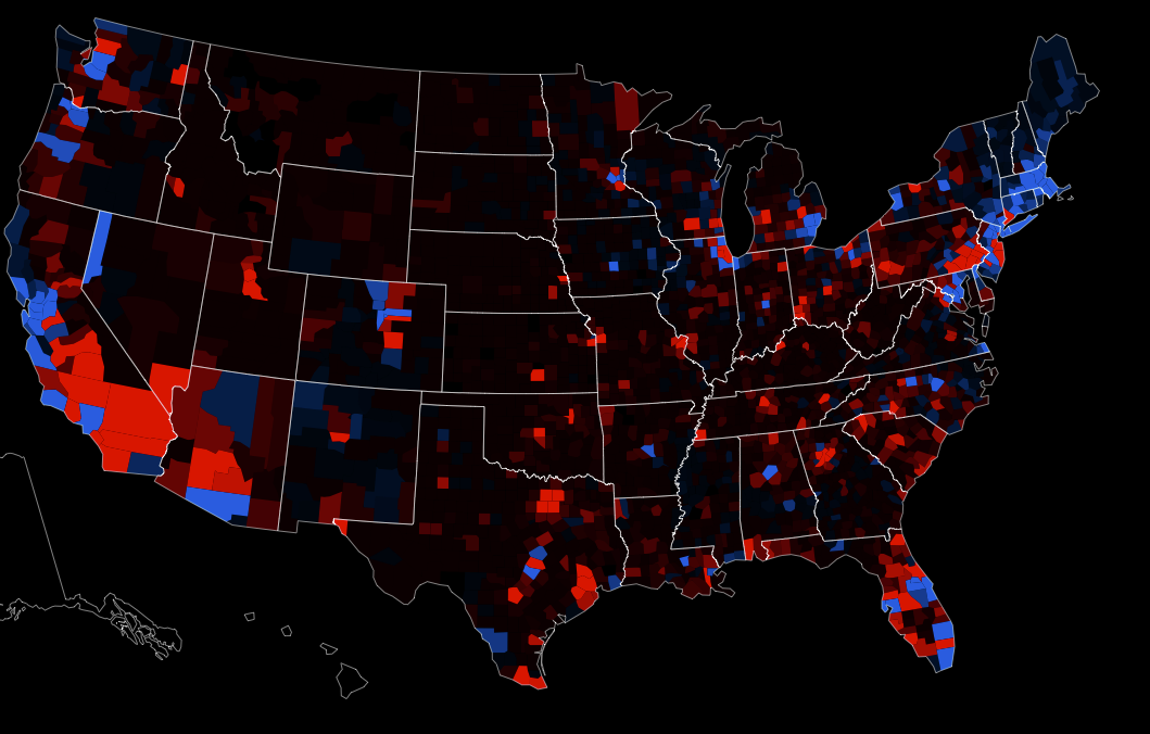
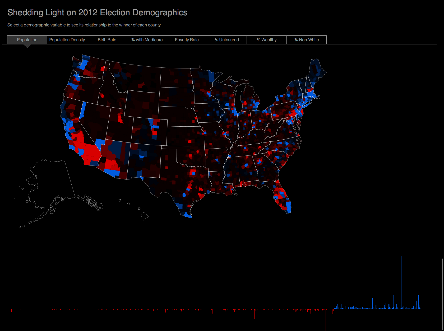
11:50 AM Design Here's a VBA map showing county margin of victory by population.
11:50 AM Design Switch to black background.
11:55 AM Design Let's go with 2-class winners. It's too hard to see both change in color and alpha.
12:05 PM Design Here are new red and blue color specs.
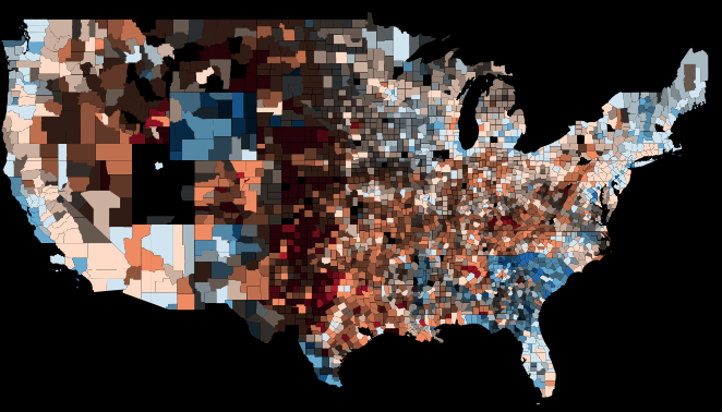
12:10 PM Design Here's a new VBA map showing county winner (2-class) by population.
12:10 PM Design "That's looking pretty okay." -Dave
12:10 PM Design How is population classified? The map looks kinda bright, making it hard to see population differences.
12:10 PM Design Should we go with equal-interval or unclassed population instead of quantiles?
12:20 PM Data "Argh, this stupid data. Chicago is red!" -Andy
12:25 PM Data For unclassed data, opacity should be a percentage of the max, right?
12:25 PM Design "Los Angeles is ruining it for everybody." -Dave
12:30 PM Data How about capping the population values at a certain threshold?
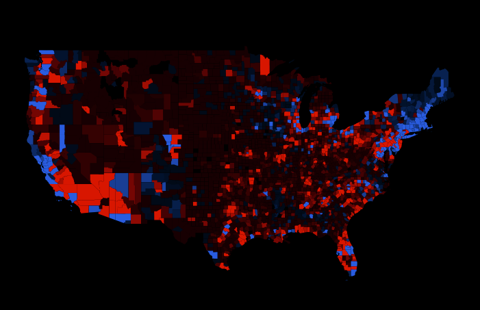
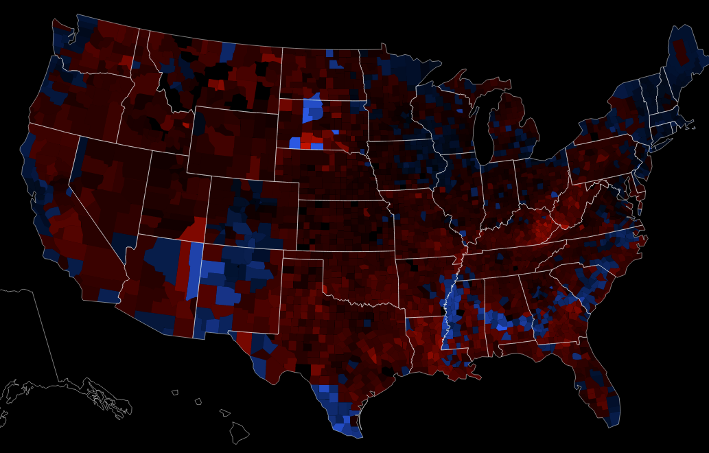
12:50 PM Design Here's a new VBA map showing winner by population, capped at the 90th percentile.
12:55 PM Data What about going with population density instead, in order to control for county size?
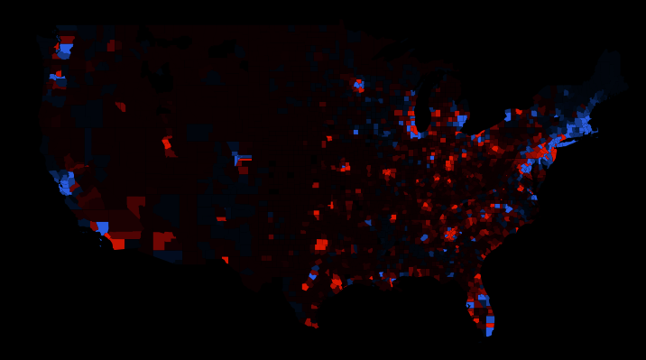
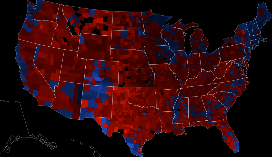
12:55 PM Design Here's a new VBA map showing winner by population density.
1:20 PM Data Here's the fourth version of a Shapefile with our map data.
"Gave up on Excel, used a Python. Er, Python, not a Python. No snakes involved." -Andy
1:25 PM Design The user interface mockups are done.
2:00 PM Code Maybe we ought to go with D3 so we can use a map projection.
2:05 PM Design Does using VBA even make sense for mapping demographic variables? What if there is no real correlation between the demographic variable and county winner? VBA might be best for things that are magnitudes or certainty.
2:15 PM Design It's worth a try. In the end, it's just a bivariate color scheme.
2:25 PM Data Here's the final version of the Shapefile with our map data.
2:25 PM Planning Let's tweet that data.
2:25 PM Data I'm still not sure if population or population density makes more sense here. If we think of VBA as a cartogram, shouldn't we just map totals?
3:05 PM Design Does this map need a legend?
3:10 PM Planning How should we proceed, now that we've got data and an interface design?
3:15 PM Planning What exactly are we trying to make here? A static map viewer? A basic interactive map with data probe and linked chart?
3:20 PM Code If it's a static map viewer, how about using indiemapper + SVG?
3:25 PM Code There are problems getting a good data probe and chart that way, plus the SVG is too huge.
3:30 PM Code D3 and JSON is sounding like the best approach.
3:45 PM Code The D3 shell is made.
"It was an election day sweep for President Robert Smith of the Goth Party." -Dave
4:10 PM Code Here's what it looks like with colored data.
4:20 PM Data The JSON files are ready.
4:30 PM Planning Let's divide up the remaining work (data probe, data loading, chart, and ui).
4:40 PM Design Let's put the project data on SVN so it's easier to work together.
4:55 PM Data Any other interesting demographic variables we should be mapping?
5:15 PM Data Here is poverty:
5:30 PM Data Here is uninsured:
6:10 PM Data Data loading is complete for five demographic variables (birth rate, medicare, poverty, uninsured, wealthy, and non-white).
9:05 PM Design We should go back to quantiles for the demographic data so the maps look balanced with respect to alpha.
9:10 PM Design We probably need non-linear alpha steps to make them look right. Differences should be optical, not mathematical.
9:40 PM Data Can we get data indexed by FIPS code in those JSON files?

Day 2 - November 8, 2012
8:30 AM Design Yeah, let's do 10-class quantiles for the demographic variables.
8:45 AM Data Get rid of Alaska and Hawaii. There's no data for those in the source.
8:50 AM Code The 10-class quantile maps are online.
8:50 AM Design They still look too bright overall.
8:55 AM Data Let's problem solve any data issues. Class breaks and data distribution look okay, at least.
9:05 AM Design Let's try that non-linear alpha scale to even these out visually.
9:10 AM Design "That's hella-nicer." -Dave
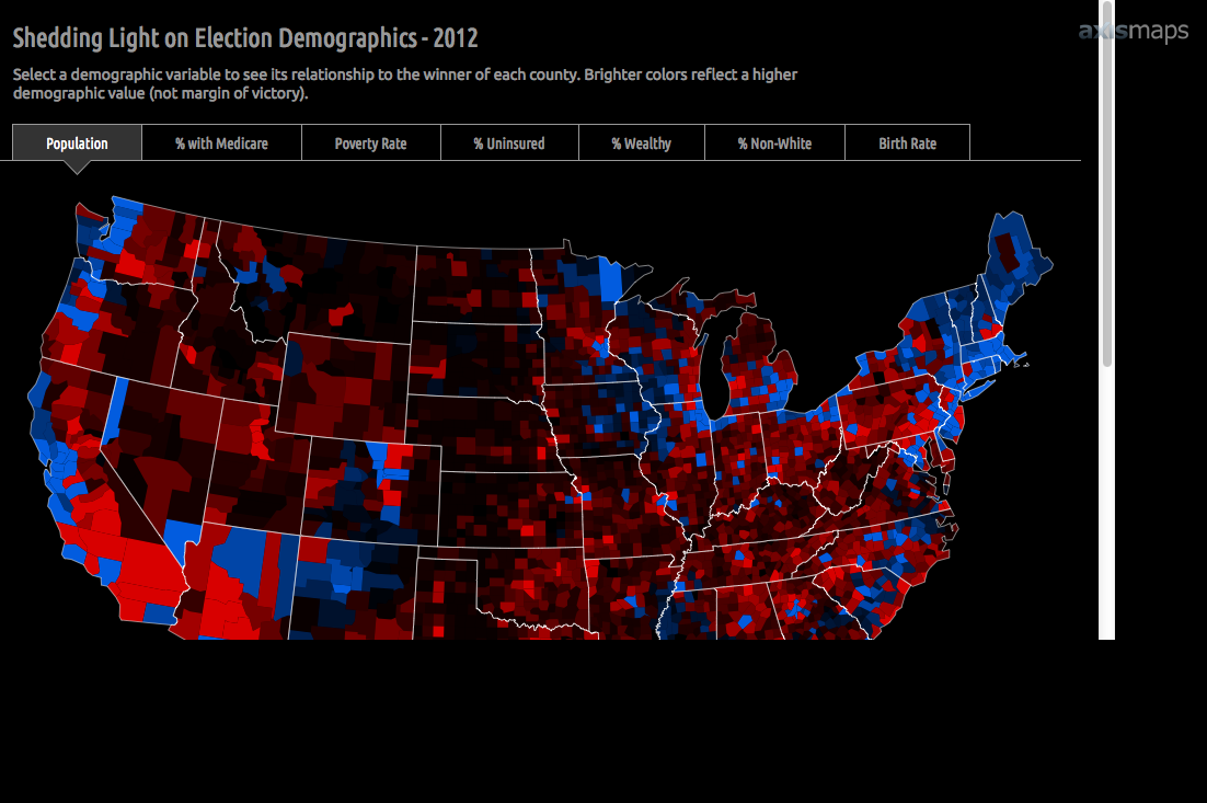
9:15 AM Design What kind of instructions will people need to understand these maps? E.g., Brightness is NOT margin of victory.
9:25 AM Code A basic chart is working.
9:25 AM Code How can we easily link the map and chart on mouseover?
9:30 AM Code Try looping through counties to find matches.
9:30 AM Design Here's a new, cleaner, down-pointing triangle PNG for the user interface.
9:30 AM Code How's that chart looking?
9:35 AM Code Are the fonts in the mockup on TypeKit?
9:40 AM Design Yep, that's Ubuntu Regular and Condensed.
9:55 AM Code We need a red and blue PNG for the bars in the chart.
10:10 AM Code The new fonts are in.
10:25 AM Design We need a better way to do the x-axis labels on the chart. They get buried and probably aren't very clear.
10:25 AM Code Let's drop in an Axis Maps Logo.
10:30 AM Design Does the page feel too tall? Can we fix that without shrinking the map?
10:40 AM Design Here's a mockup showing new chart labels.
10:55 AM Code Implemented the new chart label design.
11:00 AM Design Let's put in an active state for the selected variable text in the UI.
11:05 AM Code Implemented the new active state.
11:05 AM Design There's a problem with positioning the divider in the new chart labels design. How about a text pipe instead?
11:15 AM Code Implemented chart label tweak.
11:20 AM Design Horizontal page scrolling won't go away.
11:25 AM Code The scrolling problem is fixed.
11:25 AM Design Let's give the map a final look over.
11:30 AM Code Let's stick in a new map title and add some instructions for users.
11:30 AM Design Dang. The page gets cut-off in Firefox.
11:45 AM Code The FF page problem is fixed.
11:50 AM Design Dang. The chart isn't showing up in Safari.
12:05 PM Code The Safari chart problem is fixed.
12:10 PM Planning Let's tweet this map to the world!