Last month at the annual NACIS conference, I gave a presentation called "In Defense of Bad Maps" — an attempt to demonstrate the value of prolific, popular, yet supposedly "bad" cartography on the web; and to propose a small bit of advice on how to approach cartographic sacrifices in the real, professional world.
This was a last-minute submission, not without occasional regret, and as such there are no especially strong arguments here, but my hope the is that the talk provided one or two things to think about as web cartography continues to grow and evolve. Presentation slides have been posted, but as usual they don't mean much without the spoken component. Here's a summarized version.
Now, I was going for something a little trollish, at least in the title, but I'm too mild-mannered (by day) to go on a true rant, so the provocation—while evident, I hope—is minimal. This is the tl;dr synopsis:
- There are "bad" maps on the web, they sometimes become very popular in spite of (or even because of) being bad, and they bother cartographers.
- "Bad" does not mean they fail utterly and are without use, however.
- All of us commit cartographic crimes, as tradeoffs and sacrifices are part of any real-world job.
- We can be wise and responsible in practicing "bad" cartography to good effect.
- We should reconsider how we conceive of web cartography, and perhaps break away from the rules of old.
Bad maps
A "bad map" could be a lot of things, but here I'm focusing on four categories, a few of which I suspect are related the potential of a map to become popular among a web audience.
- Breakin' the law: Rule-breaking maps are easy to identify and pick on. Mercator projection? More like jerk, hate yer projection, amirite??
- Lack of design: It's the dreaded pushpin map, which is the web equivalent of the godawful GIS map with a north arrow the size of a baby. It's easy to accept defaults and crank out a web map in seconds, but defaults are rarely good across the board.
- Form over function: Some maps pretend to say something but really don't—they're eye candy with no real value added by the cartographer.
- Code over content: Similarly, there is, uh, the code candy map. A map is presented as something useful and important, but in fact exists mainly as a demonstration of its underlying technology. (This "crime" is perhaps more often committed by the people who promote the map, not the cartographer.)
Who cares?
We care about this because, well, it's what we do. It's what we've done for hundreds of years. Good cartography has been figured out, and we don't want to take steps backward. Furthermore, perhaps, we've so bought into the idea of maps being powerful that we feel bad cartography may even be dangerous in the long run—or else we just want to assert how important and powerful we are as cartographers.
And, in a point to which I'll later return, I think we look for bad maps because we don't really embrace the web; we treat it as an obstacle to overcome. Try to find literature on web cartography that doesn't give substantial treatment to limitations: screen resolution, colors, projection, and so on. Why did we cheer when D3 came along? We cheered because it allowed us to overcome the Mercator projection, not because it opened up so many new possibilities.
Why we do it
When it comes to deliberate carto-crimes, we make bad maps because of money. A client or boss asks us to do something stupid, and we do it because we like having a job. Or we do something bad but eye-catching, and the attention leads to work. Or we don't have the budget or time to do a good job, so we do something quick and not so good.
Or, besides money, we make bad maps as part of a process of exploration. We've always done this. It's just that it used to mean printing something out that never left the confines of our cubicles, except in the trash. The web is a much more public and open environment in which we're encouraged to publish and share our processes, which may include bad cartography.
Bad maps are no big deal
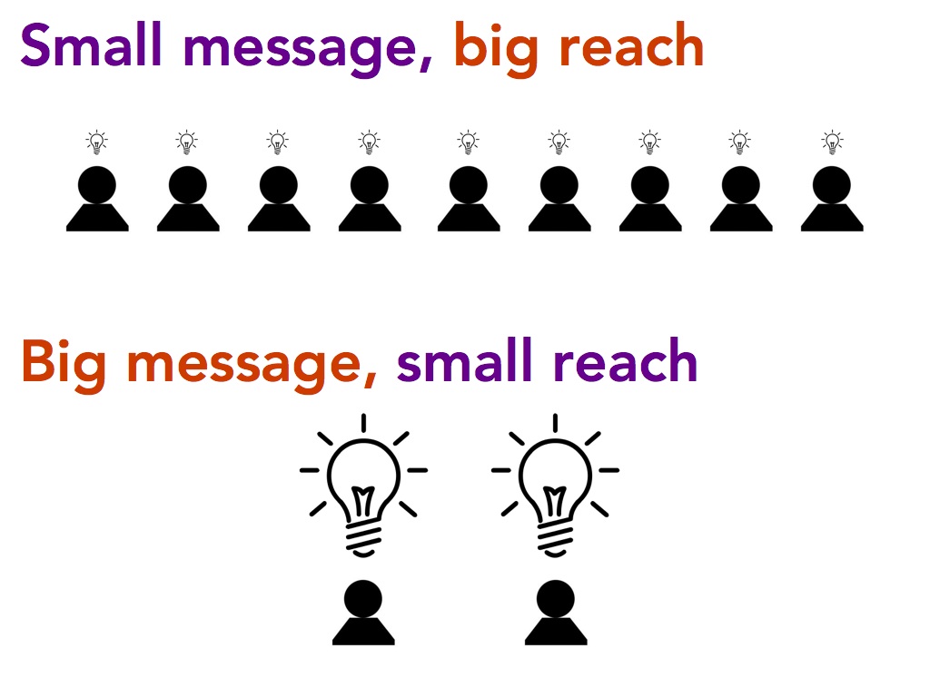
My conjecture is simply that most "bad" maps under-inform rather than misinform. That is, they don't entirely succeed in their purpose, but they do offer some small takeaway. And, if the sacrifices in cartographic integrity mean that the small message is more likely to reach a wide audience, the map is valuable.
The open, public exploration process is important, too. Maps needn't always "say something" but rather can be used to prompt questions and discussion. Having more maps out there, even if many of them are technically bad, inspires us to think about a variety of issues, and additionally drives a sort of design competition that will lead to all-around better cartography.
Wise uses of bad cartography
We can, then, judiciously and wisely practice bad cartography for good reasons. Here are some ways:
- Know the basics. Yes, you should learn basic cartographic rules and best practices. Ignorance is no reason to do anything. And, in our experience, cartographic expertise is respected. Our clients trust our decisions because of it.
- Design in proportion to meaning. If your map is meant for a silly fluff piece that intends to do no more than raise a smile for two seconds, then sure, go ahead and make it a dumb non-normalized Mercator choropleth map. If it's meant to explore a complex and important topic, then give it the proper thought toward good, sound cartographic design.
- Be clear in purpose. If your map is for exploration or experimentation, let that be known. If it's a code demonstration, bill it as such. Don't pretend that a map is saying important things about its subject if you didn't design it to do so. On the web, we can't control every context in which our maps appear, but we can give them the right start and help prevent them from being carried away for the wrong reasons.
- Accept feedback. Nothing on the web is permanent or final, and especially if we are trying new things, we should be willing to change them based on feedback from others. You don't always have the time or resources to change something after you've published it, and yes this is the internet so people are probably going to be awfully rude in their comments, but you can still learn something for your next project.
- Be smart in responding to client/boss requests. If they request something bad, first try to talk them out of it or propose better alternatives. Try some smart business maneuvers to discourage them or shift the responsibility for the decisions. When those things fail, then give in and do the bad thing. It's not the end of the world.
- Choose your battles. Continuing on that last point, prioritize the elements of your design. Not everything is worth defending when a client asks for a change. For example, we'll give up on the look of UI controls most easily, then non-spatial content, then basemap symbology, and then we'll most strongly defend thematic symbology. We'd rather have a map be not that good than be wrong.
Moving forward
What I mean to say is that bad maps are nothing to worry about, and are not a plague to fight. But we have a chance for things to be different and better, and to escape the same old types of critique.
Let's study and understand the use and impacts of web maps specifically on massive, public audiences. What is the actual impact of a "bad" but popular map? What makes a map popular in the first place? I'm looking forward to continued attention on web map use from the academic side of cartography. There's work from Ian Muehlenhaus on online persuasive cartography, Sarah Battersby on Web Mercator, and even more casual folks like Marty Elmer on viral maps.
Let's continue to educate users on map reading. I feel confident in my use of a bad map, but maybe that's because I know maps well. That should not be a privilege. More map literacy means more trust of users, which means less dumbing down of maps because we fear users won't understand them, but also less fear that "bad" maps will be misused or dangerous.
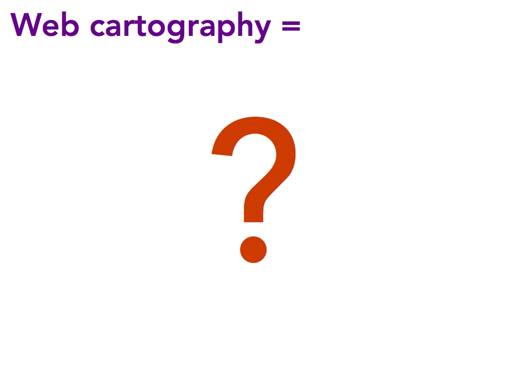
And, importantly, let's rethink what web cartography is. We cartographers are in a print mindset, no matter how much we think we are web mappers. The rules of web cartography are a mashing together of a bunch of different things: the principles of print cartography, web design, computer science, statistics and "data science," and whatever else. Crucially, it's all founded on cartography rules that were developed for static maps. We don't need to start over, but let's at least have a thought exercise: what would web cartography look like if we didn't base its rules and principles on print cartography? The web is different in so many crazy ways from paper; should the rules really be the same?
I used to be in that camp that always says, "there isn't a new cartography; only new underlying technology." But I've been backing away from that lately. True, at the moment the bulk of web cartography isn't anything truly revolutionary—it's only modern means of producing, presenting, and interacting with the same types of displays we've always had. (Think choropleth, proportional symbols, etc. We jazz these up considerably over paper versions, but fundamentally the cartography is the same.) But maybe there is a new cartography out there. Maybe our fidelity to the rules of paper prevents us from discovering it. And maybe that's why born-and-bred cartographers are not the ones leading the charge these days.
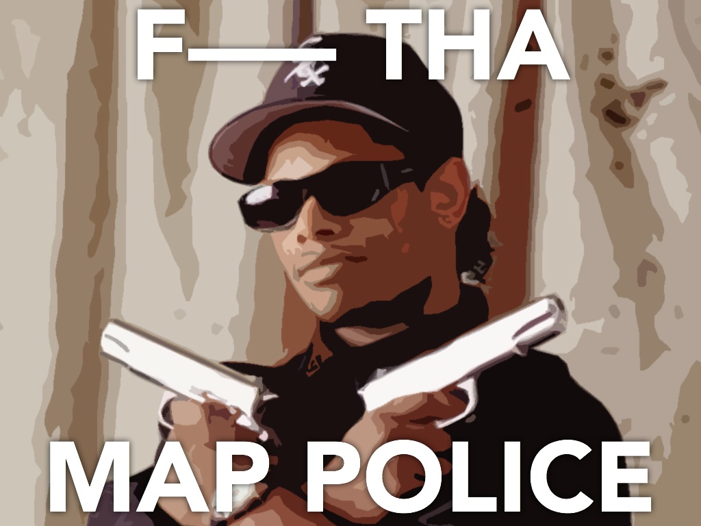
 Above map by Marty Elmer