One of our recently completed projects is a new Geography of Jobs map for TIP Strategies. Have a look at it, and read what they have to say about it.
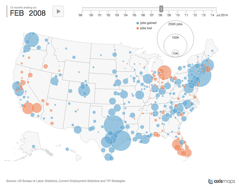
It's a month-by-month map of job gains or losses over the prior twelve months for most (or all?) of the metropolitan areas of the United States, from 1999 to present. Proportional circles are colored to indicate gain or loss, and the map can either be animated or controlled by moving a slider.
This is a very straightforward project, and we like it as an example of animated proportional symbol mapping using the D3 library. Data are loaded from a CSV file and plotted on a map drawn with D3's convenient Albers USA projection, which automatically handles Alaska and Hawaii insets. Then we use basic transitions and timers to create animation. The timeline slider uses Bjørn Sandvik's d3.slider plugin.
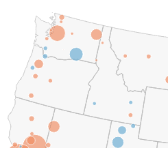
Smooth transitions between frames are achieved by tweens (created with D3's transition method) that are the same length as the frames. Although this may obfuscate specific point values, tweening improves change blindness problems, and is just plain nice to watch. Compare the smooth transitions:
With an abrupt version:
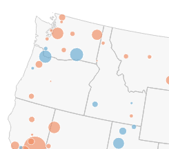
Perhaps the latter would be easier to interpret numerically, but in general we expect people to retrieve exact values by poking around the map, rather than watching the animation.
In any case, view source on the map if you're looking for code examples of animated D3 maps!