Last month, Andy gave a talk at the OpenVis Conference entitled Blindfolded Cartography. Essentially, things to look out for when designing maps (especially interactive ones) so that when real data comes in, the map/design/page doesn’t get wonky. Things like too long text, missing data, skewed data, etc… The last week or so, we’ve been working on adding accessibility features to one of our projects and wanted to share a few thoughts and lessons on Cartography with an actual blindfold.
First off, what are accessibility features and why should you care? Accessibility features are features and general design patterns that allow people with disabilities to view and interact with your content. This can range from simply allowing keyboard navigation all the way up to screen readers. Now, why should you care? We can get fairly pedantic about whether a font size should be 16pt or 18pt, should this light brown text be #f2e1cb or #f8f1e7, should this div have a margin of 20px or 22px? If we as developers take that much care about things that a lot of users aren’t going to consciously notice, shouldn’t we take at least some care with things that some of the users are really really going to notice?
So what categories of accessibility should you be aware of? There are 4 areas that I’m going to talk about; I’m sure there are more, but these cover the majority of cases that I’m currently aware of. Color, keyboard navigation, ARIA, and Screen Readers. Also, I should note, I am not an expert in this. What follows are the notes of a developer brand new to the area of accessibility.
Color
Color can cover a whole host of issues, but the main areas to watch out for are color blindness and low contrast. About 10% of all males have some form of color blindness, of which the most prevalent is red/green (protanopia) color blindness. That’s a big percentage of your users. Simple fix – don’t put red and green right next to each other. As a mapping company trained in classical cartography techniques, this one is pretty much embedded in our blood and bones. Other versions of color blindness do exist though. It’s up to you to decide how many versions you want to design for (since the more you cover, the less options you have for design). A good site to figure out which colors you can use is Colorlab.
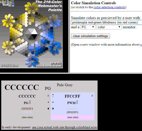 Magenta vs Gray for Red/Green color blind people
A color tool for Cartography specifically and which has colorblind options is ColorBrewer (which Axis Maps hosts).
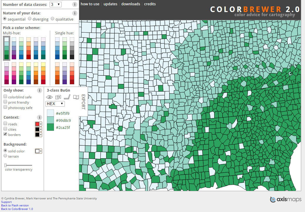 Color Brewer
The other major category related to vision is contrast. Many users have a harder time distinguishing low contrast color pairings. For example, #ccc color text on a #999 background. You can check contrast between colors using the Color Contrast Check tool.
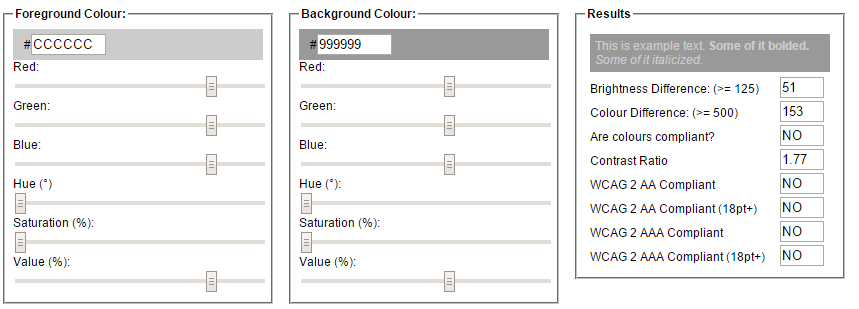 Contrast Checker - #999 vs #ccc
Testing: The best way to test for color blindness issues is to have a someone who is actually color blind look at the site (and since 1 out 10 men are, there is a good chance you know someone who is). Barring that, run the various colors through Colorlab and the Color Contrast Check tool.
Keyboard
There are two types of people who use the keyboard only; the visually impaired and those with a disability making use of a mouse impossible (for those of you wondering, as I did, how you can use a keyboard but not a mouse, many alternate input devices emulate a keyboard but not a mouse – e.g. Sip and Puff devices).
There are a couple of key points to keep in mind when designing for keyboard users. Most browsers are already pretty good at keyboard navigation, IF the HTML is organized in a logical order. While this isn’t a problem when writing HTML for the most part, where you can run into issues is with adding pieces via Javascript. It’s really easy to add a bunch of divs with JS and as long as they look in the right place, ignore the fact that they are not keyboard navigable. One major gotcha, div is not keyboard navigable by default. You have to add the attribute tabindex="0" to make it navigable. a links and button elements are keyboard navigable by default so those don’t need an extra tabindex attribute. Best practice is to make all clickable areas that go somewhere a links and all clickable areas that trigger functionality button elements. Unless absolutely necessary, don’t use div for buttons/links.
tabindex=0 simply adds the element to the keyboard navigation index. Sometimes, especially with adding elements via Javascript, the default tab order ends up not really being a logical one. In these cases, you can override the tab order by changing the tabindex to any positive numerical value. A tabindex=1 will come before tabindex=2 and so on. This is not considered good practice, but in production, sometimes this ends up being the only way without a complete rewrite of the code.
Testing: Keyboard navigation is really easy to test. Just use the site with only the keyboard. Can you access all the functionality? Can you get to all the links and do they work by pressing space or enter? Are all the buttons/divs/links/etc… in a clear and logical tab order?
ARIA
ARIA stands for “Accessible Rich Internet Applications” and is designed to let screen readers and other assistance software help make interactive pages usable by all users. ARIA tags are usually element attributes such as aria-hidden and role. Like other element attributes such as id and src, there are attributes for pretty much every element and they apply differently. I’ll mention a few that are good to know about:
aria-hidden- makes a particular element hidden from screen readers. This is useful if, for example, you have a description that is truncated for display reasons, but is expandable through mouse interaction.
HTML
Two divs. One with a class of hidden making it all but invisible to the naked eye, yet still there. The other one is the normal div that everybody sees, but with an aria-hidden="true" attribute to hide it from screen readers so they don’t repeat themselves.
<div class="full-description hidden">Blah blah, this is the full description and is not truncated with ellipsis</div>
<div class="description">Blah blah...</div>
CSS
Hidden class that reduces the element to 1px by 1px. The clip and overflow: hidden hides everything that goes out of the 1px by 1px box.
.hidden{
  position: absolute !important;
  margin: 0 !important;
  padding: 0 !important;
  height: 1px;
  width: 1px;
  clip: rect(1px 1px 1px 1px); /* IE6, IE7 */
  clip: rect(1px, 1px, 1px, 1px);
  overflow: hidden;
}- As seen above, the use of the
.hiddenclass is very important. This allows screen readers to “see” something, even though people can’t see it. - Using a
hiddenclass is different than usingdisplay: noneorvisible: hidden. Changing the display to none or the visibility to hidden takes the element out of the screen reader’s view. role- ARIA-role w3 page - this one can get complicated as there are four different categories that can be used, but the idea is that you can tell the screen reader what the element is for. The four categories are:- Abstract Roles – Do not use.
- Widget Roles – Define what the element is to be used for. This is helpful when, for example, you have
divoperating as abutton. Most of the time, you should just mark it up as a button, but if you can’t, then you can assignrole="button"and it acts as a button to screen readers. - Document Structure – Defines what structure the element has. This is so the screen reader can take special care with the pronunciation and navigation of that element. For example, the
mathrole tells the screen reader that mathematical formulas are in coming and to take appropriate action (such as saying “eh-ex-squared” instead of “ax-squared” when ax2 is encountered). - Landmark Roles – Define the different areas of the document (such as
navigation,main,search, etc…) so the screen reader can jump between them easily.
alttags – This is pretty well known, but I’ll reiterate. Put descriptivealttags on all images so that the screen reader knows what the picture is about. Make sure it’s short though, no need to wax eloquent on all the little details of the logo.- links – This is probably the one I’m most guilty of. Don’t have links where the only linked text is “Click here.” In context, this is fine. But out of context this doesn’t make any sense. And many screen reader users navigate by pulling up a list of links in which only the text of the actual link is available, so the links very well may be spoken out of context. Don’t say “click here”, say “Link to Annual Report PDF”. Oh, and don’t leave the full link in visible text or the screen reader will read “double-u, double-u, double-u, dot …”.
Testing: Testing ARIA tags is mostly about testing things with a screen reader. The testing part of the Screen Reader section below has more information.
Screen Readers
And now to the most well known accessibility genre, the screen reader. Screen Readers work by reading off the text from a web page. How they do this is different for each one and can devolve into a similar situation as the early 2000’s with web browsers – each one its own special flower. There is some standardization and it is getting better, but you will still run into situations where different screen readers read the same markup differently (especially when Javascript gets involved).
The four main ones that are relevant to interactive web sites are JAWS, NVDA, VoiceOver, and ChromeVox. JAWS, the most widely used screen reader, is a commercially licensed piece of software for Windows, especially popular in academia and government. NVDA is an open-source program for Windows. VoiceOver belongs to Apple and is bundled with OSX. ChromeVox is a Google created plugin for Chrome that is really helpful for developers (though because of its integration with Chrome, it does create some headaches as seen below).
Each screen reader sees the world slightly differently. This can create some head bashing moments as the notes below make clear. They were filed as apart of a Github bug report for the accessibility upgrade I was working on this week. The list was a long list of images where each one, on click, would open up to a carousel widget to view more images from that spot. The carousel widget had a left and right HTML button that were supposed to be navigable by keyboard arrows, mouse clicks on display arrows, and keyboard “enter” when the focus was on a display arrow.
Tabbing through list
- Chrome - reads each section when the section is focused, reads header
- FF - reads all the sections when the entire list is focused (i.e. on normal tabbing through), reads each section when focused, does not read header when
tabbedto, but does read header whenshift-tabbedto - IE - reads each section when the section is focused, reads header
Arrows
- Chrome - does not read the arrow
aria-label, reads the title and description of each carousel image after interacting with the arrow - FF - reads the arrow
aria-label, when the focus is shifted to a new arrow (i.e. at the beginning or end when the current arrow is hidden) reads the new arrow, otherwise, doesn’t read anything on interaction - IE - same as FF
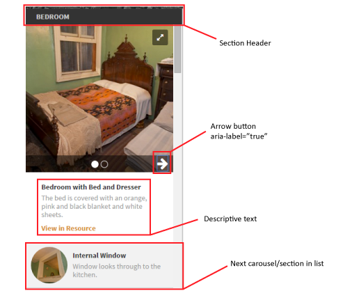 Screenshot of the carousel with the problem arrows
For the life of me, I couldn’t get Chrome to read the aria-label on the arrows, until I took the ChromeVox tutorial and realized that screen readers don’t just use tab to navigate. They use the arrow keys, the plus/minus keys, and a whole host of other shortcut keys. Tab is just for interactive elements (and apparently Chrome/ChromeVox was not reading the aria-label for interactive elements). This is by design. Keyboard only users just need tab to move through the interactable elements. They can read the non-interactive elements already. Screen Readers use other keys to move through the non-interactable elements such as paragraph blocks.
Which brings me to the final point, Screen Readers are complicated pieces of software that work in ways that are very different conceptually than how the majority of users see and interact with a web site. The best way to test your site is to get someone who knows how to use a screen reader properly, to test it. Failing that, make sure that you are at least somewhat versed in how your chosen screen reader actually works. It’s more than just tabs.
Testing: ChromeVox is a free plugin for Chrome that is really easy to setup and use. Make sure that you go through the tutorial first though as there are facets of screen reader navigation that are not necessarily intuitive for people used to mouse navigation. VoiceOver is included with OSX so that should be easy enough to include in testing if you are using a Mac. NVDA is free software as well, though for Windows. By using one or all of these, you should run into any bugs that will affect screen readers. Things to look for: can you hear all the content? Is anything behind an “interactive wall” that is not accessible with keyboard/screen reader? Do all the images have alt tags so you know what is going on without seeing the actual image?
Conclusion
Accessibility concerns affect a small but significant portion of users. If things are designed with them in mind, that can only be a good thing. Many of the above suggestions, with the possible exception of catering to color blindness, shouldn’t change a single thing on how your page looks, feels, and interacts. But by following them, more people will use and enjoy whatever content is there.
And if you really want to get a handle on how this stuff works in practice, do as Mercator did and use an actual blindfold: