"But hasn't everything already been mapped?"

In a recent post I remarked on the common reaction people have when I say that I'm a cartographer. In my experience people are usually mildly astounded and fascinated by this exotic profession (and just like that we are new best pals), and as the conversation progresses they ask if that means something like Google Maps. But sometimes it's the most dreaded, annoying question that every cartographer has heard: "hasn't everything already been mapped?"

There is of course a real answer to that question (perhaps it's something like, "everywhere, but not everything" or perhaps it's "there's actually this one spot in Idaho we haven't hit yet"), but it's more amusing to dwell on the things we cartographers hear from our new acquaintances than on what we say in reply. In that spirit, a week or two ago I posed the following on Twitter:

Survey time. Cartographers, fill in the blank based on your experience. Person: "What do you do?" You: "I'm a cartographer." Person: ______

It generated some excellent replies. If you're not a cartographer, when you meet one remember that these are things we've all heard. If you are a cartographer, please comment to share your experiences too!

Read more...
Web cartography... that's like Google Maps, right?

A few weeks ago I was graciously invited by Jeff Howarth to speak to cartography and geography students and faculty at Middlebury College, Dave's alma mater. I showed some of the work we do at Axis Maps, described our processes, and offered my perspective on what web cartography is all about. The topics were mostly aimed at undergraduate cartography students who may be considering a career path like ours. (While we're at it, check out some of the student maps.) This post is not at all verbatim but more or less sums up what I said.

The "what do you do?" exchange is always fun for me when meeting new people. When I tell people I'm a cartographer, two reactions usually occur. The first is something like "wow, that's so cool! I've never met a cartographer!" (Lesson: maps make you popular at parties.) Then follows something along the lines of "so what does that mean, like Google Maps?" I then attempt to explain succinctly that yes, sometimes it is kind of like that, but no, it really isn't.

It's a little amazing that it's only taken six or so years for the popular conception of a map—or at least a web map—to become so strongly tied to one type of map, and one exemplar at that. It's both a blessing and a curse for a practice like ours at Axis Maps, in ways that I hope will be evident as I summarize the way we approach interactive web cartography.

Read more...

New letterpress maps of San Francisco and Manhattan

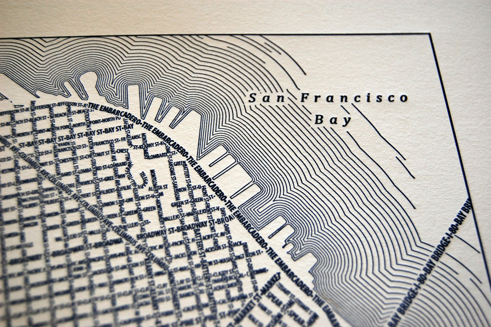
San Francisco letterpress

Just a quick note to say that we've released several new limited edition letterpress prints in our typographic maps store. Check them out, and as always thanks to everyone for the feedback and encouragement in recent months!

San Francisco 2nd edition: This is a new design of the San Francisco letterpress map we made earlier this year, featuring waterlines for a new coastal style. Available in blue or black ink.

Manhattan: This is divided into two maps. A Lower and Midtown Manhattan shows the island from its southern end to 61st St, and Upper Manhattan features Central Park in an extent from 57th to 159th Street. Available in blue or black ink, and individually or paired together.


Representing 'No Data' on Interactive Maps

We spend a lot of time determining the best way to represent data given to us by our clients. Whether in the user interface or on the map itself, it's at the core of what we do. In contrast, I've been surprised recently by the amount of time we've spent thinking about how to best represent data we do NOT have. Here, I'm talking about places where data was either not collected or not reported. Needless to say, discovering empty cells in a spreadsheet is not at all uncommon, albeit frustrating at times. This is the nature of data collected in the real world. But what is the best way to represent "no data"? It only takes a single missing value to raise the question and present this rather unique design problem.

Below are a few of the ways we've chosen to represent 'no data' in recent projects when interpolation or other means of smoothing out and covering up missing values was not an option. We feel that instances of 'no data' are nothing to hide from or ignore. In fact, in some cases, I'd argue that representing 'no data' can be a good thing and actually help to tell a more complete and truthful story about a mapped phenomenon that wouldn't otherwise be seen.

Read more...

Cantabrigian Namesakes

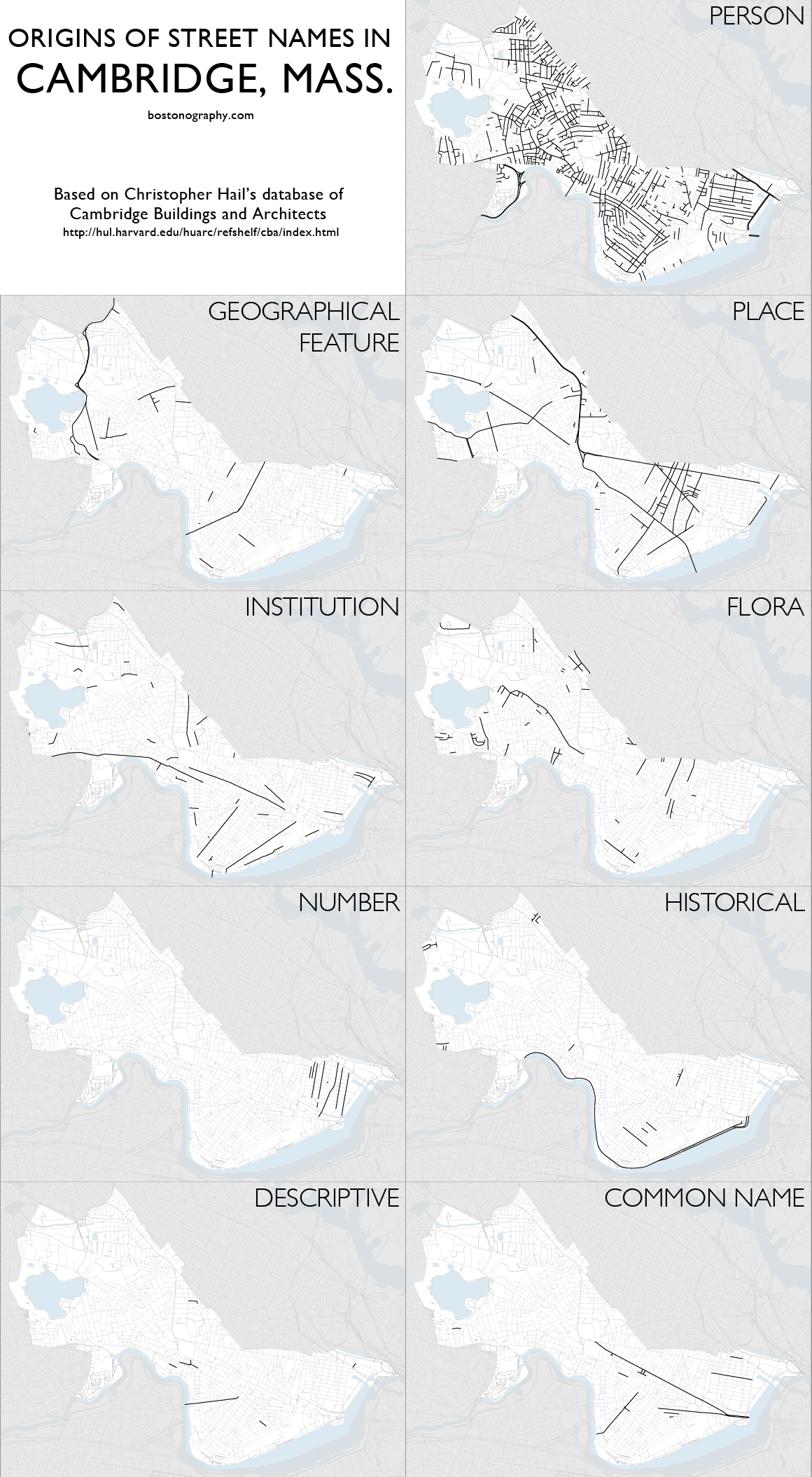
Andy's made a great looking map of small-multiples showing the breakdown of how streets were named in Cambridge, MA. Those of you familiar with the area will have fun trying to recognize the highlighted streets. Everyone else can marvel at how useful the small-multiple technique is at making easy comparisons across a complex dataset.

Cantabrigian Namesakes


The Furniture District

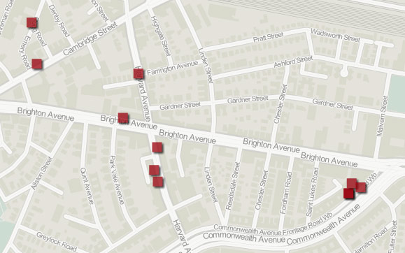
Over on the Bostonography Blog, Andy is muses about the spatial arrangement of humorous retailers in Cambridge. It's inspired by The Simpsons and has some great looking maps (like the above) from GeoCommons.

The Furniture District


London Low Life

This week, we're happy to begin a 30-day preview of one of our most distinctive interactive mapping projects: The London Low Life Map. This map was produced for Adam Matthew Digital, a digital publishing company based in the UK. Adam Matthew produces digitized archives of historic primary source documents, collected around a central theme, for higher education institutions. This map was built as part of their London Low Life collection that explores the seedy underbelly of Victorian London. It examines the documents of sex, drinking, gambling, and the institutions that sprang up to combat those very vices. As the map is integrated into Adam Matthew's collection, we will only be able to grant access to our readers for 30-days. I encourage you to explore the map and enjoy Adam Matthew's fantastic collection of historic maps and images. Since we've pulled the map out of the collection, I wanted to give you some context on what is included.

Read more...

New typographic maps of Washington DC and New York

DC and NYC typographic maps

Earlier this month we launched our new store with two new typographic maps we had been working on since last autumn: Washington, DC and New York City (Manhattan). These 24x36 inch posters, along with the existing line of cities, are now done in super sharp detail as offset prints, and all are now found at the new store.

In addition to the new cities, we also released limited edition letterpress prints of San Francisco, which managed to sell out almost immediately. We're now looking into future letterpress editions of this and other cities.

Read more...

Video Demonstration: Illinois Public Health Map

We're very happy to be able to show-off our collaboration with the Illinois Department of Public Health and IPRO. This map makes information about the quality of health in communities available to the public, highlighting socioeconomic disparities that may exist. When combined with our indiemapper platform as well as linked graphs and charts, the clinical data in the map can be used to examine the health needs of a community, county or region for better policy and planning.

Above is a quick demonstration video showing the basic functionality. After watching the video, check-out the map itself.


Collecting Data from Non-Mapmakers

A few months back, we partnered with the UW Cart Lab to build a map for the University of Wisconsin Arboretum. We wanted to create a map that was populated with content generated by users and experts, built on top of free existing web-services, easy to maintain and great-looking. The map itself is relatively accessible so I'll let you explore it on your own, however, I did want to talk a little bit about a major piece of functionality that is completely transparent to the end-user. First, a little background...

The University of Wisconsin Arboretum is easily the fourth best thing about living in Madison, WI after the Memorial Union Terrace, The Farmer's Market, and being able to bike to anywhere (coming in fifth: that bonkers taxidermy museum). It's a relatively vast piece of natural land on the near-West side of town. In just a 5-minute bike ride from downtown, you can feel like you are in the middle of the wilderness. Residents and researchers alike use the Arboretum for everything from running and biking to invasive species research, from snow-shoeing and hiking to painting and nature writing. This piece of land is very meaningful in many different ways to many different people.

Read more...