San Francisco Typographic Map

HOORAY! The San Francisco typographic map is finally finished and is ready for purchase today. I made a big push to get this map ready for the holidays (with some help from Andy and Ben) and we're really happy with the way this turned out. More images.

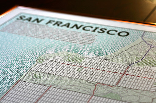
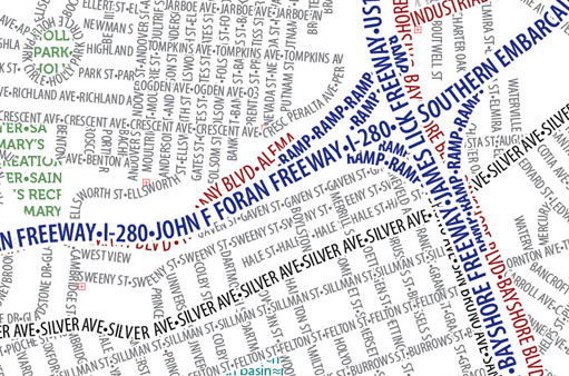
I went a bit overboard and decided to map the *entire* city; The amount of fine detail in this map is pretty astonishing. To fit the entire city onto a poster, of course, means the type itself has to be much smaller to fit it all in. In fact, the street text is half the size of the Chicago map (6 pt surface streets versus 12 pt) so there's lots of detail for your eyes to enjoy.

GO BIG: Given the crazy density of streets I strongly recommend you get one in poster size (23x34 or up) so you can best see all of the parks, water features, and twisty streets the city is famous for.

WHAT'S THIS ABOUT LETTERPRESS?! Great news, we'll be offering limited edition, gorgeous letterpress prints on rich cotton paper in the first half of 2011. While we love Zazzle (their prints rock), many of you asked (and begged!) for us to do these as hand-made, limited edition art prints and we thought that was a great idea. Want to be the first to know when they go on sale? Go here.

WHAT'S NEXT? We have New York City (Andy) and Washington DC (Ben) coming up shortly. They look sweet.


Death's Door Spirits: Mapping Wisconsin's Finest Craft Distillery

I only have a few rules in life. One of them is when the makers of this gin offer you a straight-up trade–bottles for maps–you take it... and you don't cut your partners in on the deal. That was the situation when a friend-of-a-friend approached me to build this simple locator Google maps mashup which I took on as a side-project away from my normal Axis Maps work.

fuck_me

Death's Door Spirits is a craft distillery based out of Washington Island, WI and distilled in Madison, WI. They use locally-sourced ingredients for their gin, vodka, and whisky which they distill in small batches. While their small-scale makes their products excellent, it also makes them tricky to locate. The purpose of the map is to simply show where you can buy bottles or cocktails containing their spirits.

Since the map was so straightforward, it gave me the opportunity to experiment with a few new technologies I've been meaning to check out. Here's what I thought...

Read more...

Indiemapper + Adobe

Interested in how to present your indiemapper-made maps on beautiful Natural Earth Raster imagery? Check out this indiemapper + Adobe workflow over at the indiemapper blog.

finalMap


Typographic map posters

Today we're pleased to show off a pet project that's been occupying us off and on for nearly two years. After some emotional separation issues, we are declaring finished a few typographic map posters—one of Boston, and color and black and white flavors of Chicago. Everything in these maps is made of type.

These look good hanging on a wall, so of course prints are available. Check out the page we've set up with some more detailed images and links to get copies for yourself.

I began this project with the Boston map, thinking it would be fun to expand the style of my small party announcement map to a full city. The idea caught on here at Axis Maps and soon Mark and Ben had parallel effort underway for a map of Chicago, a city to which several Axis Mappers have some affinity. Ben took the lead on that map, and some twenty months later we both added our respective finishing touches and reluctantly let go.

Read more...

Professional-looking water boundary effects made easy

If you haven't seen it already, head over to the indiemapper blog for a quick tutorial on how to create some cool water/land boundary effects with a few clicks of indiemapper.


ColorBrewer 2.0 gets permalinks

Good news, we've improved the export options from ColorBrewer2.0. Starting today you'll notice a new export option: permalink. This allows you to bookmark and share specific color schemes + number of classes without having to hunt around for them. For example, this will automatically open an 8-class red sequential scheme. Neat, huh?

If you have other ideas for ColorBrewer, drop us a note.


Map Evolution 2

Over the summer, a friend asked me to put together a map of Punta Gorda, a small coastal town in the country of Belize. He works for Hillside Health Care International, a non-profit organization providing medical care in that area. The map was needed to help orient and guide volunteer health care professionals visiting from the States while serving at the clinic. It was to be printed in color on a letter-sized page.

In talking with my friend, I knew right away that the biggest obstacle was going to be getting good local data for the map (and getting it for free, because there was no money set aside for the project). Most importantly, I needed data for local roads (locations and names) and point features (hotels, government buildings, grocery stores, banks, etc.), these being the two main pieces he wanted clinic volunteers to have at their disposal.

Read more...

Indiemapper Launches April 12th, 2010

After months and months of non-stop design and development, the release of indiemapper is imminent. We're all palpably excited about this product and can't wait to get it in everyone's hands. Thanks to everyone who has provided their invaluable expertise and enthusiasm along the way.

We'll be spending the next 12 days fine-tuning indiemapper for launch. You can head over to http://indiemapper.io for full details. Also, be sure to follow @axismaps on twitter as we start to introduce you to all the new stuff we've been working on.

Without further delay, I'd like to present to you an introduction to indiemapper:


Ed Parsons dislikes cartographers, "more than anyone in the world"

The title was one of the opening statements made by Google's "technology evangelist" Ed Parsons in a recent talk for the British Computer Society. In the talk he argues traditional street maps are bad (all of them) because they fail to engender a sense of place and because they abstract the world using map symbols. He goes on to say Streetview is good and doesn't suffer any of these problems. So is Google Earth. The take-home message is that 2D is bad! Maps symbols are bad! Photos are good! And paper is bad! [subtext: Google doesn't make paper, but if we did, we might soften our stance].

Here is my concern: I'm not aware of any research to support such simplistic claims. Merely saying them, repeatedly, doesn't make them true. The wayfinding research that I have seen shows that for some users, for some map reading tasks, yes, absolutely Streetview and Virtual Earths and geo-tagged photos can help. And for some users and some situations paper is better than pixels. And for some users, and some kinds of data, 2D is better than 3D. But none of those statements is a blanket truth and by outright rejecting all traditional maps in his talk--even if just for wayfinding on mobile devices--an otherwise solid argument is overshadowed by hyperbole.

Read more...

Visualizing Indieprojector

In case you haven't seen it over on the indiemapper blog, this is a composite view of all the data loaded into indieprojector since it was launched earlier this summer.

IndieProjector_Poster_small