Info windows are the familiar pop-up balloons that often appear when interacting with features on a map. This activity is generally called data probing. For example, click on a Google Maps marker and up comes a little bubble with information about the place. The uses for data probing are seemingly limitless, ranging from the retrieval of map-based comments, annotations, and descriptions of 'what's here?', to map stats and info graphics, to map use instructions (e.g., "get directions"), explanations (e.g., "group of 3 markers"), and controls (e.g., "zoom here"), to alternate map views (e.g., an historical map). All of this, of course, can come through in the form of text, photos, audio, and video.
Data probing is essential. In one sense, its needed because we've got tons of data about the world, but just small, low-resolution computer screens to view it all on. Like a drop-down list or an accordion menu on a Web page, data probing is a design compromise that can save space on maps. In another sense, however, data probing is an important design decision that can help direct map readers' attention and understanding from the general to the specific by offering details on demand. Without data probing, we'd either have crazy-cluttered maps or watered-down maps not taking advantage of all of that rich data out there.
Of course, data probing is everywhere outside of mapping as well; on charts, graphs and all sorts of other info graphics. But here I focus on Web maps, specifically on info window design, and outline some major design considerations and provide a few examples that could help inspire your next effort.
Read more...


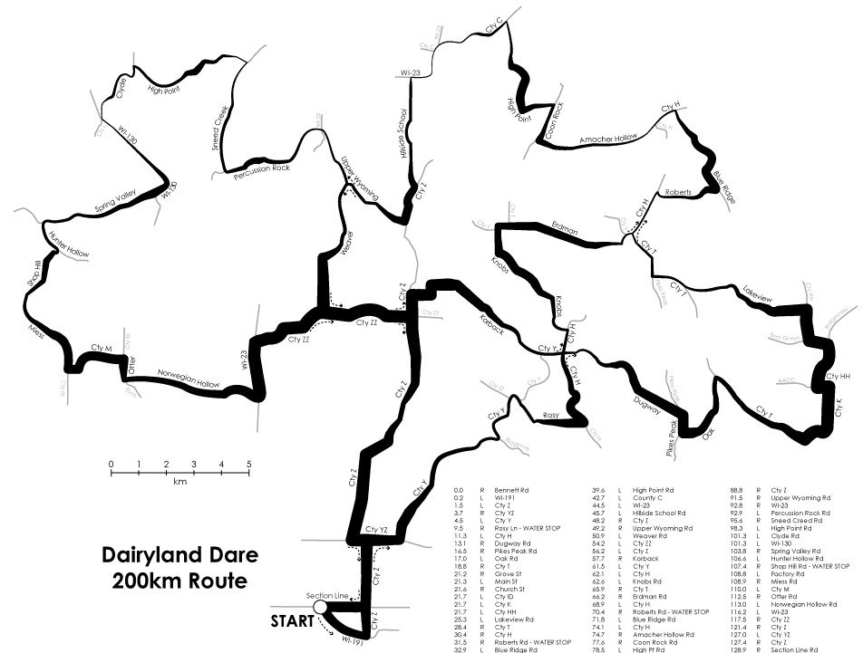 Figure 1: The above is a draft of one of my first attempts, in this case depicting a particular ride that one of my roommates hopes to participate in this summer. click to see fullsize

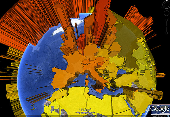 3D prism map in Google Earth (blog.thematicmapping.org)