Map Evolution

Recently, we took on a nice little print mapping project for a few hotels located in downtown Madison, Wisconsin. The project involved making a one-sided, page-sized map showing hotel locations and the locations of a few points of interest in the area. The idea was that hotel guests could use the map to find their way around downtown as well as get a sense for where they were staying in relation to the university, interstates, airport, etc. The map was to be printed in grayscale, plus 3 spot colors (red, yellow, and blue).

Before starting out, we discussed the possibility of sharing the project with those interested in seeing all the stuff that goes into designing a map like this. The map design process is notoriously difficult to articulate and we're keen on the idea of making pieces of it more transparent, where possible. One option was to screen capture the hotel map as it appeared in the production software at regular time intervals from blank page to finished product. So, here is a sequence of 116 images, originally captured at 10-minute intervals, compiled to show the evolution of the hotel map in just under 2 minutes. Clearly, not all maps are made in the same way, but this should expose some of the kinds of design decisions made in a relatively simple project like this.

Election map follow-up

After posting our election map last month, we received a number of excellent comments and suggestions. It's late, but I thought I'd finally post the couple of variations of the map that I've managed to find time to put together. The maps below do two things differently from the original:

  • Vary the brightness of counties by population density rather than total population. This was a frequent suggestion. I think it has a few of its own drawbacks too, but it looks pretty good.
  • Different color schemes. Just for fun, I've used the purple color scheme that has become common in recent elections. I also liked the suggestion in one comment to saturate colors by margin of victory, so I've done that too. In these, full blue would be total Obama domination (Obamanation? Obamadom?), full red would be the same for McCain, and gray is an even split.
Read more...

Panning and zooming tutorial

Perhaps the most basic capability of any custom interactive map we make is the ability to pan and zoom the map.  That is, after all, the way to make something that might be the size of a wall poster in print fit on a computer screen and still be readable.

On my personal site I have posted a very basic tutorial and example of ActionScript code for a simple version of the way I typically code panning and zooming.  If you're looking for a starting point for panning and zooming, check it out.

Based on my own experiences, if you're looking for basic ways to improve upon that minimal functionality, consider these:

  • Tweening zoom changes
  • Replacing vector graphics with raster while moving the map (faster performance)
  • Dynamically drawing and placing symbols on the map
  • Drawing geographic data (shapefiles, kml, etc.) into a pan/zoom map

The Best of Both Worlds: Semi-transparent choropleth maps in GeoCommons Maker!

When we were building GeoCommons Maker! one of the key map design challenges we faced involved producing semi-transparent choropleth maps. Choropleth maps are perhaps the most common type of thematic map and are regularly used to show data that is attached to enumeration unit boundaries, like states or counties. Ever seen a red state / blue state election map? This is a basic choropleth. There are a lot of more sophisticated ways that choropleths can be made to best represent a given data set, for example, by playing around with classification, categorization, choice of color scheme, etc., but we won't get into those here.

I want to talk about color. Traditionally, choropleth maps are read by looking at the general pattern of unit colors and/or by matching the colors of specific map units to a legend. Other reference data is often removed from the map because it is either, 1) not necessary to communicate the map's primary message or 2) makes communicating this message more difficult. It could be argued, for example, that other reference map information, like green parks, gray airports, brown building footprints, and blue water distract readers from seeing the general pattern of choropleth colors on the map, which is where the map's most important message can be found.

Read more...

Simplicity, not Simple

The first time I used Google Maps I knew that the world of cartography had just gotten a lot more interesting. It blew my mind. What really struck me then (and still does today) is that I didn't have to learn how to use it: It just worked. It didn't come with a manual, and I didn't need a class in it. Rather, I would think, "Hey, I wonder if..." and sure enough it did just that. First try. It worked. What was happening was that my expectations of the map and the feedback it gave—and the speed at which it gave that feedback—left me feeling empowered to explore more, rather than frustrated or confused.

This is true of all the best tools in our lives: they make us feel confident (even smart), not intimated or confused or frustrated. And they quickly become completely transparent. The master violinist, photographer, or painter all work so comfortably with their tools that they are able to translate their powerful and nuanced intentions into a physical reality. We've all experienced this – when the interface between our cognitive and emotional selves and the world around us disappears and we are able to lose ourselves in a great book or a great movie (you cease to realize you're sitting in the theatre watching reflected light on a screen or scanning printed characters on page).

Read more...

The trouble with pies

I made mention of 3D pie charts in an earlier post and thought I'd outline exactly why they are such a bad idea. As both a teacher and designer I campaign hard against "chart junk" and the needless and confusing eye candy tricks that software companies create to clutter-up our lives. I know these companies need to offer something to try and convince us to upgrade to the new version, but let's be clear: drop-shadowing every element on the page, or adding an outer glow to the text isn't going to make your message any clearer, and will most likely distract from the very thing you're trying to show. My design philosophy can be summed up as:

In cartography, aim to be clear, not cool.

Read more...

A new kind of election map

Update, Dec. 22: A few variations of the map technique are posted here.

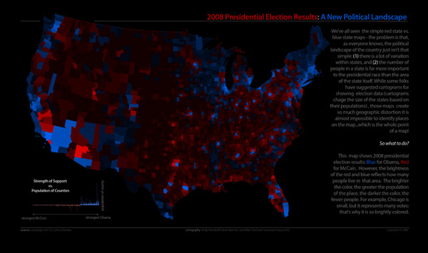
2008 election results with population

We spent some of our spare time last week exploring data from the 2008 presidential election and thinking of some interesting ways to visualize it. Above is one map we put together.

Read more...

ColorBrewer 2.0

I love ColorBrewer. All of us here at Axis rely on it almost daily and it's helped us to make nice looking maps quickly; and that's what good tools do, they make their users look really good at their jobs.

7+ years later, ColorBrewer is due for some changes and Cindy Brewer has been kind enough to ask us to hold the scalpel. Nothing major. Same great color schemes (of course), but a new interface and some new functionality to help ColorBrewer's 2000 visitors per week get the most out of the experience.

We're in the early stages of planning this project but we though we would open this up for some discussion amongst the ColorBrewer-using, Axis Maps Blog-reading masses.

Read more...

The geography of presidential campaign rhetoric

A few months ago I started on a little side project to visualize presidential campaign speeches spatially. My idea was to collect speeches by the 2008 US presidential candidates, generate a word cloud of the most common words in each, and each word cloud on a map in the location where the speech was given.  We've seen a number of text visualizations and analyses, sometimes in-depth, during this campaign, but so far not by geography that I can recall.  (See those from Martin Krzywinski, and The New York Times with help from Many Eyes, for just a few examples.)  Are the candidates speaking to different issues in different parts of the country?  Are they talking about jobs in Michigan and immigration in New Mexico?  Are they pandering to everyone, everywhere they go?  (Can we call this project PanderViz?)  Visualizing campaign words on a map might answer such questions.

Campaign speech word clouds

We hoped to develop this idea into a sophisticated interactive map in which a user could search for words, filter speeches by date, and so on.  Other work has kept us from doing that before the election next week, but it seems worth showing some screenshots from what I did manage to get done originally.

Read more...

The Golden Age of Cartography is Now

This is an exciting time to be a cartographer. Cartography has changed more in the past 5 years than in the previous 50, and the field is in the midst of an unprecedented revolution that has forever altered what maps can do, and how and why we use maps. How far have we come? I now see teenagers using on-demand, customizable maps rendered in real time from multiple, distributed data sources on their cell phones that automatically geotag and upload photos to their blogs while they sit on the bus. Five years ago, heck, one year ago this would have been science fiction, now it's just a collection of geoservices on a $200 phone. As a result, mapping technology has quickly outpaced mapping theory and practice.

While much attention has (rightly) been focused on the technology that is enabling these amazing advances  (Google Earth, mash-ups), I think the equally significant change is why people are making maps and the role maps now play in our everyday lives.

Read more...