Dot Density Maps
When to Use
Dot density maps are a simple yet highly effective way to show density differences in geographic distributions across a landscape. Dot density maps have been popular for 150 years because they are easy to understand and, at a glance, show us intuitively where things clump or cluster. There are two basic types: one-to-one dot density maps (one dot represents one object or count) and one-to-many dot density maps in which one dot stands for a number of things or a value (e.g., 1 dot = 1,000 acres of wheat production).
NOTE: All dot density maps must be drawn on an equal area map projection. This is critical — using a map projection which does not preserve the size of areas will distort the perceived density of the dots. Albers Equal Area Conic, Sinusoidal, and Cylindrical Equal Area are all good choices.
Reasons Why We Like Them
There are at least three big advantages of dot density maps over choropleth maps: (1) on a dot density map you can map raw data / simple counts (e.g., number of farms) or rates and ratios (e.g., number of farms per sq kilometer); (2) your data need not be tied to enumeration units and hence some of the concerns inherent in choropleth maps can be side-stepped with dot density maps (unless, of course, your data are reported by enumeration units—in which case you’re probably stuck with them); and (3) dot density maps work fine in black and white, when color isn’t an option.
Example datasets appropriate for dot density maps:
- the distribution of car dealerships in Belgium (1 dot = 1 dealership)
- earthquake epicenters across the Pacific for the past 10 years (1 dot = 1 epicenter)
- number of people, by county, USA, 2010 (1 dot = 10,000 people)
- number of hectares of land treated for weed control in Russia, 1997 (1 dot = 500 hectares)
Example Dot Density Map
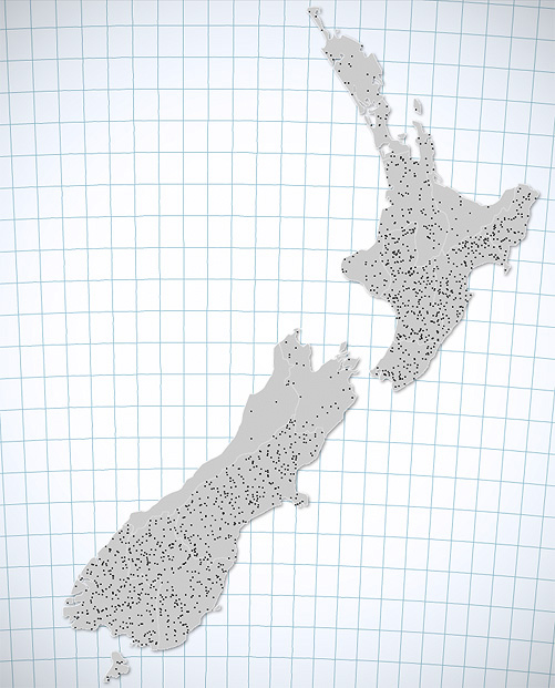
Here is a dot density map that shows the number of sheep in New Zealand (by province). From this map, we can see sheep are generally found throughout NZ, but that there are more sheep raised on the eastern side of the islands than the western side.

Limitations
While the versatility and easy-to-grasp nature of dot density maps is appealing, they have one fundamental drawback: they’re terrible for retrieving rates or numbers from the map. For example, few people will have the time or interest in counting hundreds (or thousands) or dots in order to know the precise number of sheep in New Zealand (above). They’ll likely know that some places have “more” sheep than others, but they won’t know necessarily by how much. To help with this problem, you can add numbers directly on the map or provide a table to accompany the map.
Additionally, although most dot density maps distribute dots randomly, map readers may potentially infer dot locations as precise locations of the phenomenon being mapped (e.g., the actual exact location of a person). To combat this, dot density maps should not be made at too large a scale. Further, to avoid confusion, ideally dots should be distributed only in areas where the phenomenon actually exists (e.g., no dots in lakes for a map of population).
Not sure you should use a dot density map? Potential alternatives include choropleth maps (if your data can be standardized and are attached to enumeration units), graduated/proportional symbol maps, and cartograms.
Dot Size and Dot Value
In the New Zealand map above, one dot = 27,500 sheep, which is known as the dot value of the map. The number of things one dot stands for is up to you to decide and there is not necessarily a single best number or a formula to use. Rather, experiment with the value and aim for a balance where the sparsest areas (with the fewest dots) should still have a few dots, and areas with the most dots have them just starting to coalesce (just start to touch). Avoid making a dot density map in which some places are solid with dots—increase the dot value using the slider bar until a bit of white space shows through even in the densest areas. Changing the size of the dots is the other way to control how much ink is on the page (and how busy the map looks). You’re aiming for the dots to be big enough you can see them clearly, but no bigger.
Your dot density map is a happy balance between dot value and dot size. Experiment with both together until you get something that looks good!
HINT: If you are going to print your map, be sure to make the dot value and dot size look right when printed, not just on the screen. Since printers offer higher resolution than many computer screens and can show more details, the optimal design will likely be different for different media.
Our Recommendations
Dot density maps are underused and have long been praised by professional cartographers like Arthur Robinson for the ease (and economy) with which they portray geographic densities and distributions. They’re flexible, work with all kinds of data, and are easy to comprehend. However, if it essential for folks to retrieve numbers from your map, you might be better off using a classed choropleth map or a proportional symbol.

Cartography Guide by Axis Maps is licensed under a Creative Commons Attribution-NonCommercial-ShareAlike 4.0 International License.
