 Primary source ship's logs integrated into voyage playback
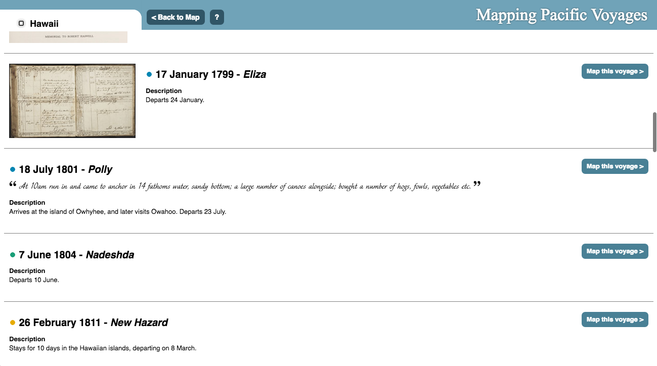 Browse all map data as accessible text organized by voyage or port
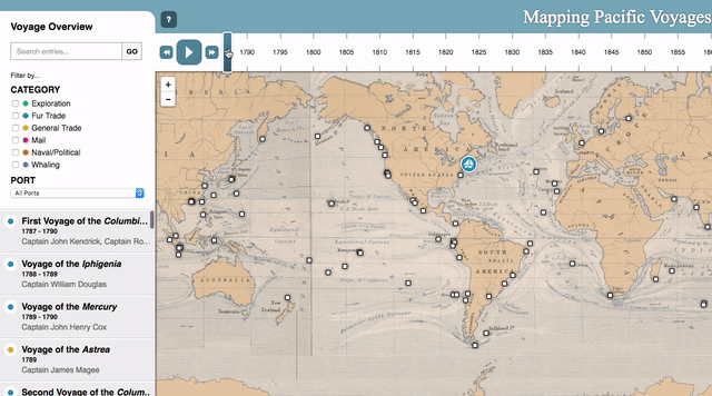 Fully interactive timeline
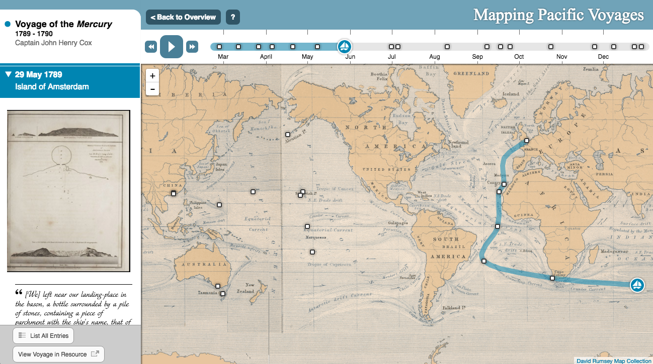
This map for the China, America, and the Pacific resource was our 8th project for Adam Matthew Digital. The resource contains an extensive range of archival material connected to the trading and cultural relationships that emerged between China, America and the Pacific region between the 18th and early 20th centuries including manuscript sources, rare printed texts, visual images, objects, and maps. Among these manuscripts were ships’ logs taken from voyages containing date, location, descriptions, and drawings. From these primary source logs, we were able to create an animated interactive map that explores the development of international trade by showing the movement of ships. This map also presents the primary source ships’ logs in an engaging way, giving users access to descriptions, quotes, and images linked to the time and place they were recorded.
The concept for this project was developed by Adam Matthew editors during the early stages of their work seeking out primary source documents. After collecting and scanning the ships’ logs, we were brought in to design the data model that defined how this data would be stored in our database. The data model defines both the information collected about each stop on a voyage as well as metadata for the voyage as a whole. Once this structure was devised, Adam Matthew editors began parsing through the logs recording the date, location and text, as well as links back to the scanned page in their resource.
The biggest challenge for this design was building a map that worked in two discrete modes that treat animation and the passing of time differently. The initial mode shows all the voyages at once, running relative to each other in time while the second mode shows a single voyage, slowed down so users have more time to explore the content. We have intentionally exaggerated elements of the design and used animations to ensure users would be able to find their way between these modes and have visual cues to understand the different between them. The skinning of the design began with the historic basemap from the David Rumsey map library. The basemap adds a fantastic sense-of-place to the map and was the foundation for the colors and styling used. We’ve also tried to add a few playful elements throughout the UI to engage the user wherever possible.
This map contains multiple complex line animations, rendering at the same time at around 30 frames per second, making performance our primary concern. We built a few proofs-of-concept and eventually decided on Leaflet over D3. This gave us better support for the map tiles and slippy-map panning and zooming and still rendered as fast as we needed it to in all browsers except for IE9 (where we slowed down the fps to where there was no noticeable lag). The curved paths are rendered on the client-side using a script adapted from Andy’s AS3 bezier curve library. We’ve added a few invisible guide points to the voyages to keep the curves from crossing land wherever possible.