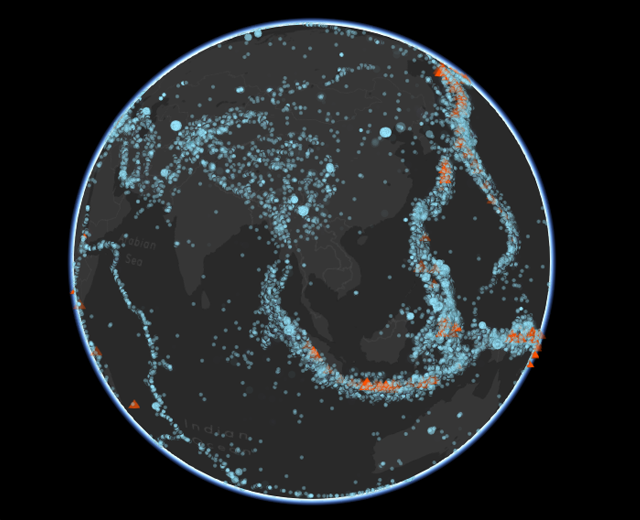
 Points can be viewed on either an interactive globe or flat map
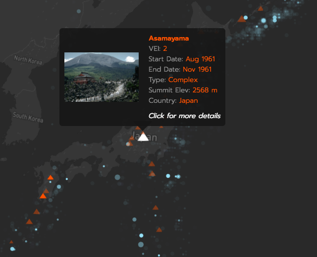 Probing points provides access to more details and data
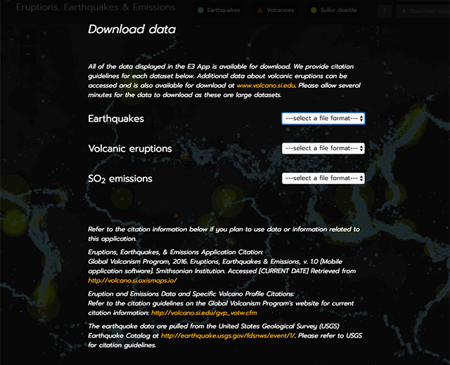 The application offers direct data downloads
“Eruptions, Earthquakes, & Emissions” (or “E3”), built for the Smithsonian Institution’s National Museum of Natural History, is a time-lapse animation of volcanic eruptions and earthquakes since 1960. It also shows volcanic gas emissions (sulfur dioxide, SO2) since 1978 — the first year satellites were available to provide global monitoring of SO2. Eruption and gas emission data are drawn from the Volcanoes of the World database maintained by the Smithsonian’s Global Volcanism Program (GVP). Earthquake data are from the United States Geological Survey (USGS) Earthquake Catalog. The data updates from these services daily. However, instead of the map pulling directly from them, it is first loaded into our own Postgres database. We then optimize the data before sending it to the client by removing some attributes and generalizing the locations. This allows us to deliver data on hundreds of thousands of points with a reasonable load time.
Upon entry to the interactive map, which can be viewed either as a flat map or 3D globe, animation begins from 1960, with earthquakes, eruptions, and emissions appearing as points—sized according to magnitude—when they occurred, then gradually fading away. All points are interactive, and can be inspected to learn more about the event or to visit external pages with even more details and data. Emission events additionally offer their own animations, which show the spread of the SO2 cloud over a period of days. Alternatively, the map has an “all events” snapshot mode in which all points from the entire time span are visible at once. In either mode, the “ring of fire” and other features of the Earth’s active tectonic geography become apparent.
The map is fully responsive, working in both portrait and landscape mode with multi-touch support. This was achieved by optimizing the size of the top and bottom controls and moving the data probe to a sidebar.
A key technical challenge in this map was the smooth, fast display and animation of hundreds of thousands of points. To that end, we built using the Cesium JavaScript library, which leverages WebGL technology and includes a 3D globe mode. This was far more efficient at rendering so many objects on screen than typical canvas or SVG elements, allowing us to create an animated map that is both dazzling and richly interactive.