We're excited to announce that we're bringing the work of some of our friends to the Axis Maps Store. We've always been interested in new ways to encode and represent data. Also, typography. We ♡ typography big time. It was both of these interests that lead us to the work of Miguel Nacenta, Uta Hinrichs, and Sheelagh Carpendale and the FatFonts project. From their site:
Fatfonts are designed so that the amount of dark pixels in a numeral character is proportional to the number it represents. For example, "2″ has twice the ink than "1″, "8″ has two times the amount of dark ink than "4″ etc. You can see this easily in the set of characters below:
This proportionality of ink is the main property of FatFonts. It allows us to create images of data where you can read the numbers, and represent tables that can be read as images (like the example below).

It's a fantastic technique for cartographers (especially when making static maps) because the ink density allows you to see geographic patterns while the digits give you the exact values for each grid cells. This bi-visual technique essentially replicates an interactive data probe on a static map.
If you're interested in using FatFonts in your own maps, you can download the font faces from the project home page.
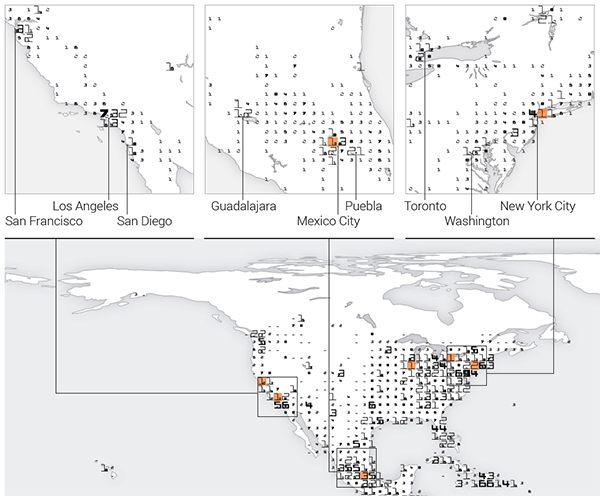
The FatFonts World Map
If you want to get your hands on your very own FatFonts map, the World Population map is now available at the Axis Maps store. They were a natural fit and quantitative cousin to our typographic maps. Like the typographic maps, the FatFonts maps show the big picture from afar, but reveal their extensive detail as you move closer. From Miguel's blog:
The poster is made using an equal area projection of the world, and it represents data collected by CIESIN and others. Each grid in the main map, which represents an area equivalent to 200 by 200 km has a 2-level digit FatFont digit in it. That way we can know, with a precision of 100,000 people, how many humans live there.
Since the number of dark pixels of a FatFont digit is proportional to the number that we are representing, we can calculate how many people each black pixel represents. For an A1 poster in the main area of the map at 600 pixels per inch, each pixel represents approximately 1880 people! FatFonts with the orange background are up by an order of magnitude, so there the ink of a pixel represents approx 18,000 people.
It's a fascinating map that clearly illustrates how unevenly population is distributed across the globe. Particular areas of interest are highlighted and given higher-resolution treatment:
The FatFonts World Population map is now available from the Axis Maps store. All profits will be re-invested to fund more FatFonts research.