This is an adaptation of a talk I gave at the 2015 OpenVis Conference in Boston, expanded in a few spots and abbreviated in others. You can see slides and, ugh, video from the talk.
At Axis Maps, a rough napkin sketch of our projects often looks like this:
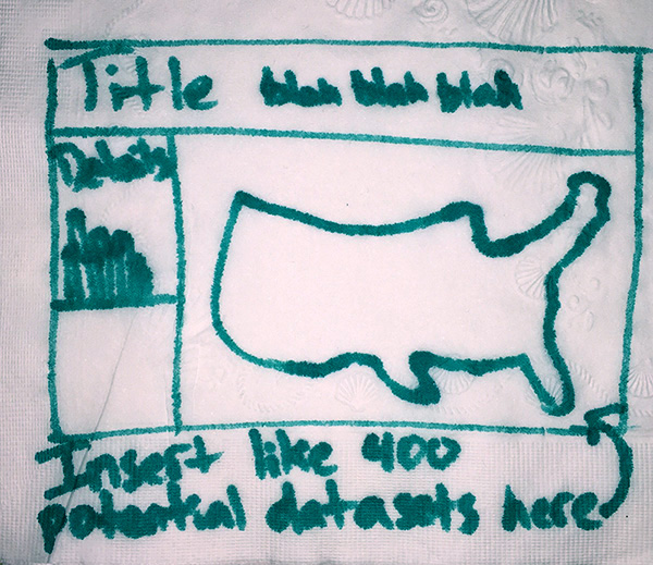
We're tasked with designing and building interactive maps of data that, for one reason or another, we can't yet see. Sometimes the client doesn't have data ready soon enough. Sometimes we expect data to change or be added after our work is done. Sometimes it's just too vast for us to lay eyes on all of it. Whatever the reason, this reality of web mapping is a significant departure from what we knew back in cartography school.
Traditional cartography allows—encourages, perhaps—perfectionism. We were taught attention to detail, and to find and tell the story in our data. Crafting beautiful, effective maps and telling stories with them is one thing when you can obsess over every detail; it's quite another when you have to do it as though blindfolded. (And I don't mean sea monsters and mapping unknowns; I mean mapping real things that are known but somehow inaccessible to the cartographer.)
Compromise
As always in cartography, this is all about making compromises. We make design choices that we know are not are not ideal for most cases, but are at least acceptable for all cases. What follows is a list of some areas where we've found the "blindfold" particularly challenging, and some compromises that we or others have found helpful. And an occasional shrug where we haven't found good answers yet. Much of this is about design, some of it is about code (JavaScript), some of it isn't even about maps, and none of it is perfect.
Data classification
John Nelson has a succinctly handy explanation and demonstration of why data classification decisions are important on choropleth maps. One way of dividing data into bins can produce a starkly different map from another way, potentially in a functionally and aesthetically bad way.
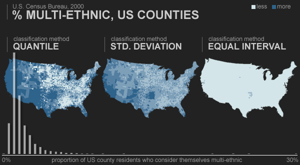 Data classification example by John Nelson
We want to devise a classification scheme around several questions: Will the map be useful and look good? Are the class breaks meaningful? Are they understandable? Are they pretty numbers? As usual, this isn't too difficult when dealing with a single data distribution. But we need satisfactory answers to those questions for any data set, without our manual intervention. And real data... well, real data are always messy.

Two common solutions are Jenks optimal breaks, where class breaks are calculated to optimize both grouping and spacing, and quantiles, in which each bin contains the same number of values. Both offer some assurances of visible spatial patterns, but both have drawbacks. For example, optimal breaks can be hard to understand, and quantiles can inappropriately group or split values.

One compromise we've used can be described in two parts:
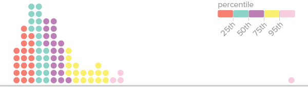
1. Unevenly distributed percentile breaks. Quantiles are friendly, readable, and somewhat reliable, so we often err toward them. Instead of dividing data into evenly sized classes, though, we might break down some of the classes further to separate or highlight extremes or important breakpoints, for example the top 5% in the histogram below.
2. Use percentiles of unique values, not all values. Datasets often contain many duplicate values; when quantiles are calculated properly, a single value could span several classes. (A common example is having a whole bunch of zero values.) To avoid weird map legends and to better bring out geographic patterns, we might base our classification on the distribution of only unique values, avoiding duplicates.
// basic example
function getValueAtPercentile( data, percentile ){
  return data[ parseInt( (data.length - 1) * percentile ) ];
}
// using underscore.js
var dataArray = _.sortBy( [ 0, 0, 12, 23, 2, 5, 0, 5, 19, 0, 0, 0, 33, 9, 25, 0 ], Number );
var uniques = _.uniq( dataArray, true );
getValueAtPercentile( dataArray, .25 ); // = 0
getValueAtPercentile( uniques, .25 ); //  = 5
null
Expect holes in the data. Assume that sometimes data will be bad or missing. Catch these missing values in code, and, importantly, design for them. "No data" is data too.
Andy Kirk gave a talk called "The Design of Nothing: Null, Zero, Blank" at last OpenVis in 2014, covering (among other things) some no-data scenarios. It's worth a look:
There are two sides to handling missing data. On one side is code that won't break if a null value is thrown at it. Basically this means a lot of error handling and bailing out of functions if they're passed null values. But it also requires some understanding of the data format. A missing value could come through in a variety of ways.
// no data might be...
null
undefined
NaN
""
"NULL"
-9999
// &c. &c.
Be careful to avoid the JavaScript gotcha of equating zero with "no data"—usually not the same thing in reality.
// a tempting way to catch "no data" in javascript
if ( data ){
  // yay, we have data!
}

// but watch out!
var data = 0; // zero is real data
if ( data ){
  // zero won't get us in here :(
}
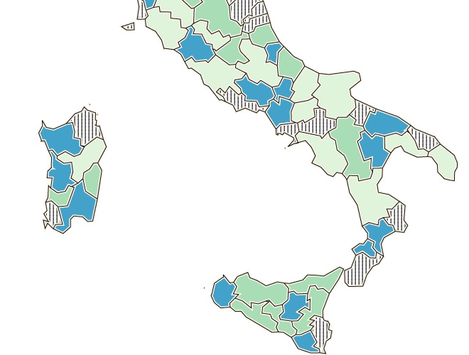
The other side is design. One common scenario is missing data in a choropleth map. We like using texture to indicate missing data. It's distinct, not easily confused with colored values; and it's explicit, keeping "no data" as part of the story instead of hiding it. If you're working with D3, check out Textures.js for easy texturing.
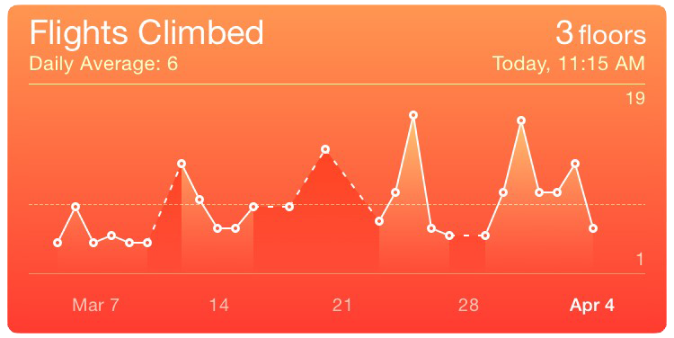
Another common case is gaps in time series data. Again, it's good to be explicit. Interpolation can be misleading. For example, I like the dashed line in the iOS Health app. It explicitly indicates a gap in data without losing continuity.
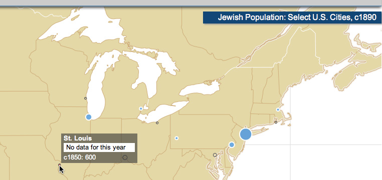
On maps, one thing we've tried is using a special symbol to indicate a gap in data. Below is a frame from an interactive animated map where proportional symbols remain on the map even when there's no data for the current year, showing the most recent available data but with a different, hollow symbol.
Text
Text in an interactive map setting is more than just labels. Marty Elmer has written nicely about prose on maps, and how it's ubiquitous yet overlooked. Text, too, can be an unknown part of map data—one that can ruin otherwise beautiful layouts.
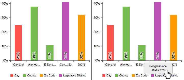
The big lesson from experience here is to restrict the space allotted to text. If you've designed for a short sentence, assume you'll be fed a novel, so make sure text doesn't overflow all over everything. CSS properties like max-height and overflow:auto can help. For shorter labels, truncation and abbreviation (such as via text-overflow:ellipsis may be useful, but also take advantage of what you do know about the data to be clever about this. For example, in the chart below we knew that some labels would be for congressional districts. If we simply chopped off those labels after a few characters, they'd all be the same, so instead we put the ellipsis in the middle and retained the district number at the end.
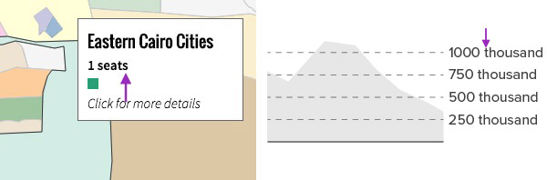
One last thing: mind your number formatting! It's easy to forget to design label formats for things like singular versus plural or different orders of magnitude, in which case you end up with some funny-looking labels.
The Lorem Ipsum Map
All of this, broadly, is about the challenge of designing around missing or fake data. The "lorem ipsum map" is a phrase used by Rob Roth and Mark Harrower (2008), as a caution against designing user interfaces around a placeholder map. In studying the usability of a map we made for the UW-Madison Lakeshore Nature Preserve, they found some negative reactions to the cold, metallic UI (which we designed first), in contrast to the green and fuzzy map (which we didn't add until later). It's hard to offer solid advice about this, other than to suggest trying to understand at least the basic nature of the unknown data and what it might look like. ¯\_(ツ)_/¯
Instead of designing around a blank spot, however, we often generate fake data. That of course can be a challenge itself, because how do we design somewhat realistic fake data when we don't know what the real data look like? Carolyn Fish has a good term for this goal—"smart dummy data"—and an interesting anecdote about challenges she faced trying to make OpenStreetMap data stand in for totally inaccessible (to her) classified data.
All that said, fake data can be an excellent test of code. In some ways, the more unrealistic the better. If the code can handle ridiculous data scenarios, it can probably handle the real data.
The Human Touch
Big picture time. The ultimate goal, really, is to approximate good, human design when we're forced to do it through rules and algorithms applied to unknown data. I'm going to keep pointing to Daniel Huffman to explain why this matters, at least until he makes good on his promises to follow up on four-year-old articles.
To illustrate how enormous a task handmade design can be in the web cartography age, consider The Essential Geography of the United States of America by David Imus. You probably saw this map a few years ago when a Slate writer declared it "The Greatest Paper Map of the United States You'll Ever See." Indeed, it's a lovely map with tons of manual details.
The map is 1:4,000,000 scale, and according to the Slate article, it took nearly 6,000 hours to complete. 1:4,000,000 is approximately zoom level 7 in the standard slippy map scheme. Just for kicks, let's extrapolate and say David Imus wanted to design a fully multiscale web map (zoom levels 0 to 18) with the same attention to detail. How long would it take him? I'll spare you the details of my calculation: it's 2,803 years and 222 days. And that's only the United States. Im-freaking-possible, in other words. That's why we need algorithms.
Big Design
This gets into what I want to call "big design." So-called "big data" isn't just a computational challenge; it's a design problem too. How do we accomplish good human design when there's simply too much data for a human to see?
The problem is perhaps unique to cartography, where at some level we want to see almost every piece of data we have, not aggregates and distillations. For most of us that means a map based on OpenStreetMap data down to the highest detail levels. With 2 million users mapping all over the world, quality and consistency can't be 100% guaranteed. Our challenge is to come up with design rules that ensure the map looks pretty good everywhere, at all scales. Yikes.
Nicki Dlugash of Mapbox spoke to this very topic at NACIS 2014. To summarize her advice:
- Prioritize areas you care about for your specific use case.
- Prioritize the most typical or common examples of a feature.
- Look for the most atypical examples of a feature to develop a good compromise.
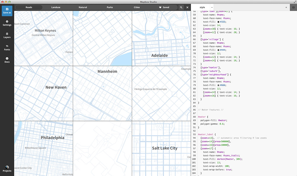
To help you along the way, there are things taginfo, where you can explore OSM tags and get a sense of things like geographic variation; or things like this view in Mapbox Studio where you can inspect many places at once.
And of course the nice thing about OpenStreetMap is that you can always fix the data if you find problems!
Good Luck
Well, I hope that assortment of tips and problems has been useful. Good luck as you stumble through the dark!