In Defense of Bad Maps

Last month at the annual NACIS conference, I gave a presentation called "In Defense of Bad Maps" — an attempt to demonstrate the value of prolific, popular, yet supposedly "bad" cartography on the web; and to propose a small bit of advice on how to approach cartographic sacrifices in the real, professional world.

This was a last-minute submission, not without occasional regret, and as such there are no especially strong arguments here, but my hope the is that the talk provided one or two things to think about as web cartography continues to grow and evolve. Presentation slides have been posted, but as usual they don't mean much without the spoken component. Here's a summarized version.

F tha map police!

Read more...

Yakkin' 'Bout Mappin'

Last week, we made an election map that shows how counties voted in relationship to several different demographic variables. It gave us a chance to take value-by-alpha (VBA) mapping one step further than we did after the 2008 election. Back then, we produced a nice little static map. Our new, interactive map is a bit more substantial, having a user interface, loading data, including a charting component, and displaying a data probe with details on mouseover.

Unlike our typical interactive mapping project, this one was rather small in scope. We wanted to make something that could come together quickly and easily and be seen before people stopped caring about the election. There was also no client, so we were free to work however we pleased in order to get done fast. In other words, no one was telling us that we had to make this work in IE7! All said and done, we devoted twenty-eight hours to the map before sharing it on Twitter.

Read more...

Mapping Superstorm Sandy

Poking around on Twitter today I saw a couple mentions of this map from ESRI, next in what I'm sure will be a long line of maps about Superstorm Sandy. This was the first thematic map I've seen about the storm but it struck me as hugely ineffective. Comparing 2 variables (census statistics vs. storm impact) requires a bivariate map. Mapping one variable and hiding the other one behind a mouse action makes it impossible to see any trends or gain any meaning from the two datasets as a whole. Unless you're interested in just a couple of counties or having the clicking abilities of a 14-year old Farmville addict, the relationship between the data will be lost.

After manually replicating the data from the map, I put together some quick maps of a few value-by-alpha maps (here's a stellar though academic introduction from its inventors) using indiemapper. VBA maps were originally conceived to visualize election results by visually-weighting (using alpha) red / blue colored counties by their relative populations. The end result gives you an overall sense of the election by making those counties which contributed more to the result (because of their higher population) more visually prominent.

Read more...

The Aesthetician and the Cartographer

An ugly map

Sometime around 2006, when everyone and their grandma started cranking out terrible Google Maps mashups, the Cartography world soiled its collective underpants as it looked like the once specialized profession was about to become obsolete. Fear was channeled into outrage at the whole idea of the "democratization of cartography" because it facilitated—encouraged, perhaps—the production of bad maps that ignored everything Cartographers had learned and taught over the years. In other words, "they took our jobs!"

Eventually we all calmed down when we saw that people still appreciated good cartography and there was still a place in the world for us—probably even more room for us than before. Then the tools improved by leaps and bounds, to the point now where it's possible to use them for good web cartography and it's easy to make maps beautiful. But it might be time to get uppity again.

Read more...

Advice to the Aspiring Interactive Cartographer

I often get emails from recent geo-grads or new professional students asking something like:

"I'm looking to expand my skills to make interactive maps. What do I need to know to become an interactive cartographer?"

Because our industry is evolving at such breakneck speeds, the required skill sets are constantly changing. Flash actionscript code has been replaced by Javascript and HTML5. Basemap cartography is endlessly tweaked as Mapnik XML instead of Illustrator layers. We can easily build and support our own tile servers. It's exciting change and it allows us to do more with our maps faster and cheaper.

Unfortunately, if you're trying to break into interactive cartography and haven't been involved with its evolution on a daily basis, it can be very tough to know where to begin. It's no longer as easy as "learn ArcView if you want to be a GIS Tech, or Illustrator if you want to be a cartographer."

Read more...

Four new typographic maps for summer 2012

Our typographic maps store took a little summer vacation last month and has now returned with some big postcards of the four cities it visited: London, Philadelphia, Seattle, and Minneapolis. Perhaps you'll enjoy them yourself!

Read more...

The 'Why Not The Best' map: thematic mapping with Leaflet

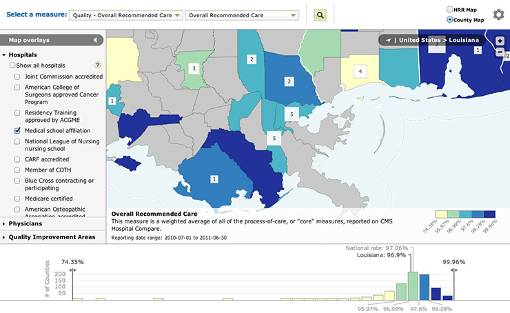
We're pleased to mention our most recently completed project: an interactive quality-of-health-care map for Why Not The Best, done in conjunction with IPRO for the Commonwealth Fund. This is actually the second incarnation of this map, which is now built with more modern technology and is better integrated with the Why Not The Best site.

Why Not The Best map

We first built the Why Not The Best map in Flash about two years ago, using the Flex-based indiemapper framework we had developed for ourselves. Flash was a good solution the time, as this was a relatively simple vector thematic map. However, the map's functionality and features later grew to the point where it incorporated multiple shapefiles, several layout modes, and embedded Google Maps—resulting in a very complex project and a large SWF for users to load. At the same time, non-Flash web mapping technology was improving rapidly, opening new doors for building this kind of map. As such we again worked with IPRO and completely rebuilt the map in HTML 5 and JavaScript.

Read more...

Your Map and the Internet

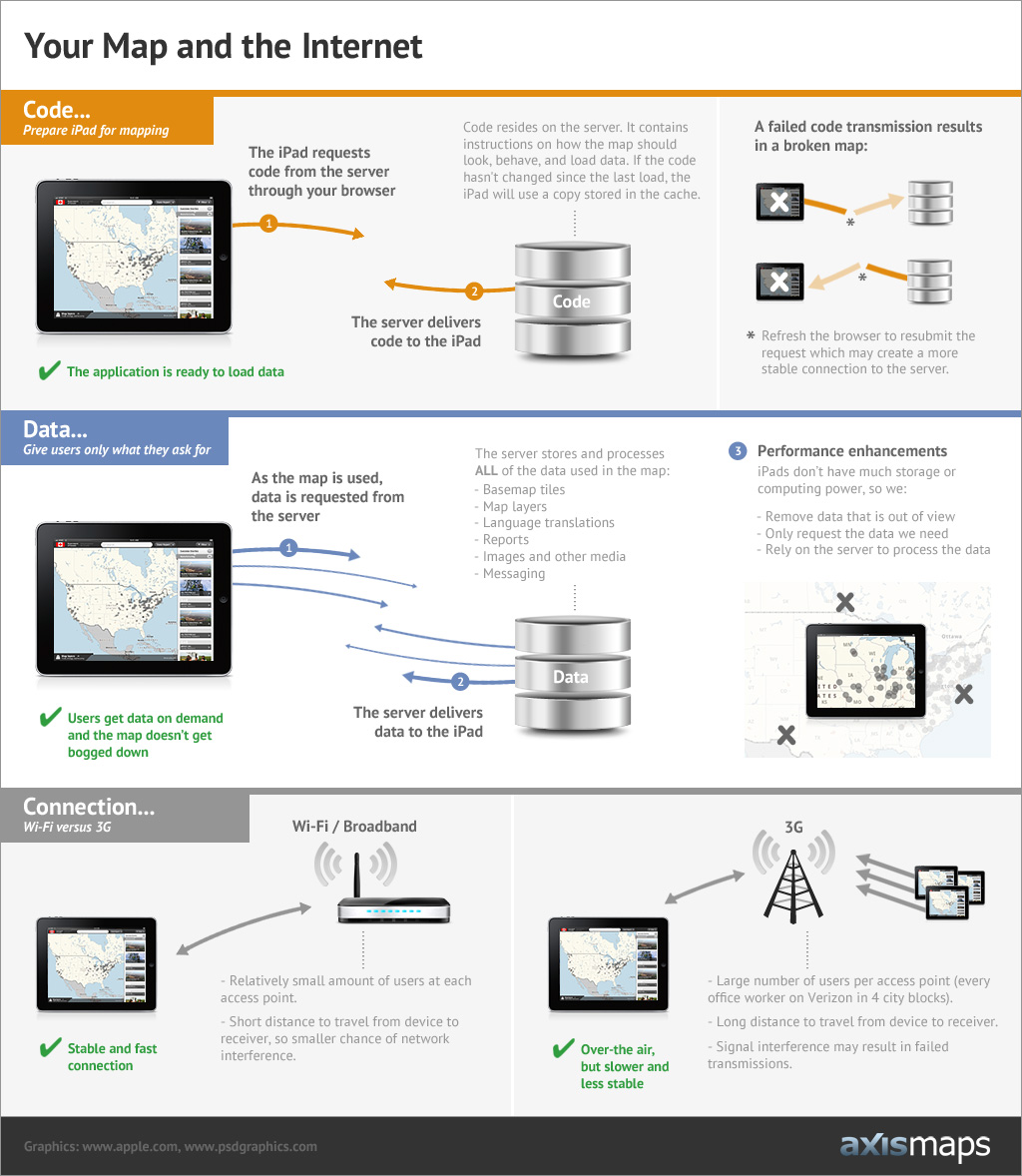
Sometimes it's important to explain the fundamentals, just to make sure everyone is starting on the same page and to keep expectations in check. Because our heads are constantly caught up in maps and the internet, we sometimes forget that there are a few basic underlying concepts that others (clients, friends, family, etc.)  might not be grasping fully when they use our maps. A better understanding might help them through potential rough spots and frustrations, often simply resulting from a poor internet connection. We found that explaining these concepts with words alone didn't get the message across very well. Words like "server", "code" and "wireless" can stick better when accompanied by a picture, as can the broader concepts that surround them related to how computers request and receive code and data for mapping purposes. This is the internet infographic we came up with:


Don't Panic: An Absolute Beginner's Guide to Building a Map Server

There are a lot of great mapping applications out there that run on a server. They can be intimidating to install and configure so I thought I would document my steps so everything would be in one place. This a a guide for the absolute beginner so if you have some command-line experience, I promise I'm not being condescending. Future posts will cover how we're actually using these tools to build our maps.

This tutorial should take you from absolutely nothing to a fully-functional web server containing:

  • PostGIS: A PostgreSQL database optimize to store spatial information. It can easily import shapefiles and OSM data using command line tools as well as connect to mapping services like QGIS and Mapnik.
  • Mapnik: A very powerful tool for automatically generating maps from geographic data with lots of control over cartographic display and rendering.
  • TileStache: A simple way to efficiently serve geographic data to mapping applications. It can send tiled vector or raster data and will speed up any application that needs to load lots of data.
Read more...

indiemapper is free

With the start of 2012, we've decided to make indiemapper free to use. Since indiemapper launched in 2010, our business has grown and changed to where supporting and maintaining indiemapper is no longer a major part of what we do at Axis Maps every day. We're making indiemapper free so that it can continue to exist as a useful tool for map-makers while freeing us up to be as awesome as possible at our custom cartography business.

To allow us to give it away for free, we're scaling back what indiemapper does. We've removed all account-based online functionality including usernames / passwords, cloud storage, and map sharing. Everything else, we've left as is. The map-making process is still the same except you don't have to log in AND you need to export your map before you close your browser. We're also moving our support operations over to GetSatisfaction to let the community of indiemapper users share their knowledge amongst themselves.

We're really happy about this change and we hope you are too. If you have any questions about the new direction of indiemapper, please let us know in the comments.

Launch indiemapper

Read more...